Classy Market 1.0: The Final Hours

Publix #172: The Afterlife
4601 9th Street North
Naples, FL 34103
A Classy Collaboration: A Companion to This Week's Albertsons Florida Blog Post

I am an historian and a preservationist, but I am also a realist. I preface that in part because a reader reached out several months ago with the high hopes that we (a collective conglomeration of bloggers) could halt the demolition and subsequent construction of a new Publix. I know that I alone cannot stop what happens hundreds of miles from where I live; however, I know that I am damn sure capable of spending 88 cents at an auction.
And that's just what I did.
It may seem crazy to some. It may seem like too little to others. I don't care.

For those who don't know, the Fox Theater in Atlanta, GA, was largely saved by the efforts of one man, Joe Patten. Think about how many other "old" and "decrepit" things were saved by somebody decades ago, which have now become beloved treasures of the past. Think about how many more pieces of history are now lost to time which don't deserve to be.

|
| Publix #172 - May 2022 |
There is a good chance that in 30 years, nobody will give a rip about what a Publix looked like in 2006. I'd just rather him or her be afforded the opportunity to make that judgement for themselves after seeing some primary source material. Isn't that better than never being given the chance to do so?
It seems ironic how modern society doesn't value "mundane" surroundings until they become "nostalgic" 20-years down the road (once they have mostly been erased from this world). These things seem like nothing special when they are everywhere, but trends do change, and people move on to the newest and greatest thing in a hurry. It's only when we stop to look back that we begin to miss where we came from.
This is one way I feel I can contribute to society as a whole. If people don't care after I'm gone, then so be it. At least I had fun making memories in the process!

|
| Almay - Publix #172 - June 2016 |
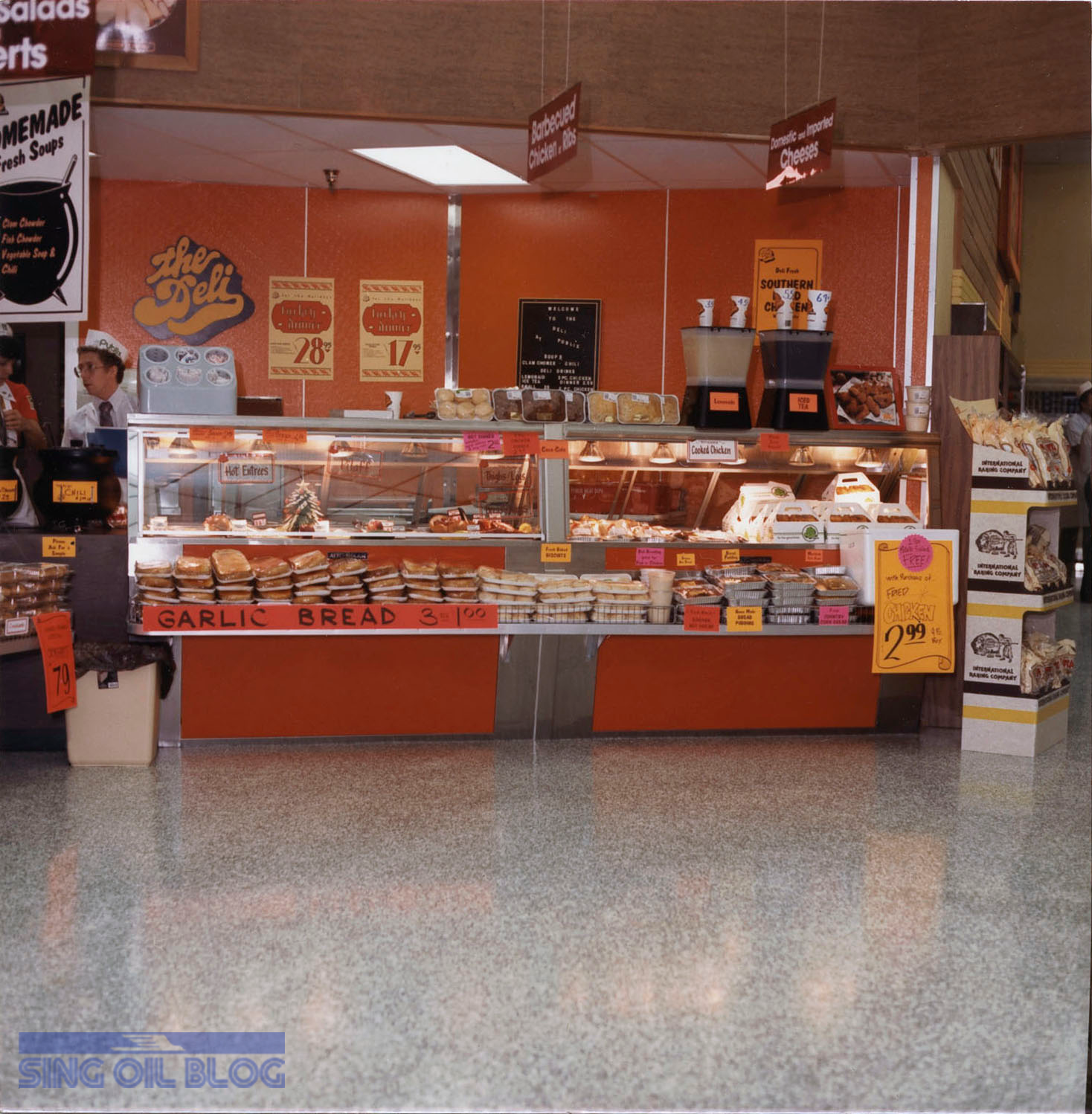
I hate to admit it, but I remember waking up frantically from several dreams in which Publix announced this store was closing – all before I had the chance to see it. Publix #172 is literally the store that would never die (It's almost like Winn-Dixie, in that regard). First slated to convert to a GreenWise Market back in 2008, this location postponed more remodels and demolitions than any other I'm aware of, causing it to be a time capsule like no other in the 2020's.

|
| This is still to this day one of my favorite photos I've taken while doing this blog. |
After years of rumors (and me being reassured by the cashier that construction had been delayed), solid plans finally came forth in October 2023 for the demolition (which themselves were drafted in December 2022). It would still take over a year for the store to finally close on November 30, 2024.

When I saw this store's auction posting go live in November, much less when I first visited back in 2022, I never thought I would be able to make it to see this store's afterlife. Nonetheless, the stars fell into line the week before listings closed when I realized I had an unallocated vacation day which would expire at the end of the year, enough hotel points to spend a weekend in Florida, and just enough mileage left on my car's oil life to take the trip. Inside, I really didn't want to drive all the way to Southwest Florida just for some signs I'd have to take down, haul, and store, but I also didn't want to see this piece of history get thrown away.

|
| The cover photo from the auction listing. |
I set everything in order and anxiously awaited the auction day; my one condition was that anything I purchased must fit in my car and be accessible from the ladder I already owned. Check.
The last two pieces I needed were the money and the gumption.
Both of these came to light as the auction progressed and the high bid for the lot of signage remained in cents, rather than dollars. I knew at that point that I couldn't let this one go. After all, I do love spontaneous road trips.
I ended up winning the entire décor signage lot for a grand total of 88¢ – the rest is history. I wasn't exactly looking forward to an entire day's worth of driving, but I set the plan in motion regardless. After all, I got to spend a fun afternoon exploring Tampa and the better part of a day wandering Naples: both cities I had spent mere hours in prior to this.

The fact of the matter is that I feel a sense of freedom on these spontaneous trips: I have a limited agenda, plenty of free time, and no expectations (from or of me).
One of the most relaxing parts of my trip was when I walked from Fifth Avenue in Downtown Naples to the clear waters of the Gulf. The weather was gorgeous that day, and despite me not bringing sandals, I slipped my tennis shoes right off and walked at least a half mile along the water: it was heavenly.
 |
| The beer on the left, titled "Alotta Colada," was by far the most unique. It did remind me of a Piña Colada! |
A trip to the beach, of course, was the recommendation of a local at the brewery I visited. By now, y'all should know that I love trying different types of craft beer, and Naples did not disappoint.
The man also recommended a local gopher tortoise preserve that was an interesting visit. Part of me does feel bad for the threatened keystone specimens who can only inhabit the small tract of land, considering how cramped their digs are, but at least they have a place to dig.

My vacation didn't end in Naples, either. I also took the opportunity to explore Tampa, including the famous Ybor City and high class Hyde Park.

Oh yeah, and I couldn't resist throwing in a few more supermarket stops along the way. As I was debating my dinner plans, I pulled into the parking lot of former Winn-Dixie #2433 and watched the steady stream of Teslas pull into and out of the adjacent Superchargers. What do those residents think about ALDI coming to town?

Similar to Hyde Park, Naples seems like one of the last places in Florida where I would expect to find a Publix that had gone 20+ years without a remodel. Home to affluent retirees and luxury travelers, it is common to see all sorts of expensive vehicles while traveling around the city, which almost makes me think Publix' decisions regarding good 'ole #172 were made out of complacency rather than intention. After all, why rush to update a store when it has a steady and captive audience (like the tortoises). If residents want a larger, newer store, all they have to do is drive three miles to the north to find the world's first Sienna / Classy Market 3.0 Publix (that's on top of the several other stores within a 10 minute drive).

Driving up to the store on auction pickup day, the shopping center looked largely unchanged from how it did in 2022, with the main exception being the road sign advertising Publix as "coming soon" and the old building signage being removed from view.

As I parked my car and walked through the door, I instantly recognized the sights and sounds of an auction: saws whirring in the background, mysterious brown liquids covering the floors, and gondola shelves in disarray.

|
| A look toward the old wine department & long-gone pharmacy counter. |
Oh, and the smell.
If you have never been to a supermarket auction, there is always a distinctly stale chemical smell that seems to linger in your nostrils for the next few days. I'm sure it results from a hazardous chemical that is released from the old, dismantled refrigeration units. I know it is memorable, nonetheless.

|
| Who stole a shopping cart from Winn-Dixie? The closest one is almost 9 miles away! |
I was forced to aimlessly wander the front of the store for several minutes because it took the auction manager a moment to arrive at the table to check me in. Most of the buyers had already cleared their purchases, with this being one of the final pickup days, so he didn't have many more tickets to tend to.
Once he found my paperwork, he sent me on my way to remove any and all signage remaining around the perimeter of the store (which didn't turn out to be everything photographed in the listing, but I wasn't in the mood to complain).
I decided to start with the produce lettering.

Plop the ladder down, snap-snap, twist-twist, slide, lock, repeat, and up I went.
The foam text may have been well secured to the wall; however, it was quite easy to remove. All it took was some gentle force at each of a letter's felt adhesive pads, and pop, there it was.

Since all of the refrigerated cases had been removed, most of the wooden trim which once framed them was also absent. This proved beneficial, as it revealed several of this store's circa 1986 wall paint colors. Here we can see the bold green which was once used as an accent in the produce department.

Anyway, after "Produce" was successfully saved, I attempted my next victim: seafood.

The small signs were very easy to remove, as their wires were simply screwed to the wall through a small loop.

All I had to do was lift the loop back over the head of the screw, and huzzah, I was finished. I was certainly excited to take home these pieces due to their compact size and bold blue color.

Probably the most surprising thing for me when I first visited this store was how it featured accents from Publix' latest interior, Evergreen, alongside its classic 2002 looks. That shock was reinforced when I spotted this notice adhered to a wall in the seafood department which utilizes a design language introduced in February 2024. Yup, this store was still getting new signs less than 10 months before it would close for good. Shocking.

What thankfully wasn't shocking was the track lighting trellis that was still suspended over the old produce department. Whew!

The main seafood department sign, likewise, was easy to remove after disconnecting the support wires which have braced it for the last twenty years. It helps that the 8 foot wide sign was surprisingly light, to boot!
I decided that all of my work thus far had tired me out, and I was in need of a figurative smoke break. Let's see what I found during my short intermission.

Behind one of the now-removed produce cases was this pile of cleaning supplies and garbage.

The piece that stood out to me in particular was this mangled bottle of bleach because its label still shows the Publix branding that was discontinued in 2005. It may be in pretty rough shape, but I figured that it was small enough to still take home with me and easy enough to throw out if I decide not to keep it. Now I just wonder how it ended up in that corner so long ago.

Also, friend of the blog Ryan B. was kind enough to recreate the label for me, and I think it turned out pretty cool!

From there, I made a round through the stock rooms, where I discovered the old produce service sign (pictured at the bottom of the post) lying against a wall. I should also mention that I found more trim pieces with the same green color we saw up on the wall. Based on some plans I've seen for a different store (thanks, GeorgiaPubDude), I believe this green was interior paint color #1 for the original 1986 package (hence the #1 written on the board) and its code was Sherwin Williams BM-26-16. If anybody has an old Beau Monde swatch deck (which is what I believe BM stands for) or an American Wallcovering sample book from the 1980's, please shoot me an email!

Continuing on our "behind the scenes" tour, we find the space which once housed the walk-in meat cooler from the perspective of an old storage area adjacent to the seafood department. We can see the meat department and meat office beyond.

We'll take a few steps further into the stockroom to find (from left to right) two old frozen food freezers, a chicken cooler, and a storage room lining the back wall of the building. On the right side of the hallway, we have the ice cream freezer, and the alcove created by the removal of the old meat cooler.

|
| Store #274 - Demolition Plan - Invigorate Remodel (2010) |
If both of those perspectives confused you, take a look at this map of Publix #274's stockroom space, where I marked my two photo locations in red. I will say that I believe #172's ice cream freezer was in a different location from what the plan shows for #274.
Next up, we'll return to the main sales floor to continue our Kiwi dissection.

While the produce signage was easy to remove, that wasn't exactly true here. The trick that Publix deployed to ensure the longevity of the adhesive was to insert several small finishing nails through each of the letters to secure them to the wall.
I suppose this tactic worked well if no signage was missing a mark after close to two decades! Consequently, the letters adhered to wood paneling (like MEATS shown above) were significantly harder to remove than their drywall counterparts.
Speaking of the wood paneling, I would have loved to reveal some of its original look if I had more time. I know from construction plans that Publix used natural cedar with a clear sealer on it, which would honestly fit in well with today's design trends. I suppose it doesn't look to bad with a coat of Pale Shrimp on it, either.

Wow, this place is a mess!

|
| WANTED: Meat category signs - Auction listing photo |
While my quest for the meat department lettering ended in success, I unfortunately wasn't as lucky with the old meat category signs. Based on the auction listing photos, they were obviously included in my lot, yet they were nowhere to be found by the time I arrived for pickup day. I'd love to know what happened to them – I presume that whomever removed the adjacent refrigerators seemed to take the liberty to remove the signs as well. Oh well, I guess they are gone now.

The next color I stamped off my bingo card was this bright orange, which my best guess was Sherwin Williams BM-5-6. Regardless of the color code, it looks a heck of a lot like the orange paneling used in the deli during the 1980's.

That orange band continued across the entire face of the meat department. I never realized that this whole wall was open between the meat department and the sales floor, and the only thing separating the two was the row of meat cases. I guess the original coolers used to have open backs for easy stocking?

Some of the strangest things come out of the woodwork during fixture auctions, like this old stoneware jelly Christmas gift set I found sitting atop the meat partition. Maybe this was once part of a display over the meat coolers and just got lost?
I wasn't too interested in some 20+ year old preserves, so I just let this guy lie.

Following the meat department, I moved to the old floral sign. I figured it would be just as easy to get as the seafood sign, until I realized it was hindered by a presentation of glass shards directly below (courtesy of a shattered freezer door). After all, I'd imagine that 1998 model freezers were only removed for their salvage value and not for the intent of being reused, meaning nobody really cared when one of the doors broke. Lovely.

Oh yeah, and our old track lighting friend also proved to be in the way.
I managed to dodge all of the obstacles and take this shot looking back toward the old produce department. Don't you love those old floor stains!

I guess I'll still take those stains from traffic patterns over the cleanup that is needed on aisle twelve.
Isn't it crazy to see how open the back of the store looks with all of the meat coolers removed!
|
| Look at my buggy stacked full of signs to the left of the column! |
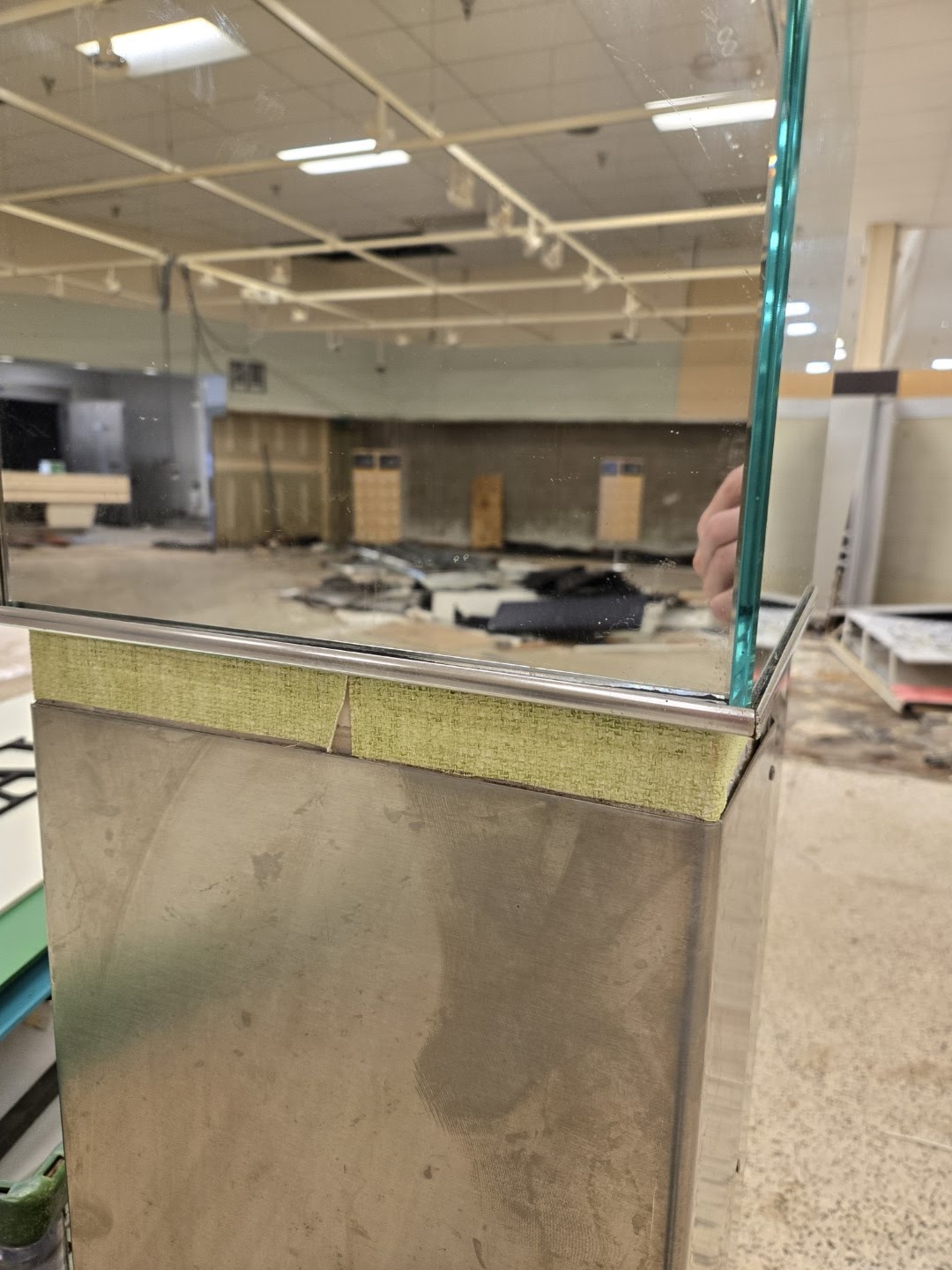
Stepping down from my ladder, I noticed this old mirror wrapping the column in the old floral department that was just above a small strip of textured wallpaper.
I'm no expert, but I believe that wallpaper pattern happens to be from American Wallcoverings. This store originally had four bands of different wallpapers running around the upper wall of the produce department, and this may be a small sample of the bottom row. What a nice surprise!

Let's take a look down aisle 14; it's a bit more apocalyptic than it was before.
I believe that this section of ceiling grid was removed to allow workers to salvage any of the copper refrigeration lines they could find (they were busy removing old pipes from the dairy stockroom which prevented me from seeing that part of the store).

The shelves on aisle 12 couldn't bear the weight of losing their longtime neighbor on aisle 13: the beer fridge. I guess they eventually fell down on the job.
Isn't it strange to see the pristine Publix logo still standing guard over the chaotic store?

Since I didn't find anything of interest on top of the beer fridge remnants (I was really hoping to find an old Wavy Pastel category marker), I decided to shift back to aisle 14 and attack my next target.

Frozen Foods, of course.
I wonder how many people realized that the Pink Grapefruit paint used for this department is actually a different shade than the Pale Shrimp used in Meats . . .

After removing the frozen lettering, I ventured into the bakery alcove. This also involved a look at a salvage-destined bakery freezer which was adorned by several rat and roach traps behind the green-painted trim (shown above). Neat! That begs the question of, how one would remove said rat on the off chance it scurried its way into a snappy destiny? Removing a trim board nailed to the wall seems like a difficult task to extract a stinky dead mouse.

You know what else would be difficult? Withdrawing several cherry turnovers from a plastic container while the box is still sealed shut.
In any case, that's exactly what happened here. I found this cherry turnover box, which is more than two-decades old, stashed were a freezer used to sit and empty as all get-out.
My only guess is that ants crawled in and ate every last bite of the sugary goodness that was once inside. I didn't care, in the end, because I found another remnant from the Wavy Pastel era to take home (and a rare disposable one, at that)!

Somebody stole the "T"! (And the "O".) I had so many letters in my buggy at this point that I didn't even bother with "N vel ies • Ice Cream". I'm just glad that I was able to snag "Publix Premium" off the wall to my right.

Originally, the bakery must have used a different configuration because the front wall had white wallpaper installed behind some of the freezers. At least that meant it could be preserved!

After I had removed all of the bakery lettering from the walls, I went for a quick walk through the corridors between the frozen and produce departments.

Who knew that there were employee restrooms back here! I'd guess that the "Men" and "Women" placards on the doors are original to the store as well.

We'll head on over to the opposite side of the building to see what kind of damage I can do in the dairy department. I also just noticed that (almost) all of the old wall sconces are gone!
|
| Publix #172 - May 2022 |
It's amazing what a few years (or a few days) can do to a place!

I figured I should take one last photo of the text before it met its demise.

Since this store missed out on a number of remodels, cold beer never moved to aisle 1, and the old GreenWise natural foods section was instead used for a small selection of beach items . . .

. . . and canned fruits? It looks like somebody stacked the shelf too high a time or two!

While on this aisle, I figured I might as well examine some of the secondary décor elements the store had to offer. After all, didn't you wonder what those faux windows were made from? (Psst. it is just foam.)
I found out the "window" was screwed to the wall in several places, but removal still wasn't all that difficult. I just was annoyed when that thing squeaked on the whole drive home!

After the window, I took a look at one of the shutters and was shocked to learn it was made of real wood; it even had a real hinge attaching it to the wall.

|
| Publix #411 - Wood Shutter Detail - Kiwi Remodel (2007) |
I just didn't know at the time that it was secured to a piece of wood blocking. I was not about to easily get that off the wall!
Once I saw the bolts used to hold that heavy piece of wood up, I said, "screw you," and moved on with my life. On to the next task!

But first, we'll take one last glance toward the old service counter.
I knew this before I arrived onsite, but the customer service sign was at least a foot taller than its counterparts across the store, hence why I didn't end up getting it. It also, interestingly, used the same marbled foam letters featured as accents throughout the store instead of the plain black ones found on the floral / seafood signs.

|
| Store #274 - Equipment Plan - Invigorate Remodel (2010) |
I was also surprised to learn that the customer service office dead ended and didn't include access to the rear stock room or mezzanine break room. If only the workers hadn't been in the dairy stock room taking down those copper pipes!

With the coolers removed, we can see how the dairy department was extended toward the front of the store during one of the remodels to cover up the old seasonal section wallpaper. The green looked very similar to what I saw in the floral department.

Last, but not least, I couldn't leave this store without snagging a custom Pub Sub sign. If only the wood paneling sheet it was fastened to didn't make things so difficult to remove!

The deli sign was hanging on by a thread, to say the least (and was like this when I arrived). I didn't even bother with it since the letters were so messed up.

I did try to get the smaller deli sign off the back wall, but it, too, was secured very well. I gave up after realizing I'd probably break the thing just trying to get it down. I was also pretty tired at this point!

I took this picture to highlight the door jam leading from the deli to the stockroom, but I'm not sure if any of the colors we see are significant. Maybe somebody can prove me wrong?

Wow, this space almost looks normal compared to everywhere else!

My last few surprises came as scraps I found on the floor and served as sweet vindication: Publix did in fact recycle its old Wavy Pastel and Metallic Marketplace tri-sided aisle markers! I knew my eyes hadn't tricked me when I thought I saw blue on the back of an old category card at #515!

Needless to say, I took a few of these now-rare double sided aisle marker cards home with me. Now, I just need to see one of those markers with the green paint scraped off.

You know what else I found? Several old "Compare & Save" tags glued to the terrazzo floor. These two showcase how Publix was cheaper than its competitors on several varieties of cat food over the years. Wouldn't you love to have saved 30¢ on some Meow Mix over the Naples Sweet Bay (sic) in July 2008 or have saved 90¢ on some Friskies over the Cape Coral Albertsons in February 2002?!

Or, you could have saved $1 on Folgers coffee over a Fort Myers Albertsons in August 2001. If these signs weren't glued to the floor, I would have considered grabbing them! At least I still had the chance to pick up some coffee here at Publix #172 . . .

Oh, when I stood up my latter to evaluate the Service sign, I noticed a piece of Scotch tape on the awning below. I couldn't resist peeling it off to reveal some pristine teal paint (which was much less tacky than the green coat on top). I wish I could have saved a piece of the metal, but there was no practical way for me to do so.
Just before I left, I overheard some other workers having conversations about farmyard roosters which must have originated from their chicken lunch. It was during this time that I was tempted to ask about a checkout cube, but I became less inclined as I saw a man removing each register line with the cube intact. After all, they were only from late-Sienna.

As we reflect on our journey, I'd like to discuss the legacy of the circa 2001 Kiwi package as a whole. The design began as the flagship accompaniment to Metallic Marketplace and Wavy Pastels, before becoming mainstream as those two designs were wound down in 2004. As The Albertsons Florida Blogger put it, Kiwi truly served as Publix' "classy" upgrade from the tropical and whimsical looks of the 1990's. The interior design made these grocery stores look like upscale and professional open-air markets that consumers were vying for in the 2000's.
This design shift came as a big transition for the company, too, considering how the store-brand products eventually adopted the look, which has lasted on some products through 2025. I personally think AFB may have drug on the "Classy Market" moniker a bit too long, but he seems to have been spot on with describing the Kiwi package before its true name was known. (Again, that credit goes to GeorgiaPubDude. I can only take credit for the Invigorate and Bamboo names!)

Following my departure, Publix #172 went on to live another week or two before it was reduced to a basic pile of rubble.

|
| Courtesy Publix - Publix #1782 Front Elevation |
I understand that 40-year-old buildings take a lot to maintain, but I feel like the old store still had much more character and curb appeal than #1782 ever will. I think it has to do with #172 using a standard pitched roof compared to the imposing "box" façade of the new store. Then again, we should just be happy that #1782 will still use some Spanish tile reminiscent of its predecessor.
Just like what I did with Publix #1331's Afterlife post, this last section is dedicated to an up-close look at the pieces of history I managed to bring home. They may not be craftsmen items like a wooden antique desk, but they still seem cool to me!
I hope you'll enjoy this, as it provides something you won't really find anywhere else: a side-by-side comparison of Publix' interior designs from the 2000's.

First up are the three eras of category signs I have in my collection. The top one obviously came from #1331, and the bottom two were picked up amidst the shattered glass next to aisle 13 in #172. Biscuits, Margarine, and Bacon are a story for another day – they are from a Sans Serif Kiwi store, nonetheless.

Second, we'll compare the sans serif signs from #1331's liquor store to the secondary category signs from #172. The thing that stood out the most to me, other than the sizing difference, was how bold the updated Avenir text is compared to the original Garamond.

Next up, we have the presumed American Wallcovering "Sidney #KL-1004 Sage" paper I snagged from the floral column. It's crazy to think that Publix stores used to feature textured wallpaper!

That's followed by the bakery paper which may be American Wallcovering "Fiber/Yarn #KO-0504 Off-White".
The even crazier thing I learned is that two of the produce department wallpapers were titled, "Kiwi," and "Evergreen." Isn't that quite ironic!

And of course, I couldn't forget some extra shots of the mysteriously empty cherry turnover box.

Isn't that classic logo so cool!

In the spirit of comparisons, let's see how the Invigorate (Classy Market 2.0) logo stacks up against the Kiwi serif text. If only the Invigorate sign wasn't mounted to the arched aluminum brackets . . .

My three secondary signs make an appearance together. I just wish I had one of those stupid meat department signs that I bought to join them!

At least I got to snag several of the double-sided category markers that the aisle sign purchaser left behind. These were honestly one of the coolest discoveries of the trip.
Oh yeah, and I can't forget about the two Sienna H&BA markers I found – "Hosiery" and "Family Planning." It reminds me of the "Feminine Products" category marker I saw on the floor at #1331!

Here is a fish-eye shot of most of the major department signs . . .

. . . followed by another one of the secondary lettering from the bakery, deli, and vestibule.

Last, but not least, are some of the "bonus" odds and ends I picked up along the way. This includes the faux window, several of the frozen category markers, a few old "Advantage Buy" tags, the wallpaper swatches, a piece of trim, a piece of bakery tile, a produce nutrition card, a steamed seafood sign, and one of the "Compare and Save" tags that wasn't glued to the floor.

I'll leave y'all with a warped side-by-side comparison of the seafood signs from former Publixes #1331 (Invigorate) and #172 (Kiwi). It is crazy to see the differences in design between the two adjacent generations of interior styling but also fascinating to see how both signs make the focal text pop in their own unique way. Part of me feels like the older look is timeless in the sense that it could still be used in an upscale supermarket today. The newer signage still doesn't look dated, but it feels like a stronger attempt to capture the out-of-style design aesthetic of the 1950's. Which one do you think has aged the best?
Anyhow, that will conclude today's post, but make sure to check out Horizontal Horizon's pre-auction adventures over on The Albertsons Florida Blog. Don't forget that I'll be back next Sunday on the Florida Retail Blog with the third part of this year's Marketplace Madness series – you won't want to miss this timeless treasure!
Until then,
- The Sing Oil Blogger