
Tallahassee #13 | GreenWise Market #1573 - Tallahassee, FL
In Memoriam: 2018-2024

GreenWise Market #1573: The Afterlife
Publix Super Market at Gaines Street Station
Tallahassee, FL 32304
Still Wise, No Longer Green.
Greetings, and happy leap day! In a shocking twist of fate, I am somehow two posts ahead at the moment and have time to spare! To celebrate this rare occasion and this extra day, I figured it was best to release a timely interim post covering one of my favorite subjects, Publix GreenWise Market, and the concept's untimely demise.

Today's journey will take us back to Florida's Capital City to revisit a store we saw back in April: GreenWise Market Publix #1573. A lot has changed in 10-months' time at the original (or fourth) GreenWise, but what we'll see today is simply the culmination of a years' long process that started around 2020. Ever since Colorado grocer Lucky's announced it would shutter most of its Florida locations and Asheville-based Earth Fare saw a similar, sudden implosion, Publix seemed to lose interest in the second incarnation of its organic, health-conscious GreenWise Markets.
You'll remember that this edition of the concept, originally touted for its immense range of prepared food options, craft beer bar, and new rewards program (the latter two being a first for Publix), made its debut right here on Gaines Street in 2018. This makes it fitting for the Tallahassee location to also be the first of the eight surviving stores to be put out of its misery.
Don't get me wrong, I think the concept did a lot of things right. After all, aspects of this store were clearly carried on with the headline-grabbing Publix #1808 in Tampa and the equally noteworthy Publix #1846 in Louisville, KY. It's just that Publix' trial run must not have met expectations considering how it was terminated prematurely . . . taking three locations down with it that were all less than two years old.

|
| Courtesy AFB - GreenWise Market #1659 - 2020 |
When the concept debuted, the stores initially didn't even feature the Publix branding . . . anywhere. In an attempt to differentiate the organic concept from the mundane mainstay, the company opted to forego the familiar "P" and lean into the funky "G". That being said, it wasn't hard to see that Publix was discontent with the concept as early as two years in. The lack of "standard" products, such as Coca-Cola and Nature's Own bread, was a large turnoff for the demographic of would-be GreenWise shoppers. It seems that Publix made a key mistake in its market research because instead of luring the relatively fringe shoppers looking for hard-to-find organic products (for often much higher prices than standard counterparts), the stores ultimately brought in standard Publix shoppers who liked the location of a particular store or were intrigued by the on-tap craft beer selection.

|
| Former GreenWise Market #1689 - December 2021 |
Publix realized this, and initially tried to ease the market tension by integrating standard grocery staples with the higher-end organic products. This worked in part to drive up traffic, but one of the best things to come to the Markets was the Coronavirus Pandemic. When standard supermarkets were out of ground beef and toilet paper, the GreenWise stores were typically fully-stocked and ready to welcome shoppers into their quiet, empty aisles (because people weren't flocking there in the first place). The grocer eventually gave in and added the signature "P" anywhere it could to reassure shoppers that these stores were just small, fancy Publixes. Familiar items such as Lay's potato chips and Aunt Jemima pancake mix could now be found alongside the bulk organic macadamia nuts and $1,500 bottles of Bordeaux.
The final nail in the coffin, for me at least, was when Publix #1754 opened as a regular store rather than the planned GreenWise in August 2021. This was followed by the closure of GreenWise Market #1689 in Marietta, and the opening of eight additional planned-GreenWise stores as standard Publixes. The grocer officially announced the discontinuation of the concept in May of last year.
So where does that take us? Following the initial flurry of news coverage, the answers to what would happen to the stores, and when they would change, remained largely unknown. Other than some chatter from employees that architectural crews were coming "soon" to evaluate the spaces or that the conversion would likely start "in a few months", we were flying blind.

GreenWise Market #1573 Remodel
That is, until mid-January rolled around. At that point, I finally received a firm date that one of the stores would begin its remodel in two weeks' time, shortly before visiting a different location for myself to find an active construction site.

The parking lot at that store, GWM #1573, was extremely crowded, and traffic with all of the unrelated, surrounding construction made it hard enough to even get to the store.

Add to that the shipping containers taking up half the parking lot, and you have a total mess!

While the outside looked otherwise unchanged, it didn't take long for me to notice the "changes are coming" sign plastered to the window (which interestingly still used the GWM font package). Wouldn't it make more sense to have this signage reflect the pending Evergreen styling?

Just inside, the store had also received new buggies and had the signature drywall patch in the vestibule waiting for the "Welcome to Publix" sign. This room didn't feel like it was still a GreenWise, but the weekly GWM flyer (printed specifically for this location) and the surrounding signage still indicated that was the case.

The remodel wasn't quite as jarring inside the store, however, except for the few minor details that looked out of place. While I immediately noticed the new checkout conveyor belt lines, the price confidence monitors, credit card terminals, and store receipts still sported the old GWM logo.

The biggest things that caught my attention, though, were the mis-matched checkout cubes on the new conveyor belts. Numbers 3 & 6 would have originally been issued between 2016-2021 with Sienna, while the remaining 5 & 6 hailed from one of the three packages used from 2008-2015 and appeared to be a bit faded. Why were the four checkouts numbered 3, 5, 6, & 6? Why didn't all of the cubes match? Most importantly, where in the hell did these recycled cubes come from?!
I suppose this proves that Publix has a warehouse somewhere with old décor pieces? I'm just glad that both of the designs seen here are relatively common (despite being on the decline) because I don't know what I would have done had I come across one of these.

Hopping over to the grand aisle, we find the familiar GreenWise category markers and "
GOODNESS
" signage still in place for the time being over the
GRAB & GO
section.

Produce
also looked largely the same, as did the upstairs seating area.

There were still quite a few miscellaneous signs throughout the store featuring the GreenWise design language which makes me
wonder if some will survive unnoticed. Something that didn't go unnoticed, though, was the old produce graphic on the wall.

Turning around, we find our first major change at the old prepared foods island. I had theorized that this space would turn into a deli island, much like the other Publix stores of this size, and it appears that I was right.

Despite the looming changes, the existing deli corner
looked untouched (and the Pub sub line was very long; I noticed three
cardboard signs throughout the store in GWM branding pointing hungry students toward the
subs). Only time would tell whether this space would transform into the meat and seafood counter, like is found in a standard 28M, or whether Publix would instead use the corner for an in-store bakery. The latter would involve less moving, so I pick option B. Regardless, it looked like the newfound space back here would be used for something other than sliced meats. These stores are going to be strange Publixes anyway, so what's one more anomaly.

I didn't stand in line for a sub, but I did walk past the old burrito bar, only to find some all-new fixtures for hot foods and fried chicken. This space was still very much a warzone; however, that didn't stop this Publix GreenWise Market from displaying some hot grab & go rotisserie chickens here.

On the opposite side (formerly home to the Asian bar) we find brand new cases for sliced deli meat. As to why Publix didn't want to use some of the old deli cases, I do not know. I guess they didn't want any college students to have sub withdrawals!

Back on the side facing the produce department (formerly the host of pizza and pasta), we find some yellow caution tape barricading what are presumably the new sub station cabinets.

The only food found on this side of the island was in the small sushi refrigerator. Contrary to what you'd find in a regular Publix, most of the sushi still bore the "Stonefish" branding as opposed to the blue AFC labels I'm accustomed to. I'm not sure what was special about those bowls in this case.

Finally, we find a lonely soft drink counter awaiting its final placement.

Along the back wall, we find the last remnant of the store's miniature bakery situated next to the dairy coolers; it wouldn't be long before this was no longer the case.

Meanwhile, bread had already moved to
aisle 1, along with cereal and sports drinks. During my first visit of the week on Wednesday, a flock of employees was standing on a barricaded portion of this aisle vacuuming out the old bulk food containers. By Friday (when this shot was taken) there was no sign of this aisle's past: not even the category cards on the aisle markers.

Returning to dairy, I had never noticed the milk jug pattern adorning the wall before – how cool! It's nice to know that this unique feature will at least survive.

Wow, aisle 4 really cleaned up! Other than the old aisle marker, this looks like a regular Publix.

Back up front, the
CARE
sign was floating in midair above a lonely goat soap display. If I'm not mistaken, this store had to forgo H&BA products due to its small size – I can't find another trace of bath soap in any of my pictures. The Publix app does list an assortment of body washes that can be found on aisle 8, but I'd still be hard press to see where they could fit it based on my pictures from the other day.
As for the rest of this shot, the old Restrooms sign was still mounted to the wall that appeared to be under construction for a new
SERVICE
configuration. This store's local flare murals can also be seen off in the distance and are seemingly spared for the time being as well.

|
| Courtesy GreenWise Market (Instagram) - September 24, 2018 |
GreenWise shared a few behind the scenes shots of the pieces as they were nearing completion back in 2018, including this one showing how the canvases feature a collage of local photographs and postcards.

|
| Courtesy GreenWise Market (Instagram) - September 24, 2018 |
The studio where the work was done doesn't appear to be that large compared to the size of the pieces! I do appreciate how each GWM featured one focal piece from a local artist – I wish more stores would do this.

Back on aisle 5, we catch another glimpse of the painting off in the distance along with what has become of most of the former
CARE
department. We can see how some, if not all, of the freezers to my right were added recently based on how there are new refrigerant lines running to the ceiling and how the old
CARE
light fixtures hover over part of this aisle. I just love the reflection of those square lights on the polished concrete floor; it's a shame they were gone by my next visit!

The one sign that some of these freezers were original advertised
FROZEN BREAKFAST
. It is possible that these placards were easy to move, and somebody decided to get an extra month's worth out of the piece.

As for the opposite side of aisle 5, that is now home to soft drinks and snacks: just look at all of that Pepsi!

Aisle 6 offered more frozen foods and showcase some of the concrete trenching that needed to be done for new drain lines. I wonder how well the construction crews will be able to match the existing concrete stain and polish.
Also, if I'm not mistaken, this store may now be only the second Publix to feature bare concrete floors. I don't see that becoming a larger trend anytime soon, though.

At the end of aisle 6 we FIND a few lonely wine bags awaiting their trip back to the distribution center, clearance rack, or dumpster. These, too, were gone by my most recent visit.

The
CUTS
corner didn't look entirely different from the last time I saw it, which is all the more reason to believe that it wasn't going to magically transform into the bakery.

Finally, we FIND beer, wine, and prepackaged deli meat on aisle 8. This isn't all that much different from before, except that the cold cuts and part of beer were flip-flopped.

What's really interesting is how Publix simply repurposed the
existing open-faced fridge previously used for deli meat and cheese. I understand not wanting to discard a fixture that isn't even moving, but the unit looks out of place next to all of the other enclosed refrigerators.
Otherwise, we can still see some scarring on the floor from the old
FINDS
cheese display.
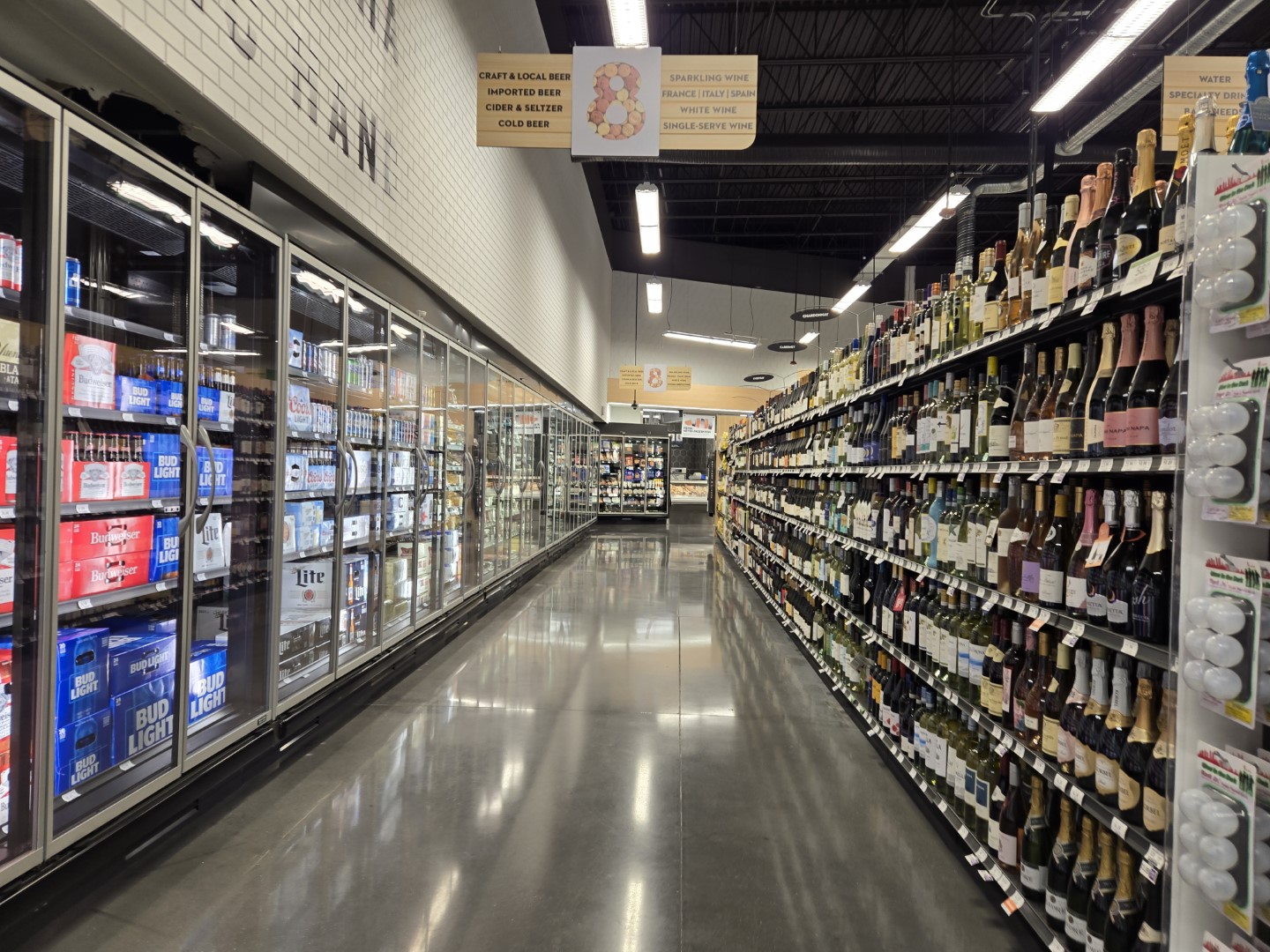
We'll close out this aisle with a nice overview of the space; even though this store is basically on a college campus, that's still a lot of wine and beer in comparison to everything else.

Our final look – ever – inside GreenWise Market #1573 showcases the last bit of the faux bricks that still needed to be painted white. FLORAL A. RANT CRA. MMY CUTS. ESHING HA. EXOT. ALPHABET SOUP.
As for the last major department in the store,
POURS was busy with people drinking beer and ordering coffees both days I went. I brought a friend along for one of the visits who commented, "This feels like I'm having a
beer in an airport." He's not wrong, and I still think Publix could have done something to give the space a better ambiance if they expected shoppers to sit there and drink. I guess it is still hard for people to turn down (relatively) cheap beer that you can carry around the store.
Publix #1573's First Week
According to the Google Maps listing, Publix #1573 was officially christened on February 19, 2024. All of that is to say that Publix decided to upload the "P" logo to the listing at that time and change the name from "Publix GreenWise Market on Gaines" to "Publix Super Market at Gains Street Station". The company stopped short of having any sort of formal, or informal, grand opening celebration.

Despite that, I
guess this is still a sign that something has changed here . . .

In addition to the new road signs, this store received its third set of
building signs since 2018. That seems a bit excessive, if you ask me.

Walking up to the building, I spotted two "now open" signs placed over the bollards (as seen in the photo above). The store hours sticker on the door had also been swapped to reflect the Evergreen design language.
The thing I was most surprised to see, however, was that the "Welcome to your Publix" signage in the vestibule was black on a white backdrop rather than white on a green wall. I'm not sure if this was a special treatment to mesh with the old GreenWise accents or if this is another chapter in the everlution of Evergreen.

It's also worth noting that #610 just south of here received black lettering on its welcome sign; it's just that both of these installs happened years apart and are the only examples of black welcome lettering I've seen. Oh well, at least this is the perfect time for you to compare Evergreen's original DIN welcome sign to its current custom-typeface installation.

Stepping inside, we find that the temporary assortment of Sienna checkout cubes has been replaced by proper Evergreen stock. The aisle markers have also been swapped over to the standard grey tri-siders.
At least the custom endcaps survived to see some Evergreen stock photos!

Turning to the left, we find a plethora of beer in the former FINDS department and a few areas of concrete that still needed to be patched.

I was also not surprised to see that the meat and seafood counter remained in the same location as before. It is still bizarre to have the familiar grey DIN lettering paired with all of the other GreenWise décor fixins though . . .

Furthermore, despite converting to a Publix, this store still felt like a GreenWise at heart. Yeah, the Lay's potato chips and Coke don't quite fit the original mold, but the grey concrete floors, white walls, and light wood accents are all hallmarks of the previous décor.

As suspected, Publix did opt to place the bakery in the old deli corner (rather than moving it to the opposite side of the store like a 28M), and I'm glad to see them take this route. I still can't understand why the 48M and 28M throw the bakery all by itself in the back left corner!
You know, I'm surprised that this is the only sliver of wall where we can see the signature Publix green stripe as well. I guess the designers preferred to keep the old wall texturing the same color rather than continuing the stripe throughout the store.

I'll be especially curious to see if Publix comes back and stains the uncovered or patched concrete to match the rest of the floor. The mismatch looks much better than an old Kroger, but it still looks unprofessional. Another thing that remained unfinished was the signage over the deli. The remodel appeared to be roughly 90% complete, but there was still a punch list of items that needed to be polished up.

You've probably heard me rant before about discontinuous dairy departments, and the odd lineage of this store led to just that. It took me way too long to find the yogurt: I knew this store had it because I saw some in another shopper's buggy, but I couldn't seem to find it after staring at the milk, eggs, and cream cheese on the back wall for several minutes.

At least the Pub Sub Island was given a familiar arrangement to what can be found in a 28M or 48M (and was also being taken advantage of by some local college students).

The last GreenWise department sign to remain was hanging off in the distance for SERVICE. I'm not sure what all Publix was doing around the service counter, but it still looked like a construction zone in that section of the store; I think part of that wall had been ripped out since my last visit? Anyhow, the customer service counter had seemingly already been replaced because it, too, matched the Evergrey look.

POURS was also still up and running, but the more surprising carryover was the old events calendar just out of frame to the right. Instead of advertising trivia and karaoke, it listed different product samplings scheduled to take place on each day of the month. I should have taken a better picture to see if there were still a few GWM events that stuck around.
Well folks, that is it for my conversion coverage of Publix #1573. I hope you enjoyed the special post, and make sure to keep on reading if you need a refresher on how this store used to look.
Until next time,
- The Sing Oil Blogger

Original April 15, 2023 post follows below:
Tallahassee #13
Sing Food Store | Deli
Tallahassee, FL 32304
Scroll Down for my More Than Convenience post on former Publix GreenWise Market #1573
The Curse of the Number 13
Welcome back to another Sing Oil Saturday! It seems like it has been a hot minute since I've covered a Sing station (probably since I pushed this post off last time in favor of my April Fools' Day special), but alas, today could be the day when we get to see another one – sort of.

You've oft heard me talk about how Tallahassee was Sing Oil Company's bread-and-butter market (and the primary reason for Amoco's interest in purchasing the chain), but every powerhouse still has its soft underbelly. For Sing's Tallahassee ventures, that store happened to be unlucky #13.

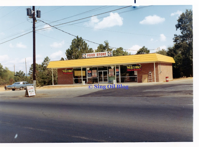
Situated on the corner of Blountstown Highway and Capital Circle SW, the circa 1985 convenience store opened its doors to the sleepy intersection of two secondary thoroughfares. The lightly industrialized area on the western outskirts of town is mostly known as the crossroads for travelers heading south to the (at that time) Tallahassee Regional Airport or west along Florida Highway 20 to Blountstown or the beaches of Panama City.

The thing is, unlike Bradfordville, this quiet intersection on the edge of town never really took off like Sing hoped it would. I'm not saying this was the chain's worst performing store in Tallahassee, but a combination of lackluster sales and right of way acquisitions for an intersection expansion project likely served as the primary reasons for Circle K to eventually call it quits here. It looks like the beginning of the end was first spelled out when Leon County voters passed a 1% transportation sales tax which outlined an expansion plan for Capital Circle way back in 2000. That project was later predicted to be underway from 2008 until 2010, which would explain why the Circle K appears to have closed in the 2009-2010 timeframe.

Therefore, Tallahassee #13 has joined Powder Springs, Sandy Plains, and Gulfport as being one of only four Sing Stores sold to Amoco that is no longer a convenience store.
 |
| Courtesy Priceless Car Rental (Google Maps) - November 2020 |
This station first opened in December 1985 and was originally managed by Lewis Hall Singletary, II, the grandson of Sing Oil Company's founder of the same name. It marked the company's 10th convenience store in the market and the third-to-last Sing would open in the area. Interestingly, it opened several months before Tallahassee #12 which makes it one of the rare exceptions to the typically predictable numbering convention.
From there, this store's lineage mostly parallels that of the other Tallahassee Sings: gas at this location was changed to the Amoco brand in the mid-1990's (while still using the Sing name on the store), at which time this station was officially changed to "Amoco-Sing #5064". It then converted to a Circle K in 1999 before closing nearly 10-years later.

Despite
the fact that this store is no longer a store, you may have already
picked up on the fact that the original building still stands.
 |
| Courtesy Capital City Imports (Google Maps) - August 2018 |
That's right, this structure is none other than a used car dealership. While it may be a rare thing to find me photographing a Walmart, you will not catch me dead inside a used car dealership! Thankfully, that's what the internet is for. Buckle up, because it's about to get weird.
 |
| Courtesy Capital City Imports (Google Maps) - December 2017 |
As I alluded to, I kept my distance from this former Sing and only took photos from Capital Circle, but the current occupant's extensive pictures surprisingly reveal a lot of Sing and Circle K traits that they have preserved to this day.
This photo of a hideously maroon Ford Edge reveals the original corduroy concrete blocks still in place, along with the herringbone wood panels below the windows. Sing's awning also continues to hang on to shelter shoppers.
 |
| Courtesy Capital City Imports (Google Maps) - May 2018 |
What is more bizarre is what we find inside the store: a Smart Car fully in-tact Circle K interior.
 |
| Courtesy The BBCO Show (Google Maps) - December 2022 |
You may not believe me, but I was shocked when I first saw these photos and instantly knew what they were. The black ceilings, chrome trim, and colorful wallpaper are all original to the multi-national chain's 2000's décor package.
Right now we are taking a look at what presumably would have been the cashier counter area (I doubt the counter we see today is original), with the restrooms down the hallway to the right. This is roughly the center of the back wall of the old salesfloor, although, Circle K has a funky way of arranging their stores.
 |
| Courtesy The BBCO Show (Google Maps) - December 2022 |
Turning a bit to the right, we see what was presumably the old fountain drink area. I've seen sinks inside other Circle K stores before so I'd imagine that is original. What's even more surprising is that the tile on the right side of the photo appears to match what we saw in the 1984 photos of the Bradfordville store. Could this be original to the store's construction?
I also saw these same tiles in Tallahassee #14 (along with a similar section of replaced tiles), so I'd guess they are vintage. The tile should run perpendicular to the front door of the building , and I think the newer tiles are placed where Sing's cashier counter was located in the center of the store. The car dealer even posted an "ad" on their Google Maps listing which gives us a bit more perspective on the space; check it out because you won't be disappointed by the guy's antics.
 |
| Courtesy The BBCO Show (Google Maps) - December 2022 |
Turning back to the left, we see the old drink coolers which were just covered with posters and had desks set in front of them. On top of the fact that this was an incredibly sad conversion, all of these Circle K relics have even survived a short stint as a "Tienda Mexicana y Taqueria".
If you need a little refresher on how this place appeared as Circle K, let's take a look at a different store we've seen before.
 |
| Courtesy Chazmen Geames (Google Maps) - Former Tallahassee #8 Sing Store - September 2018 |
Tallahassee #8 did look a bit different when we toured it a few months back, but thanks to Google Maps, we can see that it shared an identical décor with Tallahassee #13 until at least 2018. I wouldn't be surprised if the chain remodeled to this package shortly following the acquisition of these stores from Amoco.
 |
| Courtesy Capital City Imports (Google Maps) - December 2017 |
Another insight into this store's past will be a first for this blog – a picture from an old car's GPS. The alignment for this car's GPS appears to be a bit off (the car is likely parked on the opposite side of FL-263 / Capital Circle), but this photo of the dated navigation system shows us a key piece of history about this former Sing: the fact that it used to be a 76 station. It really helps when a used car dealership is the company who takes over an old Sing because they seem to post an awful lot of photographs!
The last Sing relic we will take a look at is the pair of old vacuum lights standing off to the side of the parking lot. Most people wouldn't pay these any mind, but I'm sure some of y'all would have caught onto this remnant!
Now let's take a look at some street views before heading down the road to the first-ever GreenWise Market 2.0!
Street Views
Google Street View - June 2011
Google Street View - June 2013
Google Street View - June 2015
Google Street View - May 2022
Aerial Views
 |
| Historic Aerials - 1967 Future site of Tallahassee #13 |
 |
| Historic Aerials - 1984 Future site of Tallahassee #13 (I'm not sure what the objects at the site are) |
 |
| Google Earth - 1994 Tallahassee #13 Amoco-Sing (outlined in red) |
 |
| Google Earth - February 2009 The final days of the former Tallahassee #13 as a Circle K |
 |
| Google Earth - April 2021 The former Tallahassee #13 as Capital City Imports |


A NEW ERA

GreenWise Market #1573
Publix GreenWise Market on Gaines
Tallahassee, FL 32304
Now that we've taken a look at Sing's least successful station in The Capital City, let's head into town to examine a special chapter in Publix's history: the second generation GreenWise Market. You may remember when I covered former GreenWise Market #1698 last year, and that store opened two years later than the location we will explore today.
After over a decade of rumors, Florida's Capital City gained its first GreenWise Market on October 4, 2018, making it the first of eleven locations that would eventually open under the revamped banner.
 |
| The Tallahassee Democrat (Newspapers.com) - October 4, 2018 |
"GreenWise Market operates like a neighborhood store – a place to hang and veg out in CollegeTown with the conveniences of a grocery store and a trendy pub. In the "Pours" section, customers can sip a cold beer, wine, iced coffee, espresso and kombucha on tap.
And it works. From the high bar stools to the beer flights, the space is the main attraction.
'There are a lot of stars in the store, but this is absolutely the star of the location,' said Dwaine Stevens, a spokesman for Publix. "This is just a place where you can come and relax and come with your friends. If you're a student at one of the universities, you can come in and just hang out." - The Tallahassee Democrat
 |
| The Tallahassee Democrat (Newspapers.com) - October 4, 2018 |
It was also announced around this time that Publix would convert the three original GreenWise Markets, which opened in 2008, into traditional Publix stores since they no longer fit the mold of the concept.
"'This is a new and improved version,' Stevens said of the Tallahassee store. 'We learned a lot from those prototypes, so this is the very first of its kind here in Tallahassee.'" - The Tallahassee Democrat
 |
| The Tampa Bay Times (Newspapers.com) - September 1, 2018 |
The new store was described as "a lot less like Whole Foods – which you could argue the 2008 GreenWise wave was built to combat – and a lot more like specialty niche stores Lucky's Market, Earth Fare and Sprouts Farmers Market . . . Lucky's has emerged as a serious competitor, opening more stores in the Sunshine State than anywhere else this year." - The Tampa Bay Times
Not only did GreenWise try to distance itself from its image of the past, but it also initially tried to distance itself from its green overlord: probably the most surprising feature of this store is the fact that it only carried organic products.
"Customers won't find any cigarettes or high fructose items, such as Coca-Cola products at GreenWise Market. Neither will they find a pharmacy or a place to buy a 'Pub Sub,' a popular item for busy residents and college students." - The Tallahassee Democrat
My how times can change! I'll dive into the details at a later date, but Publix ultimately decided to reverse this decision (well, not the cigarettes or pharmacy parts) following the relief from external pressures and the likely decline of internal sales. This change would also correlate with Publix adding their branding to all of the remaining GreenWise stores.
 |
| The Tallahassee Democrat (Newspapers.com) - December 15, 2010 |
 |
| The Tallahassee Democrat (Newspapers.com) - November 10, 2016 |
Lucky's Market followed suit in 2016 by opening a store in former Albertsons #4497 on West Tennessee Street. This location proved to be the shortest-lived of Tallahassee's specialty stores, as it only lasted until 2020, followed a month later by the liquidation of Earth Fare. This leaves the area with a Fresh Market (which opened in 2004 in a former Wal-Mart), a Whole Foods (which opened in 2013), a Trader Joe's, two Aldis (one of which is in the old Earth Fare), a Winn-Dixie, and a whole host of Publix stores.
Now that we have some background information, let's take a look at the store.

Without the big green sign out front (which has recently been updated to include the Publix "P" logo), I'd be hard-pressed to tell you that Publix designed and built this store. For starters, the building uses a much more urban design, despite the fact that it includes an expansive parking lot.
We are currently looking at the southwest corner of the building with the entrance facing the parking lot. The Gaines Street entrance can be seen off in the distance, along with some street-style angled parking lining the "front" of the store.

This must have been a rare day for me because I decided to take multiple exterior photos of this store!
Publix originally touted this store as being walker and biker friendly due to its close proximity to Florida State University's campus, and it seems like that is what the "main" Gaines Street entrance was designed for. After shoppers park their bikes out front, they can head inside to the POURS taproom, grab a local brew, and sit outside on the covered patio while soaking up the Floridian sunshine rain.

We'll jump back over to the parking lot entrance to see what the "O.G. 2.0" has to offer!

Retail Regents, feel free to correct me, but the buggies in this store seem to match the ones I've seen used lately in Winn-Dixie. I think he mentioned that they were manufactured by Cart Source? Regardless, they aren't the typical Technibilt units we've seen Publix use for nearly a decade.
POURS
"Kombucha on tap, açai bowls, craft beer, wine, and more! Get cozy with a coffee or take your beverage with you. Our carts have cup holders." - GreenWiseMarket.com
To guide our tour today, we'll examine the official explanations for each department from the GreenWise website. I'll go out on a limb and say that this store was designed for Millennials . . .

The stark white color palette, light wood grains, and polished concrete floors would certainly back up that theory; however, what's really interesting about this store is the fact that it appears to have been Publix's test case for changes it would eventually roll out in standard stores. More on that in a bit.
Our first look inside the store shows us a section of the front speedway, with the self-checkout stations and POURS taproom off in the distance (I really wish I had ventured upstairs to see what that space looked like).

Speaking of POURS, I really seemed to drop the ball on photographing the highlight of the store: after all, this is the first Publix you could ever have a beer in! Thankfully, our friends at The Democrat have us covered with some extensive coverage of the new concept.
What's even more interesting is how far out of their way Publix went to carry specialty brews. A different article states that, "Four of the five Tallahassee craft breweries – Proof Brewing, GrassLands Brewing, Lake Tribe Brewing and Deep Brewing – have each been contracted by GreenWise to brew a special draft beer for the Tallahassee location." - The Tallahassee Democrat
I'm not going to lie, this is probably my favorite section of these stores since it offers something unique to the supermarket realm. The concept must also have proven successful since Publix has begun to roll it out in its newest prototype of premium stores.
As I mentioned before, this store has two sets of exterior doors: the one facing the parking lot that I entered through, and the additional set facing Gaines Street. The northern Gaines Street entrance is just off to the right in the photo above while the produce and floral departments are just to the left.

We'll continue on with a look down the grand aisle which runs along the Gaines Street (northern) wall of the store. The produce department is sandwiched smack-dab in between the aforementioned POURS and EATS off in the distance.

Turning around, we can see the continuation of the produce department toward the front of the store, with the stairs and elevator shaft to the second floor seating area just beyond.
I can always tell that my photo quality declines whenever a store is pretty busy (and unlike AFB, I'm not a fan of waking up at the crack of dawn to photograph a store), as I think I was intending to include the man on the left edge of the photo in my shot. I happened to stop into the GreenWise Market during the Bacon Lovers Bash.
 |
| Courtesy Publix - Bacon Lovers Bash event banner |
I still don't quite understand the premise of this event, but the main "festivities" I saw included several stations throughout the store handing out bacon samples. I tried one over by the bakery featuring some sort of spicy garlic bacon that was very – unique.
I also overheard a man saying something else – unique – to an employee standing behind the bakery counter. It seemed as if I walked into the punchline of a joke that I did not expect to hear in public, much less Publix, that probably put a strange look on my face. I think the man handing out samples saw my expression and proceeded to hand me the bacon while explaining the beef I had just overheard. I wish I could remember the exact phrase, but the noun I do remember shall not be "c"n seen on this blog . . .

Well isn't that a whole bunch of shiitake mushrooms! Something I've noticed in the GreenWise stores I've visited is a refrigerated bin full of bulk specialty mushrooms – fun(gi)!

Just across from the exotic mushrooms, shoppers can find this store's burrito bar which is located on the "deli island". Fascinatingly, this wasn't the first Publix to feature a deli island. The latest incarnation made its debut in a 28M-2 a year before this store opened, while Publix's first attempt at the design dates back to 1991 with a 65N.
EATS
Speaking of specialty items, the GreenWise Market 2.0 was heralded for its expansive offering of ready to eat entrees, including sushi, wings, pizza, and made-to-order pasta. Pub Subs initially didn't make the cut, but we can see where the popular product was eventually added to this store's sliced meat counter.

That station, along with the sliced meat counter, can be found in the back right corner of the store.
 |
| Courtesy Supermarket News - Publix opens first GreenWise Market store - October 4, 2018 |
Thanks to Supermarket News, and a photo they likely acquired from Publix's PR department, we can see how that exact counter looked when the store opened. You'll notice that the sub counter was once home to all sorts of ready to cook items (that are probably expensive to keep fresh). Publix did eventually cave in with the decision to make this place one step closer to a standard grocery outlet.
If you're curious, this photo gallery also includes several more pictures from the press department of how this store looked when it first opened.

Turning around, we see that the expansive ready-to-eat food section continues with a full hot bar, pizza, sushi, and Asian bowls. The bakery and deli counter are located just behind me in this shot.

Wow, I didn't even manage to get a photo of the bakery counter! Oh wait, I don't think this store really had one. It seems like all of the bakery items were located on freestanding shelves between the deli and the hot food bar, with one display case possibly placed next to the orange juice.

I do like how the aisle numbers in this store allude to what can be found on that row, like how #1 references the dried fruits and bulk foods shoppers can find.
CUTS
"Meat raised without antibiotics or added hormones, sustainably sourced seafood, and—because we love you—sausage made fresh in-house." - GreenWiseMarket.com

The fresh meat and seafood counter is located in the back left corner of the store to guide shoppers toward . . .

. . . more beer! Aisle 8 is dedicated to a wide variety of adult beverages.
FINDS
"Entertaining this weekend? Start here for a curated selection of wines and imported cheeses. You may even find a special treat you’ve never tried before." - GreenWiseMarket.com

Which leads us to the perfect place to create your own charcuterie board: FINDS. Probably the most interesting part of this nook is the rapid wine chiller, and the machine which allows customers to pour a glass of their own.
The CARE H&BA section can be "found" under the square LED light fixtures, with the checkout lines located just beyond there.
As a recap, this store was the first Publix to debut:
- A rewards program
- A bar
- A mezzanine seating area
- A white and grey color scheme
- An expanded variety of prepared foods
Don't those things sound awfully familiar?
 |
| Courtesy Publix GreenWise via GIPHY |
Yes, sir they do! Despite the fact that Publix has essentially canceled the concept, it seems like the GreenWise 2.0 served as a testing ground for all sorts of things to come. From it, we have since gained Club Publix (2020), POURS in a mainstream Publix (2023), the 49M (2019), Evergreen (2019), and the 55M (2023).
I hope you enjoyed this post as much as I did (I was cracking up as I wrote it if you couldn't tell). Even if you didn't you can still see whatever adventures I find myself in two weeks from now.
Until then,
- The Sing Oil Blogger


“I'll go out on a limb and say that this store was designed for Millennials . . .
ReplyDeleteThe stark white color palette, light wood grains, and polished concrete floors would certainly back up that theory; however, what's really interesting about this store is the fact that it appears to have been Publix's test case for changes it would eventually roll out in standard stores.”
There may be some truth to the latter statement, but I also think Publix is experimenting to see how far they can go with cost-cutting and get away with it! Perhaps they feel that if they can indoctrinate younger people to accept austere stores now, they’ll accept them as they get older. I think this is what happened with other grocers. When Safeway and company started experimenting with open ceilings in the 1980s, there was a backlash to it and retailers had to be careful not to go too far with the warehouse look. However, as big box warehouse stores became more common, other retailers felt that the public had acclimatized themselves to the warehouse look and they were able to engage in cost-cutting without too many complaints.
The décor here looks kind of like Safeway’s Modern décor, but I think I prefer the look of Safeway Modern. In some ways, this décor package isn’t a whole lot different from photos of Walmart’s recent décor package, I think it is called Airport or something?, which is probably not a good sign for Publix as I doubt Publix has ever been compared to Wal-Mart in terms of design!
Although HEB’s Central Market is not really a ‘green’ supermarket, there are some aspects to this store, at least as it was originally envisioned, that reminds me a bit of Central Market. Central Market does not carry traditional groceries. Instead, it only sells upscale/gourmet products. I’m sure organic products are a large part of that, I have not been to Central Market since 2005 though and ‘green’ products were much less popular then than now even. Although this limits the appeal of Central Market (even yea, almost decades, after the first Houston one opened, HEB has not opened another one here), HEB has stayed committed to that concept. Those wanting to buy Coca-Cola will have to visit a normal HEB. For people in Dallas, they only had Central Markets for about twenty years, but now they are getting normal HEBs as well.
Back to the statement about Millennials, it seems almost assured that this store is geared to appeal to college students. With that, even when this store opened in 2018, Millennials might have been too old to be the target demographic. Gen Z makes up the current college population and I don’t know if their tastes differ from Millennials. Certainly if nothing else, Gen Z kids, especially ones in college now, probably did grow up shopping at stores with the warehouse look. Maybe not in Florida where Publix terrazzo and Winn-Dixie Golden Girls floors would have been the norm, but that would be true in Texas. Also, given the college population there and that college students living in dorms can’t really cook, it’s rather shocking that Publix ever thought it was a good idea not to sell their traditional subs here. I guess Publix did rectify that issue rather quickly.
Anyway, just for comparison, here is a relatively new urban Tom Thumb store in Dallas with Safeway Modern décor. While warehouse stores of this design are not my thing, I would much rather shop at the Tom Thumb than the PubWise. No, the Tom Thumb does not have a bar (it wouldn’t be legal here anyway), but it has a much nicer traditional supermarket experience with slightly classier décor, IMO. Link: https://goo.gl/maps/HjvgjeJHecfEDTMh9
Also, check out the mural at the Tom Thumb gas station across the street! Link: https://goo.gl/maps/5J59VMXGuNNtM7bt5
I wouldn’t be surprised if some of the changes were made for cost-cutting purposes (like using polished concrete floors instead of terrazzo), but I also think some of the design aspects were implemented to reflect the trends of the industry as a whole. That is an interesting point about stores using warehouse ceilings because that seems to be the design of choice for most large retailers. Dropped ceilings aren’t exactly the most elegant solution either though.
DeleteI’ve been to one Safeway, and it happened to have the Modern package – I can certainly see the similarities. I’m not sure I would go so far as to say that a GreenWise reminds me of Walmart’s Airport package; nonetheless, I was shocked when I first saw an Airport store because it didn’t seem to reflect the “soulless void of retail” I was accustomed to with the Arkansas chain.
The way you describe HEB’s Central Market does make it sound like it falls into the same category as Publix’s GreenWise. I’d imagine that Central Market is probably more in line with GreenWise 1.0 (which was comparable to Whole Foods) rather than GreenWise 2.0 (which is comparable to Earth Fare, Lucky’s, and Sprouts, to an extent). Publix has since pivoted and started selling Coke products, etc. in GreenWise 2.0 stores which leaves them in the odd position of being a very small Publix with extra ready-to-eat food options. I think Publix may have neglected to sell Pub Subs at this store initially due to the other options, like burrito bowls, that they figured college students would prefer.
You need to remember that Publix was likely developing this concept as many as five years before #1573 opened, which is when all college students were Millennials. Gen Z is also known for having much “louder” design tastes; likewise, the grey tones are typically thought to resonate with the older Millennials. I’ve heard that the “conservative” design trends that were a product of the Great Recession that many Gen Z’ers grew up in led to this revolt and preference toward a “unique” aesthetic.
That Tom Thumb does look nice, as does the mural across the street! It still seems strange when I see the Tom Thumb grocery chain because I always associate the name with the old Kroger convenience store brand which operated in the Florida Panhandle!
Oaf, when I first saw this updated post and saw that GreenWise had proven GreenUnwise, I thought Publix would have put some kind of proper floor in when this store was converted to a regular Publix. That seems to not be the case! The only things on the floor are patches like that orange 'bandage' right next to a 'Where Shopping is a Pleasure' sign and an out-of-stock shelf. Not only does that not look like a pleasure, this looks like the worst Publix I've ever seen! I know this store is a bit of an oddball, but if regular Publixes start looking like this one, maybe Albertsons and Kroger should start plotting a return to The Sunshine State (aside from that strange Harris Teeter, of course!).
DeleteIt has been a while since Kroger has built a new store around here, but some of the last ones they built here had concrete floors, at least partially, but they use a brown stain on the concrete or some kind of concrete with a large amount of stone in it to make it look like some kind of really cheap knockoff terrazzo. Neither look great, but it is certainly better than what we see here with plain and patched polished concrete.
Nope, the concrete floors appear to be here to stay (in this location, at least). I don't think these look bad in person since they were at least designed to be exposed, and I also like the polished grey much better than the reddish-brown Kroger uses. I suppose that maybe my distaste for brown concrete floors is just correlated with my bad Kroger experiences, though. I guess the orange patch you mentioned may have come from shifting the freezers back a bit – I agree how that one will probably be hard to cover up. Keep in mind that the store was still an active construction site when I took that photo so I don't think the empty shelf or orange tape will stick around. That's also far from the worst looking Publix I've seen (and it isn't the only one I've photographed with concrete floors, either).
DeleteI still beg to differ in regards to Kroger's cheap knockoff terrazzo! Regardless, at least the floors like this store has will be limited to former GreenWise locations; Publix has shown no signs that it intends to switch away from terrazzo at the mainstream outlets.
Considering how much I don't like photographing supermarkets turned into furniture stores because of all the pushy salespeople, I can only imagine that trying to photograph a used car dealership would be a much worse experience for that same reason! Thankfully this place was very generous with providing photos, as it's quite interesting seeing how the interior of the dealership still looks like a convenience store (however, I don't think low-budget used car lots are known for extensive renovations to anything).
ReplyDeleteThe first time I walked into a Greenwise 2.0, I thought almost exactly the same thing - that I was walking into Millelineal Mart. The design of the store, the original product offerings, the vibe just all screamed stereotypical Millelineal to me. I also see the Sing Oil Blog was trying to be hip and trendy to match the Greenwise vibe with the new fonts for that part of the post too! Even though I don't drink, POURS is one of my favorite parts of these stores too, mostly because I always cave and buy one of the craft sodas they sell. The burrito bar is pretty good too, although I would like to try a slice of Publix pizza one day as well. I like that Publix is using all the highlights from Greenwise 2.0 in the main stores, as Greenwise 2.0 had a lot of good ideas mixed in. While Greenwise 2.0 will most likely end up fading into Publix history eventually, a lot of people will probably never realize the impact these 11 stores had on the other 1,300!
If there's one good thing I've learned about Publix from visiting stores at the crack of dawn (besides there being less of a crowd), it's that Publix recently started selling really good breakfast sandwiches in the bakery (at least at the newer stores)!
You know I was thinking about all of your past furniture store comments when I mentioned not wanting to venture inside the used car dealership! I totally agree that it would be much worse in a dealership because at least in a furniture store you can just say “I’m browsing and want to see how this would look in my house.” Like you said, at least this dealer was kind enough to give us some photos and help me resist any urge to go inside!
DeleteMillennial Mart is a fun name for it! I’m also glad that I’m not the only one who thinks the GreenWise 2.0 concept is Publix’s attempt to appeal to that generation. Haha, I’m glad you notice the different typefaces! It just so happens that the primary fonts used on the GreenWise website are in Google’s font library which means they are very easy to integrate into Blogger – I couldn’t resist. Maybe I’ll have to try one of those craft sodas next time I’m in a GWM too. As far as the hot foods go, I’ve only tried the chicken tortellini and it was perfectly – fine. Maybe I will have better results with the burrito bar or pizza. I agree, it is fascinating how much of an impact these 11 stores will have on the chain’s future and I’m glad that the two of us have managed to photograph a large portion of them. I also think you’ll enjoy the next GWM I cover because it is by and large the most unique, in my opinion.
Hmm, I haven’t seen those breakfast sandwiches yet. I’ll have to see if I can find one next time I go to a grand opening or something.
I guess we're about to have 8 more oddball Publix stores coming our way (counting this one). Publix did a much better job retooling all the unopened Greenwise stores to look more like a regular 28M newbuild in layout and aesthetic, but I guess that's the big advantage of redesigning a store before construction begins (or has significantly progressed). The new decor looks weird matched up with the old Greenwise aesthetic, and like Swifty said below, the font used for the new department signs looks more like the Sienna font than the Evergreen one (and matched with the old woodgrain mounting piece, the new decor looks like a really bizarre mashup of Sienna and Evergreen). Those random old Sienna checklane number cubes appearing during the remodel was weird too - I guess mis-matched and randomly numbered lanes was preferable to having a bare lightbulb sticking out until the new Evergreen ones arrived? That was a weird sight, and seemed like a Winn-Dixie maneuver from 2013 than something Publix would ever do! I also have some faith Publix will find a way to blend in all those patches in the concrete to look nice and not like something from your average Kroger remodel. They do a good job with patching terrazzo to match, so I feel the concrete will be a similar case (I hope).
DeleteIf you end up at this store again in the coming weeks, let us know how some of those final touches end up.
Yep, that does seem to be the case! Other than the blatant GreenWise façades, the retooled stores that never opened as GWMs look like regular Publix stores. I'd imagine that most of those locations had made it through the permitting and design process, but still were early enough along where Publix could easily move around some interior departments. I personally like having the bakery next to the deli, like in Tallahassee, and wish that change could have at least survive the other retoolings. I'll be curious to keep an eye on other new store openings and remodels so we can see if the DIN department signs are a thing of the past: maybe I unintentionally stumbled upon Evergreen v2! And Sienna didn't even come to mind for me when I saw the wood grain because I was still in GreenWise land! Yes, I guess Publix figured it was better to have some random check lane lights than some bare lightbulbs. That seems like a lot of effort for a still-inferior outcome. I will keep you updated if I get the chance to revisit here soon!
DeleteIt looks like they've changed the font of the department signage. (It looks similar to Avenir, just like with Sienna. It's definitely more rounded than the Din family.) I'm curious to see if this is going to roll out to new stores or if this is just for the Greenwise conversions.
ReplyDeleteI do appreciate that the Greenwise stores had a similar design language to Evergreen.
I never got any photos of the South Carolina stores - they were not terribly remarkable or different. Maybe a bit smaller. I'd say their closure was the first sign that Greenwise was on its way out.
Wow, thank you for pointing that out as I didn't initially pick up on that! I'm curious if it is the same custom typeface Publix uses on the welcome sign and its marketing materials.
DeleteLike we've seen with a number of things, it looks like Publix used the GreenWise stores as laboratories before trying new features and designs in the mainline stores. I agree that the GreenWise store designs have a lot of similarities with Evergreen. It's still strange to see the ultimate combination, though.
That's still a shame you didn't take any pictures of the South Carolina stores since they were so short-lived. They were especially unique since both spaces were originally planed to house The Fresh Market. From what I've seen on Google, it looks like they did resemble the Sandy Plains store I visited, and I agree that their closures didn't bode well for GWMs as a whole.
Definitely interesting to see the results of this conversion. The store still very much feels like a GreenWise in many ways, which really isn't a bad thing in my eyes.
ReplyDeleteYeah, it was really interesting for me to document this store's remodel journey. The concrete floors, woodgrain accents, and POURS do make this location still feel like a GreenWise, so at least there are still some references to its unique past left behind.
Delete