
Publix: The Return of Wavy Pastels

Publix #830
Conway Crossing
Orlando, FL 32812-2305
Celebrate April Fools' Day with The Sing Oil Blog!
Editorial Note: Before we jump into this post, I'd like to comment that most of it is based on real facts, except for the parts which are completely made up. As far as I'm aware, Publix is not planning to bring back Wavy Pastels, and they never had a décor package called "Deco Coral". The actual Wavy Pastels construction documents (including the wall finishes, tile patterns, and shed roof sections) came from former Publix #350's remodel plans; meanwhile, the cover page and interior elevations are modified versions of Publix #830's Bamboo remodel materials. Most everything on Publix #672 is factual. Happy April Fools' Day!
Howdy folks! I had originally planned to cover a different store today until I came across some news that I couldn't sit on: Wavy Pastels is not dead! Yeah, yeah, I know I already covered former Publix #520 last year, but this time it is an active Publix where we will find the package.
You heard me right – I found evidence that Publix is planning to bring back Wavy Pastels.
First things first: I need to thank Ryan B. for vectorizing my "When Publix Waves Goodbye" logo. You may remember that the old one looked a bit dingy, so I' glad to have a much brighter and cleaner looking graphic.

For those of you who are new to the blog, Wavy Pastels was Publix's package used from April 26, 1990 (with stores #391 and #392), until sometime in 2004 (GeorgiaPubDude found this video which shows #126 opened with the package in May of that year).
 |
| Courtesy The Miami Herald - Store Unknown (but a 65N Publix, nonetheless) |
Most stores continued to operate with the look until remodels began to roll out in the early-2000's. From there, locations boasting the package slowly dwindled until the presumed final one, store #98, closed in 2013 for demolition. Publix is known for minimizing outright store closures, meaning we don't have the plethora of rogue independents sporting the design like we have seen with several Winn-Dixies (the exception being the aforementioned Nam Dae Mun). Any traces of Wavy Pastels inspire intrigue, but a revival by Publix itself is on a whole 'nother level; let's see what I'm talking about.

While I was doing a routine search through some public construction documents, I came across one mentioning a décor I had never heard of: Deco Coral. I paused and asked myself, "what in the world could that be?"
 |
| Store #830 - 2002 - Deco Coral Remodel (2023) - Cover Page |
The plans appeared to show a revision date of January 10, 2023, so whatever this is, it was something all new. Was this the sign that nEvergreen is about to be replaced? I was captivated.
I kept on scrolling through the document until I came across the following interior elevations:
 |
| Store #830 - 2002 - Deco Coral Remodel (2023) - East Interior Elevation |
To say that I was flabbergasted at what I saw is an understatement – I
was speechless. I couldn't believe my eyes. Those interior elevations
showed none other than Wavy Pastels department signs!!! (You may need to zoom into the image a bit to see them.)
 |
| Store #830 - 2002 - Deco Coral Remodel (2023) - North Interior Elevation |
Wait, does that mean that Wavy Pastels' real name is actually Deco Coral?! Where in the world did that come from?!?!
 |
| Store #830 - 2002 - Deco Coral Remodel (2023) - West Interior Elevation |
I initially had no clue why Publix would bring back a previously retired décor, but then I though back to last August.
 |
| Courtesy Publix via GIPHY |
Shortly after I published my post covering Publix #33 (Georgia's oldest Publix) last year, the company launched a nostalgic marketing campaign on social media showcasing all sorts of old photographs and '90s-themed graphics. I initially thought this was just a project for some summer interns at the company, but then began to think it may actually lead to something after reading several subtle hints of more things to come. Anyway, I forgot about the escapade until I came across the plans for #830 earlier this week.
I ended up doing some more digging, and although the plans didn't show anything else obviously named "Deco Coral", I did find the paint and tile colors used for the apparent throwback package:

It doesn't come as much of a surprise that the wall colors were fairly limited since Wavy Pastels (or shall I say, Deco Coral) mostly uses white with green or teal awnings.

In addition to the colors, I also came across a tile pattern sample . . .

. . . and section designs for the "shed roofs" used throughout the store.

They are even show details for installing track lights similar to those originally used!
In the end, I still didn't find an answer for the Deco Coral mystery. I decided to follow up with a quick internet search for "Sherwin Williams Deco Coral" (considering both Classy Market 1.0 - Kiwi and Classy Market 2.0 - Invigorate were named after Sherwin Williams paint colors) and came across a listing for the former paint color. Bingo.
 |
| Former Publix #520 - Secondary dairy department signage |
Since Publix makes all of the department signs offsite, they unfortunately don't publish any of that paint information in the construction documents, but the Deco Coral color appears to match the hue used for both the secondary department signs and possibly the seafood sign.
What's even better is that I found an article where the first two stores to receive the circa 1990 Deco Coral Environment Package were described as "Art Deco delights". It seems like Publix loved dropping subtle hints about the package's official name all along!

We may not know exactly what "Wavy Pastels 2.0"/Deco Coral will look like once it is installed or how widespread it will be, but I highly doubt it will replace Evergreen. Rather, I'm inclined to say the package will be an "attraction" of sorts only used in select stores.
Besides the fact that Publix is seemingly planning to revive a 30-year-old interior, I'm really confused as to why the picked #830: a store that originally opened with Metallic Marketplace! I can't even begin to explain Publix's reasoning on this, other than the fact that the store is near the Orlando airport and Universal Studios, originally featured a "90's" look, and hasn't already been remodeled in the last five years.
Due to this quirk, I wanted to try and visualize the outcome of this remodel. Publix #830 uses what I like to call the 44T prototype, so I dug through my photo backlog to see if I could find any similar stores. Today we'll take our "what if" to a different 44T, Publix #672, to try and give us an idea of how the Orlando store will look.

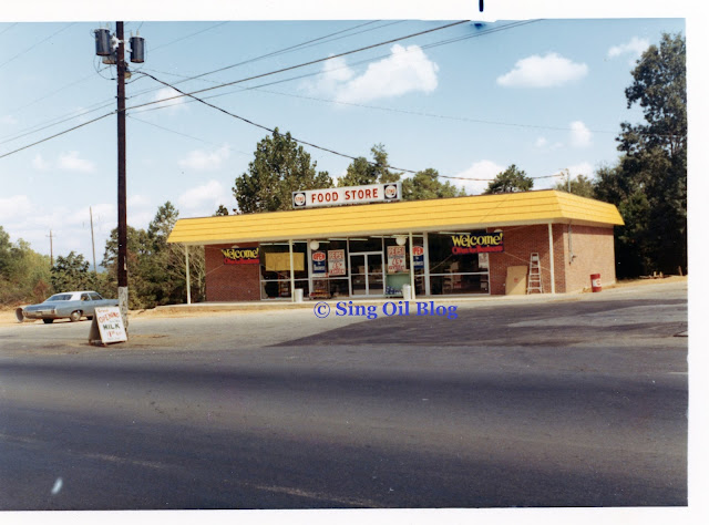
Publix #672
Sandy Plains Exchange
Marietta, GA 30066-7833
Publix Waves Hello
Since this post was a bit last-minute and is mostly dedicated to the reemergence of the Deco Coral interior, I didn't bother to do much research on Publix #672. I will say that it is only a few miles South on Sandy Plains Road from the former Sing Store I covered last August, and is therefore several more miles from the notorious GreenWise Market and Publix #33. #672 opened just over seven years after the aforementioned store on April 29, 1999, in a standard 1990's shopping center nestled between Sandy Plains and Scufflegrit Roads. The area remains an affluent suburb of the Atlanta Metro, and is only a short distance from the major Marietta / Highway 5 / Canton Road Connector exit off I-75.
It looks like this store has only undergone two major remodels: the first in 2009 when it transitioned from MM to Invigorate, and the second in 2015 when it received Sienna. This store also had a SunTrust bank branch for a time, until the company closed the location in 2004.

Our first "what if" inside this store shows Plato the Publixarus dancing in front of our classic bakery signage. Wouldn't that look cool?

We'll then jump over to the produce department and see the resurgence of teal which could chauffeur any shopper to the sunny beaches of Florida!

Next, we'll swim over to the seafood department to see how it would look with the classic colors . . .

. . . before we glance down the rear aisle toward the dairy and meat departments. So much brighter than Evergreen!

Our final glimpse will be at the front of the store where we revisit the bakery and see the floral department and restrooms signage.
Here's to hoping that along with the signage, Publix also revives the late-90's era Plato costume, which I find much preferable to the newer version.

And with that, we'll jump back to reality and take a quick tour of the full store. First up is the cart storage area with a look toward the notorious "entrance diamond" of a 44T. We can also get a good look at the tile overlay Publix used with numerous pre-2016 Sienna remodels.

Heading over to the grand aisle, we see where the flooring transitions from the traditional terrazzo to an epoxy material in front of the bakery. I still wonder if this is a sign that the store previously used grey tile in this part of the store.

It looks like the epoxy material extends down the entirety of aisle 1 and cuts off just before aisle 2 begins to the left.

Turning around, we see this store's floral nook which is nestled between the bakery and the pharmacy. I believe the 44T was the first store type to place floral here, beginning the longstanding trend which continues in 45M stores to this day.

Here's a view from a different angle.

We'll also see a quick overview of the front speedway before continuing on.

Over at the deli, we see another Sienna tile overlay which seems to blend into the rest of the department signage quite well (that is, unless a store has Evergrey).

If you look to the left, you'll notice this store's original dropped ceiling and track lighting grid over the deli.
 |
| Courtesy Jasmine M. (Foursquare) - Publix #801 - February 23, 2012 |
This track lighting grid previously extended over the salesfloor and landed at a suspended soffit (?) which outlined the grocery department. Metallic Marketplace stores were very funky when they first opened, and even featured vertical corrugated metal between the deli's dropped ceiling and the store's ceiling.
 |
| Zuma Press (Alamy) - Publix #672 - August 27, 2011 |
Thanks to a comment below from GeorgiaPubDude, we can get a bit better perspective on the suspended soffit and gable accents which used to be present throughout this store. Although the paint reflects this store's Invigorate days, the architectural features look mostly the same as they would ahve 10-years prior.
The photo above was taken for a story regarding a mother taking care of her twin boys with autism and the challenges they face bringing their service dog inside various businesses.

Continuing on, we'll head over to the produce department which looks very similar to the configuration of a modern 45M. We can also see the Sienna tile overlay for the department off in the distance which features a mosaic of brown, orange, yellow, and green tiles.

Publix really missed the mark with the banners they used back in 2022; it would've made much more sense for the one over aisle 5 to read "Fizzle" in order to match aisle 4's "Drizzle" and aisle 3's "Sizzle", don't you think?

Glancing down the rear actionway, we see this store's dairy department followed by the meat & seafood counters off in the distance. Restrooms are found down the hallway to my right.

I definitely picked up on these signs when I was in the store (since I never seem to take such a well-framed photo of the seafood counter), but I'm not sure I fully realized which previous décor were from. These happen to be leftovers from Invigorate / Classy Market 2.0 and the one of the abstract fish on the right is identical to the one I brought home from Publix #1331 (here's a closeup). They blend in surprisingly well with Sienna!
 |
| Zuma Press (Alamy) - Publix #672 - August 27, 2011 |
We'll take another trip back to 2011 to see the Schwenker family examining the lobster motel (which was fittingly placed just below the lobster graphic we saw above). I'd like to point out how the green signs didn't match the Blueblood wall as well as they match Sienna's paint scheme. I'll also not how this store didn't have a sushi counter back in 2011, which is likely why I didn't see a lobster tank during my visit (I guess they had to find room somewhere so it was time to evict the crustaceans).

You may have seen me mention Publix's recent house brand packaging update, and it seems like I decided to photograph this garbage bag display to showcase the changes. If you'll notice the three rows of boxes in the middle of the top shelf show the new simplified "P" logo while the remaining items feature the outgoing packaging.

Interesting how Publix decided to paint the accent bars two different colors in the meat department. In case you didn't know, these "bars" are another leftover from Metallic Marketplace and just had their original "shed roof" portion removed.
 |
| Publix #92 - 2002 - Bamboo |
Very few stores still have the intact "shed roof", but I think the feature adds a nice ambiance to the space. I really do wonder how these will look with Deco Coral!

The meat department also had its own tile overlay which is much more subdued than the other departments.

The remainder of the meat department and frozen foods round out aisle 16 and shuttle shoppers to the wine wonderland off in the distance.

I was just having a time with all of the classic Publix logos I was running into in this store! Here we see a nice photo I captured of the "Pork" shelf divider . . .

. . . followed by the chicken shelf divider. I don't come across either of these too often.

Another thing I don't come across very often is a Sienna aisle sign missing its number. I can think of several times I've seen the circles fall off the older-style signs, but I feel like it would be difficult to accidentally knock the number off a sign like this! Regardless, you'd be surprised at how often I come across some sort of aisle sign mishap.

I'll close out this post with a look at the old customer service area. Other than the lower ceiling, it's really hard to tell what this portion of the store was originally used for. We can also see some of Publix's Georgia state bags hanging on the rack in the distance, just in front of the coin star machine.
So, what are your thoughts on this store, and on the revival of Deco Coral / Wavy Pastels? Do you think this rollout will be widespread, or concentrated to store #830 and maybe one or two other locations? I'm personally excited to see what comes from this and will be actively planning a trip to Orlando once I hear the remodel is complete!
Since I got thrown off by this unexpected curve ball, I intend to resume my schedule with my next Sing Oil Saturday / MTC post on April 15th.
Until next time,
- The Sing Oil Blogger


Someone was having way too much fun with the photoshop, and was hoping I wouldn't realize what today's date is! :) I do have to applaud this was a good try though, you were very convincing! (Could you only imagine a modern 44T or 45M with Wavy Pastel - that would be something!) Deco Coral would have been very appropriate name for Wavy Pastel's internal designation too, the color fits right in with the package (and the name is so fitting for a Floridian supermarket decor from the 1990's).
ReplyDeleteWeird to see a CM 3.0/Sienna aisle marker with the missing panel too. The way those signs are made the panels shouldn't fall out too easily (as I believe those numbers slide into a groove rather than being stuck on with sticky tape like the circles), but someone found a way to do just that.
Haha, I was hoping that I’d keep you hooked for a bit there, especially with my Photoshoped CAD drawings! I will say that a lot of the content in this post is real, including the CAD mockups of #830 (minus the “Deco Coral” test on the front page for the store’s “Sienna Lite” remodel and the WP sign overlays on the store’s interior elevations). The shed roof mockups, tile designs, and paint schedules are from the 2001 Wavy Pastels remodel plans for Publix #350. I thought the Deco Coral name would be a great fit for the package as well!
DeleteI agree that I think the panels slide into a groove so I have no idea how that number fell out. Maybe somebody didn’t do a good job putting it in? And based on the adhesive used for the signs at #1331, I don’t see why Publix couldn’t find something stronger for the circles on the older-style signs.
I’m not sure if this Retro 1990s Publix idea is real or an April Fools’ Day prank, but if it is the latter, I will admit that you had me going for a little while! If anyone could pull of a 1990s retro store, it would be Publix. After all, The Beef People are trying to convince people that they aren’t still stuck in the 1990s, or 1980s perhaps in some cases, and some other grocers known for letting maintenance on their stores go might not want to imply they are stuck in the past either. I wouldn’t be opposed to a retro 1990s store if it is the right décor package and if it is implemented in the right store. For example, as much as I love Kroger Neon (the real Neon décor package, not the hideous fake Neon one), it would be a tragedy to put that into a modern open ceiling, concrete floor store.
ReplyDeleteI’m not too familiar with this Publix décor package, or any Publix décor package for that matter, but the Miami Herald photo of that power alley type area looks good. That Publix #520 eggs and margarine area, well, it looks like a Sam’s Club with pastel signs tacked on. That isn’t an example of Publix’s best effort.
Did Publix have a dinosaur mascot in the 1990s? Some Houston retail enthusiasts and I were talking about Barney, the infamous early 1990s purple dinosaur, and how it kind of took over the retail world for a while in the 1990s. Sadly, I’m old enough to remember this. The Barney era was rather unbearable. JCPenney even had dedicated Barney departments: https://texasarchive.org/2013_04883
There was a Barney retail story of infamy in the Houston area. In 1993, the Galveston, TX Kmart had a grand re-opening of sorts and they had someone wearing a purple dinosaur suit at the grand opening. A group of local kids beat up the purple dinosaur and it made national headlines that Barney was beat up. The Barney people heard about this and complained that Kmart was promoting a fake Barney and they also had to convince children that the ‘real’ Barney was okay and that it was just a fake Barney that got beat up. So, yeah, there you go, lol. If anyone wants to know how desperate Kmart was in the 1990s, this is the story to tell. They were so desperate that they had to hire a fake Barney!
I do think Publix missed an opportunity to say ‘Fizzle’. It certainly would have matched the other banners! As for the rest of the store, I’m not a big fan of the open ceiling and somewhat open walls combination. Again, it looks a bit too much like a Sam’s Club. At least with modern décor, the paint and such covers up some of the industrial-ness of it to a point that it doesn’t look too bad. The white-painted opening ceiling looks better than the dark painted one we saw in that new Publix you posted about over at MFR last week.
So, anyway, I’m guessing the Barney Publix is a joke, but if not, I hope they don’t pipe in the Barney song over the PA system! Also, hopefully they have a real Barney, or Pluto, or else the fake one might get beat up at the grand opening!
♫I love Publix
You love Publix
We're a happy family
I love Publix
You love Publix
We're best friends like friends should be♫
Yes, AFB saw right through the April Fools’ Day prank and exposed me! I’m glad I at least had you convinced for a time! I put a good bit of effort into adding the signage to those CAD drawings and I figured those would seal the deal for somebody (my recreations, on the other hand, were intentionally pitiful). While I would be surprised to see it, I also think Publix could easily pull off a 1990’s retro store, especially since they have several stores with retro throwback facades (and one whose façade has never been changed). As much as I’d love to see some form of the Marketplace package survive past this year, I think the time has come for Winn-Dixie to leave the 20th Century and update their image. I think the change will be best for them in the end. The thing about Publix is they were using modern open ceiling stores way back in the early-1990’s, so a new Publix with Wavy Pastels probably wouldn’t look out of place. The biggest change the company has made is how they’ve opted to get rid of light fixtures/trellises/skylights over the register lines since then.
DeleteThe Miami Herald article is from one of Publix’s “flagship” 65N stores, like Publix #33, but would have ultimately looked very similar to how former Publix #520 looked when I photographed it last year. The 65N stores originally had the deli located on an island, so I wouldn’t quite call it a power alley. The package did use a lot of white, but the bright department signs really gave the stores a lot of personality to keep them from feeling like a Sam’s Club in person.
Publix did have a dinosaur mascot in the 1990’s and they continue to use a version of him today! Plato is often spotted at store openings (I saw him at the Crawfordville store last year), and Publix also uses his likeness in activity sheets for kids available at the coupon rounders, etc. I’m not sure if Plato’s creation was a byproduct of the Barney craze, but that is a possibility.
That’s a crazy story about the Galveston Barney Beat up! I guess fake Barney wasn’t enough to save Kmart, just as real Barney wasn’t enough to save JCPenney!
At this point, most Publix stores have an open ceiling like that, so it is something that most shoppers are accustomed to. I do miss the enhanced ceiling and wall props, like the shed roofs, these stores originally boasted. I do think they should keep the ceilings painted white!
Awesome post, next visit the 60T’s in GA #647-2 and #651-2 and also there are 2 49N’s in GA that have the grand dairy aisle intact (Suwannee and Brasselton)
ReplyDeleteOk ok, it was an April Fools joke, now onto some real info
Sandy Plains had a SunTrust bank branch but that was removed by 2004-ish or so
On the topic of Houston’s comment about Barney, the new Plato looks similar to the Barney CGI reboot coming soon https://www.nbcnews.com/pop-culture/pop-culture-news/barney-makeover-viral-reaction-rcna70606 (both look terrible, OG Plato for the win and hate to say it, OG Barney wins too)
Wavy Pastel was actually last seen in 2004 with The Reserve at Boca Raton https://m.youtube.com/watch?v=7OarDPJbWRs off by 1 year
The photoshop looks surprisingly decent though some errors were made but I like it.
Check out these Sandy Plains Invigorate photos, they are really good
https://www.alamy.com/stock-photo-aug-27-2011-marietta-ga-jennifer-schwenker-with-sons-ben-and-sam-twin-43042114.html?imageid=B04A7F85-E5DB-4F85-B969-672050C1D646&p=152373&pn=1&searchId=7f51def67b39ce8ec03ee069fb831188&searchtype=0
Thanks! While I don’t think you’ll ever see me cover a 60T in Georgia, I suppose I could cover Georgia’s one-and-only 61M!
DeleteOn the subject of new Barney and new Plato, I have to agree with the #NotMyDinosaur!
As far as the Photoshop job on the photos of #672, they were intentionally incorrect. It would take way too long to make an accurate recreation and even longer to add the shed roof back (which would have been the only teal fixture).
I have updated the post to reflect the new info; it’s nice to confirm how those seafood graphics haven’t moved since this store’s Invigorate days!
You should cover the 61M and I hope you get to see a REAL 60T, the whole 60T in GA thing was made up and was intended to be an April Fools joke
DeleteYes, I know it was a joke. I've spent way too much time researching to think otherwise.
DeleteI glanced through this post on the day itself, but didn't get around to taking it in in full until now. Extremely thorough and well done for a prank post! With just the right amount of silliness too, like the purposefully silly renderings. (Unless one of Plato's dinosaur powers really is to float in midair!)
ReplyDeleteHaha, thank you! And who knows, maybe Publix would go all out and "fly" Plato across the store from a cabling system if they did bring back Wavy Pastels!
Delete