Posts

Showing posts from 2022

Jacksonville #3 - Jacksonville, FL


Jacksonville #3

Sing Food Store | Deli

11067 Old St. Augustine Road

Jacksonville, FL 32257

A Companion to this week's My Florida Retail Blog Post

     Hello, and Merry Christmas everyone! So while our usual host of the Sing Oil Blog, The Sing Oil Blogger himself, is busy wrapping presents, drinking eggnog, and gleefully awaiting the arrival of Santa Claus to bring him a new piece of retail memorabilia tonight, I have volunteered to step in on his behalf and present you with today's Sing Oil Saturday post. For those of you who don't know me, I am The Albertsons Florida Blogger, owner and proprietor of my namesake blog that profiles the former Albertsons stores around Florida (along with some other interesting supermarket finds in between). While the Sing Oil Blogger was busy photographing some former Albertsons stores in Pensacola for me (the first of which we toured last week), I was out and about in Jacksonville to bring you some coverage of that city's former Sing locations. Much like how Pensacola is outside of my usual travel realm (Central Time - I've always wondered what that's like!), the exotic lands of Northeastern Florida and Jacksonville are a bit of a stretch for the Sing Oil Blogger to get to easily. In order to bring you all some coverage of these far-flung lands from our respective coverage areas, the two of us are trading blogs this time around to bring you some interesting new coverage (and to keep our readers on their toes!). So now that we've already seen Alex Trebek host Wheel of Fortune, the time has come to see what it's like watching Pat Sajak host Jeopardy! as I take my crack at bringing you this week's latest installment to the Sing Oil Blog - so let's begin!

     Prior to me discovering this blog a little over a year ago now, I had never heard of the Sing Oil Company of Thomasville, GA. With Sing Oil's primary concentration being in Western Georgia and the greater Tallahassee, FL area, it makes sense that I'd never heard of the company, as I grew up in the Floridian Peninsula, a place that Sing Oil had hardly ventured into. Based on some research conducted by our usual host of this blog, Sing Oil appeared to be buying property in the Floridian Peninsula in the mid-late 1980's, including two confirmed purchases of property in Citrus County and St. Johns County. With Sing Oil's purchase of these lots, it seems likely that a Peninsular expansion of some kind was in the works, however, any progress on those plans was lost to time when the Sing Oil Company was sold to Amoco in 1990. While we may never know what Sing Oil's plans for the Floridian Peninsula may have entailed, Sing did get close to the Peninsula with one of their expansion efforts. In the early 1970's, Sing Oil began opening stations in Jacksonville, a city that serves as the gateway to the rest of the Peninsula below it. Jacksonville would end up gaining 4 operational Sing Oil stations over time, with today's location, the company's third in the city, opening in 1984.

     Back in 1984, there really wasn't a whole lot to be seen in this part of town. Besides the nearby interchange between Old St. Augustine Road and Interstate 295 (aka the "West Beltway" by locals), it was just forested land all around - you had to go about a mile to the north of here on Old St. Augustine to find any shreds of major development back then. While its location near the highway interchange presented itself as being ideal for a gas station in that respect, Sing Oil actually had grander plans that attracted them to this location. Sing Oil purchased not only the land for the construction of the gas station, but also a larger tract of land just behind it to develop into new neighborhoods. The mid-1980's were the perfect time to begin a housing project in this area, with development from the north inevitably encroaching southward as Jacksonville's population continued to grow. That, in addition to its prime location near the highway interchange, made this area quite the attractive opportunity for development, and Sing saw that. According to the Sing Oil Blogger, Sing Oil involved themselves in a number of side projects through the years, so this housing development wasn't a complete one-off. In the past we've seen some of Sing's other side projects, like The Happy Penny Grocery Store and a foray into laundry services, but I believe this is the first we've discussed of Sing's housing development ventures.

    Editor's note from The Sing Oil Blogger: this post inspired me to dig back into the Duval County records, where I discovered Sing also had a hand in the development of The Junction and Losco Junction subdivisions.  I wouldn't be surprised if there were others in the area as well.  Sing purchased the land for The Junction, along with the lot that this station is situated on, on April 8, 1983, as recorded on page 1021 of  volume 7386 in the Duval County Property Records.

     Construction on the new housing development, named Bentley Woods, began shortly after the new convenience store and gas station opened, with the Sing Oil Blogger having record of a "Financing statement related to the development loan for joint venture with D.W. Hutson Construction, Inc." dated January 1986 per some old company records. It should be noted these records of his could be related to another one of Sing's housing developments in the Jacksonville area (Azalea Point) - however, both developments began construction around the same time. Interestingly enough, if you clicked on that previous link and scanned over the Bentley Woods development, there actually lies a blatantly obvious clue as to what company was behind the development of that neighborhood (don't read on to the next paragraph if you want to look at the map and take a guess first, but if you know your Sing Oil history, what I'm talking about should jump right out at you).

     Now that you've seen the map, did you see it? In the middle of the neighborhood is a short street called Singletary Road - which is a reference to the founder of the Sing Oil Company, L.H. Singletary (either that or a reference to the company's president at the time, L.H.'s son Richard Singletary). Regardless of which individual the street was named after, Singletary Road was left behind as a subtle nod to the people who developed that community.

     Back to the station itself, Jacksonville #3 remained with the Sing Oil Company until it was sold to Amoco in 1990. Amoco retained ownership of this station through the company's merger with BP in 1998, however, a few years after that in 2002, this location was sold to Giant Oil. Giant Oil is a large franchisor of gas stations throughout Florida, who sells the stations to individual owners to operate while acting as the wholesaler and supplier for the fuel and the convenience stores. It's easy to spot a station owned by Giant Oil as all their stations use the "On The Fly" convenience store banner. While the convenience stores all use the same branding, Giant Oil uses a number of fuel brands for their stations, including BP, Amoco, Marathon, Exxon, Mobil, and Chevron. This station happens to use the BP branding for its fuel, so Amoco didn't lose out too much when they sold this station, as they continue to sell fuel here through the BP branding. Interestingly, as I was informed by the Sing Oil Blogger, Jacksonville #3 and Jacksonville #4 are the only two former Sing stations sold to Amoco in 1990 that followed the intended corporate lineage of the parent companies - Sing to Amoco to BP - and retain that branding today.


      Jacksonville #3 is actually a very well preserved example of Sing's 1980's "Large Format Square" design - well, at least the convenience store is anyway. The photo above, taken at Sing's Bradfordville, FL location, shows what Jacksonville #3 would have looked like when it was first built. Jacksonville #3 and Bradfordville were essentially twins, so I've included a few of the Sing Oil Blogger's classic photos from the Bradfordville post for comparison in this one (although the Bradfordville post contains many more historical images too, so a quick scan through that may help you understand Jacksonville #3 much better). Comparing the above photo to the photos I've shared of Jacksonville #3 already, you'll notice 2 major differences. The most obvious change is that the gas pump canopy at Jacksonville #3 was rebuilt. That happened around the turn of the 2010's, where the small, original two island design was torn down to make way for a larger, more modern 5 island setup (leading to 10 total fueling stations in the present, compared to the 4 there would have been originally). The other change was a bit more recent, as around 2020, the original roof above the doors and windows was replaced with a flatter design, as opposed to the original two-tiered roof design.

     Even with the new roof and the new fuel canopy, it's still quite obvious the lineage of this convenience store. According to the Sing Oil Blogger about this location in particular: "Jacksonville #3 appears to have been a mid-range performing store for the company, but it still only did half as well as the best-performing Tallahassee #7, which was leaps and bounds ahead of the runner-up in Macon and the third-seat of Tallahassee #10."

     The ribbed concrete block used on the exterior of this building is an original Sing feature. While many people associate that ribbed concrete look with Kmart (who loved using that same style of block on their stores in the late 1970's and early 1980's), that block actually reminded me of a convenience store we used to frequent a lot when I was younger (which was not a Sing, of course, and nowhere near here), as it was built with that same block! Ribbed concrete block must have been a popular look in the 1980's.

     This convenience store has its entrance located at the corner of the building, a corner which used to look directly out at the fuel pumps. To the left of the door is the cashier counter (which is still in that place today), however, in this photo, you can see another remnant from the Sing Oil days - the former exterior cashier window. This design made for a more convenient place to pay for your fuel without having to go inside and wait in line. It's an interesting concept, but one that apparently didn't catch on, as I can't think of any other convenience store that uses such a concept these days (except for those little windows at the Walmart/Sam's Club gas stations kiosks - although I wouldn't call those kiosks a convenience store by any means!). That window has probably been sealed over since the time when Amoco took control, however it was never totally removed.

     Anyway, now that we've made it this far, let's head inside and see what it's like in there:

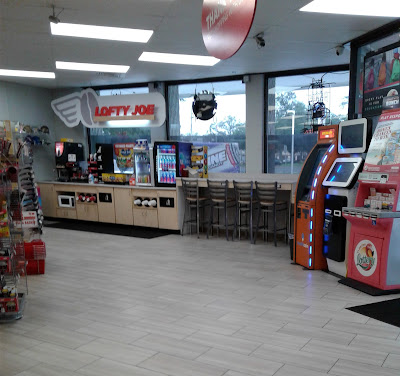
     Entering the convenience store and turning to the right, we find the coffee nook, aka "Lofty Joe". However, lofty is about the last word I would choose to describe this store's coffee nook, as the coffee selection was pretty limited (a kettle each of regular and decaf, and a machine that dispensed 3 flavors of iced coffee). It's a pretty sad selection compared to what us spoiled Floridians can find at a modern Wawa, however, I guess this place makes up for the limited coffee selection by offering a vat of boiled peanuts alongside the coffee display (I know for certain Wawa doesn't sell those!). Coffee with boiled peanuts, a new southern delight! (The Sing Oil Blog seems to be presenting a lot of challengers to the classic Southern lumpy Coke of late!)

     Back when Sing Oil was here, the right side of the store where the coffee bar is now would have looked more like what we see in the image of the Bradfordville store above. While the interior is still of the same basic design, Sing Oil used the right side of the convenience store to house the "general merchandise" section, if you will. One of the things that made Sing's stores unique was many of them carried general merchandise staples alongside the usual beer, snacks, and smokes convenience stores are famous for. As you can see, Sing carried a large automotive selection, along with gardening supplies, hardware, and household goods. With Sing having a tendency to place stores "off the beaten path", favoring opening locations in more residential parts of town further away from big box stores, this one-stop format was quite successful. Sing's sales of these types of products even lead to the company's brief foray into opening a full-blown hardware store at one of the company's Tallahassee locations.

     Here's a closer look at the coffee counter, complete with a hat rack right next door so you can look cool as you sip your coffee (with or without peanuts!).

     While this store is still mostly original to Sing Oil in terms of design and feel, later modifications made by Giant Oil and On The Fly have changed some things around. Since coffee wasn't originally over here, this counter is obviously not original to Sing. The flooring has also been redone since Sing was here, with Sing using those small brick paver-like tiles as seen in the throwback photo from the Bradfordville store. I wouldn't be surprised if those original tiles from Sing are still present under the modern wood-like ceramic tiles.

     Sing's general merchandise selection has been eliminated by On The Fly, who now stocks the store like any other convenience store out there these days, with shelves of candy and soda over here instead of hammers and watering cans. However, behind this aisle is something that remains today that would have been the same as in the Sing Oil days - the drink coolers in the back of the building.

     I don't quite remember what I was going for with this photo, but here you see some more of the store's interior aisles, in addition to the soda fountain and fried chicken counter in the background.

     Here's a look down the store's center aisle, looking back toward the front door.

     Some random beanie babies for sale here, to give you company as you sip your coffee and eat your boiled peanuts (and to stare at your new hat).

     The cashier counter is located just out of frame to my left here, with Flyby Kitchen's famous fried chicken counter in the foreground. Flyby Kitchen is On The Fly's house brand for prepared food options, housed in what would have been Sing's Delicatessen, which we can see at the Bradfordville store in the image below:

     Fried chicken is quite different from the sandwiches Sing used to serve here, but it's nice that On The Fly did manage to keep the food service counter operating as one (even if in the name of modernization, all the funky red fixtures were removed). The photo above also shows the original placement of the "Drink Center", home to the coffee and soda machines. While the coffee station was moved to the other side of the store, the soda fountain remains over here, however now placed against the wall where the "Frozen Food" coolers used to be.

     Back outside the store, here's a look toward the gas pump canopy again. It's not the original canopy as I mentioned earlier, but for the sake of completeness, let's take a quick look at that:

     All traces of the original canopy are gone, as the new canopy stretches through most of the area where the original one once stood.

     While Giant Oil has affiliations with a number of oil brands, BP seemed to be the most common affiliation for their stations in the Jacksonville area. Former Sing station Jacksonville #4 (which we'll see on the blog at a later time) is also now a Giant Oil BP/On The Fly franchise, although that station has a totally different feel than the one we just saw today.

     Also, (and what most of you are probably thinking now after seeing the above photo) what the heck happened to that fuel pump?!

     At the time of my visit, pump 9 and 10 was looking like something had backed into it, with the crippled fuel pump cordoned off with all that caution tape. I feel pretty certain this pump will be out of commission for a little while, as that looks like a project to fix...

     Out by the road, we find the station's road sign (which is not leftover from Sing, but standard issue by BP). However, if we're looking for Sing Oil remnants, we can find some of those just over to the right of the road sign:

     While the machinery itself has probably been updated, that light fixture over the air and vacuum station is our classic Sing Oil issued light. We've seen a number of these lights on the blog in the past, one of our many tell-tale signs of a former Sing.

     That photo of the air and vacuum station wraps up my ground coverage of former Jacksonville #3. We'll conclude my post with the usual historic imagery, starting with a few keynote scenes from Google Streetview:


March 2022 - The most recent Google Streetview scene of this station


October 2015 - In the above image, you can see the convenience store building with its original roofline, just painted green to match the BP branding.


November 2007 - The only Streetview image available showing the station with its original fuel pump canopy from Sing. After Sing's original pumps were ripped out, the modern pumps were arranged to allow for 8 (slightly cramped) fueling stations, compared to Sing's original 4. The new canopy allows for 10 fueling stations (so only a net gain of 2 stations after all that), but makes the fueling stations much less cramped and easier for vehicles to navigate through.

     And now for some historic aerial images, courtesy of Google Earth and historicaerials.com:


Former Sing Oil Jacksonville #3 - 2021


Former Sing Oil Jacksonville #3 - 2008 - Aerial view of the station with the original fuel canopy in place


Former Sing Oil Jacksonville #3 - 1994


Future Sing Oil Jacksonville #3 - 1984 - A lot of emptiness on this side of town at the time.


     The aerial view above shows the placement of former Jacksonville #3 in relation to the buildings behind it. I bring this up because that large building we see behind the gas station is a Winn-Dixie...


Winn-Dixie #179

Losco Corners

11101 Old St. Augustine Road

Jacksonville, FL 32257

      …and that Winn-Dixie is where we'll be headed next for the "More Than Convenience" segment of this post. Today's MTC will be located over on My Florida Retail, where we'll take a quick tour around Winn-Dixie #179. Be sure to head over there for the rest of today's coverage, as we check out a Winn-Dixie in their hometown.

    Editor's note from The Sing Oil Blogger: Neither AFB nor I realized it at the time, but the land where this Winn-Dixie now stands was once owned by Sing Oil Company!  It wasn't easy to decipher, but I managed to dig up the April 8, 1983 warranty deed (buried in different digitized paperwork from 1992) for this station's parcel.  After struggling through the surveyor notes, I was able to trace out a rough sketch of the 1983 property lines, which include the modern-day convenience store, Winn-Dixie shopping center, and The Junction housing development.  I thought this was a cool find, and it certainly adds a while new meaning to today's More Than Convenience post!  Now, I'd just love to find out if Sing had any part in the Winn-Dixie's development . . . 

Courtesy Charles Burgess, Jr (Flickr) - August 12, 2011 - Winn-Dixie #179

    That Winn-Dixie originally opened with the "inverted check" façade, but was modified to what we see today during the store's Post-Bankruptcy remodel between 2007 and 2011.  The store's entrance was moved from the left side of the store to the alcove on the right we see today, and the overall design was squared off from it's previously angular nature.  I also think the "Food" and "Pharmacy" lettering we see above date's back to this store's Marketplace days.  Make sure to check out AFB's post because this store certainly has its share of oddities!

     I hope everyone enjoyed today's post, and that I didn't do too bad of a job profiling this former Sing Oil station. If he lets me back on, I may have some other Jacksonville-related material to share with you on the Sing Oil Blog again in the future. However, until that time comes, I'll hand things back over to the Sing Oil Blogger once he recovers from his Christmas cookie sugar coma!

Anyway, I'm glad to have contributed this piece of Sing Oil history to the blog, and until the next time,

The Albertsons Florida Blogger

Classy Market 2.0: The Final Hours


Publix #1331: The Afterlife

San Carlos

16950 San Carlos Boulevard

Fort Myers, FL 33908-1224

Murder on Aisle 16

Publix may have shot Classy Market 2.0, but I hid the body.  

Are you sure?  

Damn right I am.

You might be asking yourself, "what is going on right now?" and the answer is, your crazy Publix enthusiast is making an exception to his rule of only posting content relating to or nearby a Sing Store for some exclusive coverage of the demise of Publix's Classy Market 2.0 décor package.  That's right, folks, September 28, 2022, may mark the day when Classy Market 2.0 was thought to have been put out of its misery, but October 30, 2022, marks the date when a whole new chapter of its life began.


Some of you may have read my companion post covering Publix #1331 over on My Florida Retail Blog (BTW, I didn't create that blog, I just happen to contribute to that page – just a shoutout for my loyal readers who may also be related to me and not realize that) while the store was still alive last May, or you may have read The Albertsons Florida Blogger's companion post over on his blog, but here we are going to take a look at the feeding frenzy which occurred a month after the store's official demise.  Faith, fate, or fortune somehow presented me with the opportunity to rescue the remains of Classy Market 2.0 from the bowels of a landfill (or more likely an international supermarket) in order to preserve them for future generations to be able to enjoy.  I'm still trying to wrap my head around the fact that I now own the vast majority of the final Classy Market 2.0 signs to remain in the wild (and I still don't know what I'm going to do with them), but I would rather face that dilemma than face the regret that I let this opportunity slip under my nose.  The fact that I had no prior plans for that weekend, no work travel impeding my schedule, a friend (who will from here on out be known as "Publix Pirate") who was enthusiastic about assisting me in "looting a Publix", and the resources to do so, all led to the unthinkable:  a bizarre combination of haphazard plans resulting in the removal of some gigantic signs from a hurricane-damaged supermarket in Southwest Florida (which by the way is nowhere near where either of us live).  Somehow, we made it work, and somehow, the signs weren't totally destroyed when we got back.  Several suffered some minor damage during transport, but I suppose that's the price you pay.

If any of y'all have any ideas as to what I should do with my newfound signs, I'm all ears!  AFB and I joked about opening a retail museum in the old Statesboro Publix, and that reality is looking partially more realistic.  I've also been told that I'd have some material for a cool Publix-themed man cave, or some wacky signs to throw up on eBay.  Regardless, I'm probably the only non-supermarket or landfill operator to own a 90% complete version of Classy Market 2.0!  I also figure that somebody had to save all of the porcelain gas station signs from the 1950's, so shouldn't somebody save some of the supermarket signage from the late-2000's?


Well, I did, as I was the highest bidder for several items during the store's fixture auction on October 25th.  Let's take a look at what I bought, and what I saw during my adventure.

It was a warm October morning when the Publix Pirate and I made the journey down to Fort Myers, Florida, to see what we could find at the now-closed Publix #1331.  The area had been devastated by Hurricane Ian only a month prior but was in surprisingly better shape than I had imagined.  Yes, there was plenty of obvious storm damage, but many businesses had reopened and most of the major roads seemed to be in good condition (besides missing a number of road signs).  Businesses like The Home Depot were certainly reaping the benefits of all of the damages, featuring stacks upon stacks of drywall and building supplies outside the store due to all of the demand and parking lots full of shoppers.  If I didn't know better, I'd assume it was Black Friday!

The shot above gives us a glimpse of the recovering trees and damaged sign at this store, with the recent addition of a construction fence surrounding the parking lot (if only I had realized when I pulled into this store that the same fence would force me to make a 180° turn, with a trailer, when trying to leave this parking row due to the concrete barriers at the end of each space.  I'd like to thank my brother for giving me a crash course on trailer backing many years ago).

The mangled sign off in the distance only retained one face, proudly bearing the Publix wordmark, following Ian.  Publix took this opportunity to cover the former "Food & Liquors" verbiage with a red "Coming Soon" sticker.  That served as the only exterior reminder of this store's most recent tenant (other than the blatant labelscar we see in the picture at the top).

As I made one of my final approaches toward the old Albertsons swinging doors, I noticed a shocking sight (besides the pitiful "We're Closed" sign written in Sharpie on the old "You can trust what you eat" sign we see here). 

To my surprise, Publix had planned for this store to close on September 30, 2022, and even printed banners and signs saying so.  I had thought that Hurricane Ian had canceled any official closure plans, but the actual last day of September 28 seemed to line up pretty well with the plan!  Now I wonder why Publix never bothered to add a "store closing" notice to this store's location page like they typically do a week or two before a closure.  

Shortly after I took this photo, I entered the door to my left and checked in at the information desk for the auction.  I was told to go to the liquor store first to claim my purchases before moving on to the rest of the building (which was a wise choice to knock out the easiest items first).

Fair warning: the store in these photos does not look like the Publix I saw a few months prior.  It still shocks me how much different a place can look once it has been "looted" following a fixture auction!

The shot we are looking at here shows the old liquor store (which also features remnants from Albertson's Blue & Gray Market décor on the walls) from the perspective of the doors entering the space.  We can see the remnants of two aisles which ran down the middle of the store, and the old beer cooler space off in the distance.

Courtesy Grafe Auction

This post will mostly contain shots I took during my trip, but I'll throw in and notate a few from the auction website to add a few things I missed.  Here we can see what the beer cooler used to look like before it was cut out with a saw.

Looking the other direction, we see the old register space, restrooms, and doors.

Contrary to what you may believe, my only purchases from the liquor store were the Sans Serif Classy Market 1.0 category signs (which surprisingly aren't yet extinct in other Publix liquor stores).  The set includes the following signs: Bourbon, Brandy, Cold Beer, Cordials, Fine Wines, Gin, Mixers, Ready to Drink, Rum, Scotch / Irish, Singles, Soda, Tequila, Vodka, and Whiskey.

These signs were actually pretty easy to remove, as they were held up by a wire hooked to metal clamps on the dropped ceiling grid; they were also very light.  I did end up getting a bit lazy after a few and just cut the wires though.

For the curious, the signs are constructed out of three sheets of foam board that are sandwiched together (two off-white on the outside and the burgundy in the middle).  This provides a nice 3D effect, but also doesn't add too much complexity to the manufacturing process.  The foam board was painted (using some surprisingly high-quality paint – I had to scrub several of these really hard to get some stains off and that paint was very resilient) with vinyl stickers featuring Avenir lettering adhered to the faces.

I may not have special powers, but today I can see through walls! It appears that the old door to the stockroom also led to an emergency exit and a hallway behind the old cooler.  On the other hand, the liquor store had no direct access to the main store like some may have thought.

Courtesy Grafe Auction

The store looked much more stitched-up before the auction, didn't it?!

We'll take one last look over the liquor store (don't worry, I didn't leave without grabbing the last few signs) before we head over to the main store.

My next targets for removal were the frozen department banners, but we'll skip ahead to the following destination:  the meat department.

You probably noticed the graphics I included at the top of this post, but my inspiration for those was the idea to recreate all of the major Classy Market 2.0 signage.  How do you think I did?

My "shopping companion" from May might've thought this store looked depressing back then, but it looked a helluva lot worse come October!  I don't know for sure, but I wouldn't be surprised if the missing ceiling tiles we see here are a result of water damage the store received during the storm.  We can also see several of the 1994-era Albertsons coolers which have certainly seen a better day.

Said coolers also seemed to be hiding some nasty secrets:  some of that mess could just be from the storm, but I'm sure nearly 30-years of grime has also built up back there.

My next project was exploring how in the world to remove the daunting department signs I had purchased.  I had no idea how heavy they would be, or even how large they would be (some quick ceiling tile math proved helpful though).


It turns out that the Publix Pirate's guess of these being attached to the wall using French cleats was correct; all I had to do was climb up the ladder and lift it right off the wall!  Most of the sign is constructed of Styrofoam so it was much lighter than I had expected.  


The only issue was that it fell and hit me in the head as I was taking it down, so now the "E" has a dent in it (at least it was just a big foam block).

Next up, is the seafood sign.  We'll flash back a few minutes to see the pair together one last time . . .

before we see it "meat" the same fate as its companion for the last 13-years.

Hanging in the alcove was a random historic photo collage featuring a photo of a Publix semi-truck, a picture of George Jenkins (Publix's founder) bagging groceries, and a photo of the inside of Publix #1 from the 1930's.  We also see some smaller secondary signs for the meat and seafood departments.

Now that we got those guys down, let's move on to some Classy Market closeups!

We'll first take a look at the seafood department sign, which happens to be 96" (8') wide by 26" tall (28.5" if you include the ribs). 

All-in-all, the signs left the journey mostly unscathed; however, one of the ribs on the seafood sign had a bit of paint rubbed off by one of the ratchet straps securing it in the trailer.

For the curious, the lettering on the sign is made of foam board, the blue circles are plastic, and the ribs are wood.

The backing is a thin sheet of patterned stainless steel wrapped around a piece of foam board with a strip of MDF running along the back for the French cleat.

Over on the meat sign, we see a similar situation with foam lettering and circles attached to a foam backing covered in a wood-textured vinyl sticker.

Interestingly, the sides were painted red, but the back had small sections of the faux wood along either side.  This sign also had a MDF French cleat running along the bottom, which was likely just a scrap used to space it off the wall.

The signs may just be made of foam and MDF, but 8 feet of said materials are heavier than you'd think.  That being said, I wouldn't imagine either sign weighs more than 15 pounds.

Similar to the seafood sign, the meats sign measured 96" wide by 26" tall.  Thankfully my dent in the "E" isn't too noticeable!   Let's jump back down to Fort Myers to continue our store tour.

The listing photo for the meat and seafood signage also included a certain photo collage . . . so who could resist their own photo of Mr. George bagging groceries?!?!  

Ever since Publix rolled out the classic photo collage around 2006 (with Sans Serif Classy Market 1.0 and Classy Market 2.0), I've always thought it was one of the coolest pieces of these décor packages.  Several months ago, I tried to get a photo or two from a store that was undergoing a remodel but ended up missing my chance by a few days.  I did hear that many of the photos from that store were damaged as they were taken off the walls because they were attached with nails and lots of double-sided tape.  How could this be?

Well, it turns out that construction crews used copious amounts of double-sided adhesive to place the photos and plenty of finishing nails to secure the edges.  I'll just say that some of the photos were much easier to remove than the others.  You can also see how the photo of the truck above faded over the years, as it is much less blue where the other photos were covering it up.

The shelves may have been barren, but the coupon dispensers were still present and functional!  Don't forget to save $1 on some Purdue chicken nuggets!

Heading over to the greeting card section, we see the scarring on the floor from Publix's old shelving.  Look at all of that dirt!

Courtesy Grafe Auction

I didn't get many contextual photos from this side of the store, so I decided to throw in a few from the auction website.  Here is the shelf which used to grace the section of flooring we see above.

Courtesy Grafe Auction

I also didn't even think to look inside the old pharmacy! If only I had known I was looking at the old pharmacy!  At least we can see the door to the space on the left side of this photo.

Courtesy Grafe Auction

We can also get a better look at the old pharmacy box itself which faced aisle 16.  Some may think that Publix just covered the old counter with this magazine rack, but I think they actually patched the wall based on other photos from inside the room on the auction website.

Courtesy Grafe Auction

We'll also take a quick look at the other side of the old pharmacy, thanks to our trusty auction photos, before we move on to more of my pictures.  This store looks much nicer when all of the lights are turned on, doesn't it?

We'll go back into the shadows to see my next signage victim: Cold Beer.  This sign was just made of foam letters that were stuck to the wall with (you guessed it) double-sided adhesive.

Courtesy Grafe Auction

I actually decided to leave the "Cold Beer" lettering from my photo in place, and instead opted to take the sign we see in this auction photo since it was easier to get to (the shelves had already been removed from the store while the [c]old beer coolers remained in place.  I also managed to peel off some of the avocado green paint when I was removing the sign if anybody wants a swatch!

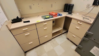
Behind the wall with the beer coolers was the store's breakroom.  This space had already been mostly cleaned out by the time I made it back to #1331, but we can see a few odds and ends that were left behind.

We can also see the remnants of the water fountains that were just outside the hallway to the breakroom and restrooms.

Turning our attention back toward the entrance, we can see the mostly intact Customer Service counter.  This space seemed to serve as a tool hub for some of the crews removing equipment, and we can see the check-in desk for the auction off in the distance.

The "Customer Service" letters were included in the décor lot I bought, but I was so tired by the time I made it to that side of the store, so I decided to leave it be.  I did end up telling another person they could have it, so maybe it got to have a second life after all.

Behind the customer service counter was a Classy Market 2.0-sytle "Publix Guarantee" sign.  This is one item that I probably could have gotten away with taking, but I didn't want to test my limits and figured I already had enough signs as it was.

It was also really tempting to take this architectural rendering of future Publix #1853, but I resisted the urge and left it behind since it wasn't remotely close to the description of anything I bought.  That didn't stop me from taking a picture of it though!

From the looks of it, this store's replacement will be a 48M prototype and will ring in at 47,307 sq. ft. while featuring a liquor store and pharmacy.  A 45M façade looks slightly different than the one above since they tend to feature a single, centered "primary arch" (I'm not an architect so I don't know the correct vocabulary), while the 48M features a primary and secondary arch, flanked by additional columns and covered area, and the 54M doesn't have any additional columns.  Wow, I want to apologize to all of the architects who may be reading this because I really butchered that!

Courtesy Grafe Auction

This store also had a small office to the right of the customer service counter.

Courtesy Grafe Auction

I didn't manage to take a look in this space during the auction pickup, but I overheard several men discussing the best method to break into the safe and remove it from the store.  It isn't often that you'd overhear a conversation like that and not be concerned in the slightest!  I also wonder why the auction company sold off the safe without first finding the combination, and why somebody would willingly buy a safe they knew they wouldn't get the combination to!

Courtesy Grafe Auction

It appears that there could have been a small hallway between the safe room and the customer service counter because I can't imagine where else this photo was taken.  The whiteboard we see was from the same auction lot as other fixtures in the safe room, and I don't think it was in the safe room based on the other photos of the space.  

If Alex or Colin ever read this post, I'm sure that Publix #1331 / Albertsons #4413 will miss you too.  At least they can find solace in the fact that their kind words toward the store will be forever immortalized in this post (could the auction company not bother erasing the board either?)

Leaving the service counter, we'll head back to the middle of the store to remove some frozen foods banners!  We see our friend, the broken freezer door, never managed to be rescued before this store met its demise.

These signs also happened to be the first ones in the store that the Publix Pirate and I managed to dismantle, but I figured it made more sense to throw them in the middle as they were found in this store.

Unfortunately, we decided to leave behind 8/12 of the signs since we knew we had lots of other tasks and a limited time to carry them out.  Again, maybe somebody came along behind us and took the other eight signs to a cold and loving home.

I did notice that the signs had alternating colors of screw hole covers on the side.  I'm not sure if these were purely coincidental, or if this was planned to differentiate two different styles of the sign so identical ones weren't placed next to each other.  I didn't get the chance to study my four signs up close, but maybe I can piece something together eventually.

I'm really glad I ended up buying those frozen foods banners (I paid a whopping 10¢ for all twelve of them) because I otherwise wouldn't have explored what items found their home on top of the circa 1994 freezers.

I only noticed this after I was looking back through my photos, but I'm wondering if those panels we see off in the distance are pieces of an aisle sign (the part where the cards slide in).  I'd really be kicking myself if they were since I didn't get the chance to buy those from this store (all 32 sold for $6.40 but I wasn't able to make it to the listing in time to bid, but also am glad I didn't have additional things I had to remove from the ceiling).


The world may never know what those panels were, but I was able to spot a few goodies that I took home.  I was overjoyed when I saw the red "Love To Shop Here. Love To Save Here" tag from Publix's extensive 2011-ish marketing campaign.  I also found half of a "Bonus Buy" tag which appears to date back to Albertsons' stint in this building.

The third item I found on top of the coolers was this frozen meats category sign – I was thrilled!  Publix had removed most of these before the auction so I thought all of them would be lost to history.  I also found one for frozen vegetables, but that one was broken and had all sorts of mildew on grime on it.  I just decided to leave it be and take the pristine one for meats.

The final frozen foods find was the best:  two chicken bones.  I have no idea how they ended up there, or how long they had been there, but it appeared that somebody had eaten two drumsticks and left the remains behind for somebody else to savor.

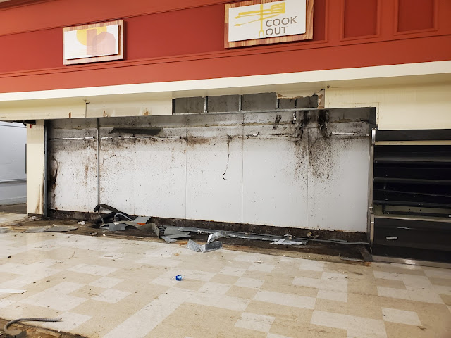
Wrapping up our tour of the frozen department will be this glimpse at the former home of an endcap freezer.  I'm still amazed at the amount of gunk that can build up over 28-years (the floors under the cooler were original to Albertsons which indicate Publix never bothered to move these freezers), and I wouldn't be surprised if most of that rust is due to the store's proximity to the ocean.  The piece of paper on the ground reading "Reduced <something> <something> sale" was the only interesting remnant I saw, but I didn't think it was interesting enough to photograph or take home.

We'll now pivot our tour to the storage space in the back of the store.  The opportunity to remove the last traces of Classy Market 2.0 might have been cool enough in its own right, but I wanted to take the chance I had to explore the entire building while I was there!

Here we are looking back toward the store from a hallway leading to the back of house storage space.  The now-removed doors served as the dividing line between the meat and dairy departments, and we are currently looking straight down the former aisle 8.  Behind the wall to my right was the walk-in cooler for the dairy department (topped by a mezzanine level containing equipment that Publix Pirate poked his head into), while a meat processing room was located to my left.  If you zoom in below the electric panels, you can see a small category card lying on the floor.

The aisle sign inserts we see above were spread all across the floor throughout the store, so I managed to pick up a few to take home (I guess the crews removing the signs weren't too concerned about getting all of the cards).  The one I was most excited to find reads "Fresh Subs" which happens to be the one we see under the electric panels above.  I have no idea why it was there, but the Sing Oil Sidekick has stated that he has wanted one ever since he first noticed one in a CM 2.5 store (these seem to have only been used in CM 2.0 signs, but some of those live on with Invigorate).  I would eventually like to get one of these for myself but knew my sidekick would appreciate the memento.

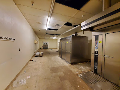
Now we'll take a look at the section of the stockroom which runs behind the left side of the store.  The loading dock was located just to my right, while the dairy cooler was to my left, and the deli prep area was off in the distance.

Courtesy Grafe Auction

I didn't get a good picture of the loading docks themselves, so I decided to improvise with this picture of some ladders at the auction.  The green cardboard compactor standing behind the orange ladder is the same one seen in my photo, for reference.

We'll now look over toward the right wall of the store and see the door leading to one of two meat rooms.

The first meat room appeared to be a walk-through cooler (the door on the right is the open one we just saw in the photo above), which lead to the meat prep room next door.

This picture was taken in the meat prep room facing the opposite direction from my previous photo (we are now looking toward the meat and seafood counter rather than the dairy department, if we could see through walls).  I believe the door off in the distance led to a small hallway which provided access to the meat counter.

Now that we've had a short behind-the-scenes tour, let's jump back to the salesfloor to check out the dairy department.

This scene looks much different than it did back in May, doesn't it?  The hallway off to the right is the same one we were looking down earlier, and the freezer aisles are just off to the left.  I'd have to guess that the lack of ceiling tiles in this part of the store are due to water leaks from Hurricane Ian, or maybe the auction company sold some of them off to some happy customers?

Doesn't that flooring under the old coffin cooler just look disgusting?!?!

My next sign to remove happened to be the one for dairy.  This one was a real challenge because it happened to be a whopping 12-feet wide!  The Publix Pirate and I decided our best course of action would be to dismantle the sign rather than having it fall on one of us trying to bring it down the ladder (it was shockingly heavier than the meat and seafood signs).

If you ever wondered what a dismantled Classy Market 2.0 sign looked, well here is your answer!  The curved aluminum pieces bearing the "Dairy" lettering were attached to the backing in all four corners, with some additional screws holding it in place from a bracket at the top. Once removed, the giant corrugated plastic sheet was then held up by one column of screws running down either side of the sign.  After taking all of this down (the plastic was a pain to take down since it was so big and somewhat heavy), we determined the backing was still too heavy to mess with and decided to leave it on the wall. 

Just to show you how big those signs are, I decided to lay a standard (4'-ish) floor broom next to one of them for some perspective: each arc measured roughly 11-feet wide!

The blue plastic sheet may have been a pain to transport, but it still made it back in one piece!

We'll take one last look at the back of the dairy and produce arcs before we move on to the rest of the tour.

It's not often you get to see a Publix from a 10-foot ladder!  Here we can also see where the lights mysteriously decide to change orientation halfway through the store.

I couldn't leave without the curved deli sign!  Perhaps one of the most unique signs from Classy Market 2.0, this guy was held onto the wall by two brackets supporting the upper two arms of the sign, with additional screws holding the separate piece bearing the "Publix" name.

The sign was also constructed on a wood frame, with foam lettering and an aluminum frame secured to the front.

It doesn't look quite the same without the Publix lettering, does it?

In front of the deli was a myriad of trash left behind by the previous removal crews.  I noticed this one piece of sheetrock in particular which showed the Publix deli orange and a section of Albertsons deli accent yellow (?) (which had been painted over).  The intriguing piece was the section of red on the left side of the scrap – could this be a leftover from Albertsons' deli too?

The produce department is up next, along with more remnants from this store's past.

Eww, just eww!  This beautiful sight was found behind one of the produce coolers, and I really hope it was a result of more recent events at this store (although, I'm doubtful).  It appeared that the store had an inch or two of water on the floor during the hurricane so it could have been soaked up by the walls to cause the mess we see here.  Throughout the store were random puddles left behind after people moved the various store fixtures, and I'm inclined to say that those were from storm damage rather than condensation or refrigerant.  Either way, they were pretty gross to walk through!

Looking over toward the bakery, we'll take one last look at the stately produce sign which has graced these walls for the last 13-years.

We'll also see some more paneling – and paint – which hearken back to simpler times.  Blue and Gray Market, I suppose?

It hurts my heart every time I see this picture since I wonder what fate the backing of the produce sign ended up having.  I would have loved to save a piece of the orange leaf pattern, at a minimum, but the 12-foot wide sign was just too big for the Publix Pirate and I to handle with only a single ladder.  To make matters worse, the sign appeared to be made from a heavier material than the foam board of the 8-foot signs, so we made the decision to leave it in its place.  There also didn't appear to be a simple way to dismantle it like we did with the dairy sign.  Maybe somebody came along behind us to save it, but there is a chance it wound up in a landfill along with the rest of the store.  On a positive note, I was able to save two of the other leaf accents, similar to the one in the middle of this sign.

I also noticed these produce bins sitting near the front of the store.  I found the two on top to be especially interesting since the font used for "Produce" matches the font used for "Publix".

To the left of the produce department was additional stockroom space for produce, the bakery, and the deli.  I think I took this picture from the back left corner of the store, looking toward the front, where we can see a walk-in cooler used for produce storage off in the distance.

A produce prep space was located just through the double doors to my left, with the produce cooler being between that room and the deli tea cooler.

Eight departments down, one to go.  We ended up saving the bakery for last, likely because it appeared to be one of the easiest signs to remove and because it was in the front of the store.

It turns out that was not the case and the Publix design team wanted to make sure none of Florida's massive earthquakes ever brought one of these letters down!  Each letter had three strips of double-sided adhesive running along the back in addition to two 5" (I think) wood screws. 

The wood screws were easy to back out with a drill, but the adhesive proved to be a royal pain in the rear.  Publix Pirate ended up finding a metal trim piece from one of the coolers and used it to scrape the adhesive strips off the wall.  You can see how they ended up taking some pieces of the paint with them.

Speaking of the letters, they are also made from foam and feature some surprisingly resilient paint (those letters took a lot of scrubbing to get all of the grime off them).  I decided to include a disposable camera (who still has one of those?!?!) for some perspective.

The sign was a total of 5 pieces of foam which were glued and stacked together to form the letter.  I'd also like to note the brown trim we see between the silver edge and the cream backing:  the sign facing the produce department didn't have this!  I don't know why the one sign only had silver around this edge, but I didn't notice this until I was cleaning up the two signs to give one of them to the Publix Pirate.  I'm glad I realized it before I mixed the letters up!  Maybe somebody at the Publix sign office was just having a bad day, but I think the brown-trimmed edition is the historically accurate one and the silver-trimmed one was a mistake (that also happened to be the sign with the missing "7"). 

Still hung on the wall was the old frame for the bakery manager and assistant manager.  This was another item I was tempted to take, but decided it was best to leave it behind.

To the left of the front half of the produce department was this bakery room, complete with industrial ovens and proofers.  I believe the door in the distance leads to the produce prep area mentioned earlier.

Courtesy Grafe Auction

Back in the main bakery space behind the counter, we see the nook in the front left corner of the store which happens to be home to a walk-in cooler.

Courtesy Grafe Auction

I didn't take any pictures over here, but I'd say the auction pictures should suffice.

Courtesy Grafe Auction

Turning back to the left just a shad, we can catch a glimpse of the sales floor and the door to the training room off in the distance.

Here's the picture I took from the bakery area looking toward that hallway and the front door of the store.

Courtesy Grafe Auction

With the lights turned on, it's a bit easier to see the store's data closet off in the distance.

Courtesy Grafe Auction

That data closet used to host the store the store's networking and telecom equipment.


The server rack may have been gone by the time I made it back to #1331, but a sheet featuring the stores telephone extensions was still stuck to the wall.

Courtesy Grafe Auction

Also in that alcove / hallway was a small closet, presumably for office supplies or other non-inventory items.

Courtesy Grafe Auction

Turning down the hallway back toward the front entrance, we find ourselves in the employee training room.  I believe there was an identical counter on the opposite (front) wall of the room

Courtesy Grafe Auction

Finally, the training room led to an office with a one-way mirror overlooking the entrance to the store (the other side of that window can be seen in this photo).

One of my last photos (the last one happened to be the extension list above) inside Publix #1331 was, of course, of the historic photo collage hanging next to the old floral department / on the wall of the training room.  It's fitting for Mr. George to have such a prominent view overlooking his store, and I hope somebody was able to save some of these pictures from the landfill.

If all of my back-office shots were confusing you, I managed to throw together a map based on my memories, photographs, ceiling tile math, and Google Earth satellite views.  I don't claim drawing as one of my many talents, but hopefully it can still give you a good idea as to how these mid-1990's Albertsons stores are laid out.  I also realized I forgot to include the office supplies closet in the front left corner of the store:  oh well.

For the last part of this post, we'll take a closer look at some of the other signs I picked up at the auction.  First up are the two leaves I snagged from the produce department (since I couldn't get the main backing of the produce sign).  These guys had 3-or-so wood screws holding them into the wall and were fairly easy to remove.  They are also made of foam and therefore are very light.  Each one measures 72" by 31.5" (they don't look like they are 6 feet, do they).

Meanwhile, the barn we see below was one of two secondary signs I got from the meat department.  It, along with the following secondary signs, measures 48" (4-feet) by 24" (2-feet) (the same dimensions as the ceiling tiles, I believe).  The sign features the same vinyl faux-wood background we saw before, and a graphic printed on foamboard for the barn section.

I was expecting these signs to be mounted to the wall using the same French cleats as the primary signs but was caught off guard when they didn't easily lift off.  It didn't take long before I tried to yank one straight off the wall and saw where they were screwed in.  Workers had instead used the same wood screws that we saw securing the bakery letters and produce leaves to hold up these signs.  The screws were only drilled through the Styrofoam on the sign itself, so it came straight off the wall.  All three of the screws were inserted just above the printed poster board and never would have been noticed from the ground.

The secondary signs in the produce department were hung in the same fashion, just in a portrait orientation as opposed to landscape.  The interesting thing about them is how the back of the sign was also painted, likely with the intention of it being seen, and they had two mount points for "S" hooks on the top of the sign that were taped over.  Publix obviously designed these signs to be suspended, but the construction crews at #1331 instead decided to screw them directly to the wall.

I do like how these secondary signs are both sized at 4' x 2' even though they were designed to be hung in different orientations.  Nice cohesion, Publix!

Moving onto the smaller secondary signs, we see an artistic interpretation of a fish from the seafood department and some "meaty" words from the meat counter.  Interestingly, Publix would end up using a similar color of green for their seafood department with Sienna while opting for blue with Invigorate.

These signs measure 36 inches by 12 inches and feature the same French cleats on the back as the other secondary signs and the primary department signs; however, unlike the other secondary signs, these French cleats were used for their intended purpose.

These signs also had the same construction as the other secondary signs with a four-layer design.  I appreciate the dimension it creates!

For a store I initially thought I would never see, to one I never thought I would post about, to one I never thought I would get the décor from, this was certainly a wild ride!  Yes, I did spend $140 on random stuff from a Publix that was a long drive away.  Do I regret it?  Hell no I don't!

Courtesy Publix.com (archive.org) - Former Publix #1331

That will wrap up our triple-threat coverage of Publix #1331 / Former Albertsons #4413, so I hope you enjoyed this wild ride!  I'll close with this photo from Publix's old store listing page which depicts the store before it was repainted.  Let me know what you think of the now closed store, and if you have any further questions about what I may have seen.

I'll be back next week with another fun (although less exciting) Publix tour, but plan for the next Sing Oil Blog post to be released on Christmas Eve (December 24th).  It may not be related to Christmas at all, but I know I will be excited to check it out once it is live!

Until next time,

- The Sing Oil Blogger