Smyrna - Smyrna, GA
Smyrna
Sing Food Store
Smyrna, GA 30082
Scroll Down for the MTC Post on Kroger #451
Revised: May 13, 2023 | Original Publication: May 7, 2022
Editor's Note: As time goes by, I occasionally hear from readers who have a connection to a particular location. Several months after I originally published this post, a former employee named Rick reached out to me via email to share some new info about this store. Based on what I saw, I figured I should write up a full refresh to include all of his pictures and memories. Additionally, I have since taken a few more photos of Kroger #451 following its remodel which I will share below. If you've already seen this post before, make sure to check out the new "Background" section as well as the November 2022 update to the Kroger section.
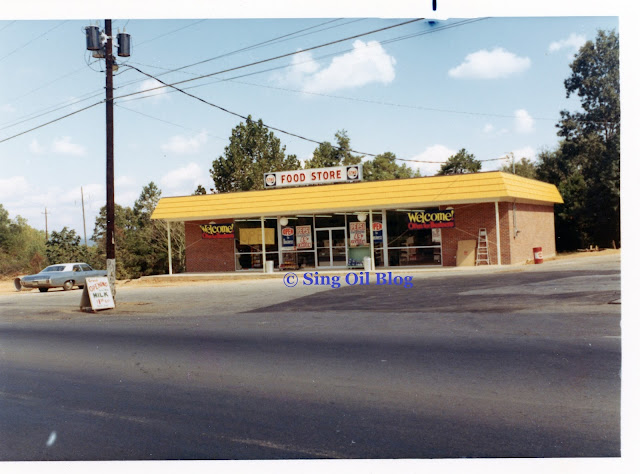
After my brief diversion [in March 2022] covering several former Publix stores across Atlanta, I'm back to my regularly scheduled programming for The Sing Oil Blog! Today, we will be covering a store which, for a change, I know a good bit about its past. Even better, I actually have some never-before seen pictures of how this store looked back in the late-1960's and early-1970's to share, beginning with the one at the top of this post! As usual, all of the unattributed pictures are from my collection, and provide us a rare look at some of Sing Oil Company's earliest convenience stores.
I love it when this blog allows me to tie personal connections into the various former Sing Stores located across the Southeast. In today's background section, we will do just that thanks to some all of the information from one of the store's former employees. Let's see what he remembers:
 |
| Former Powder Springs Road Sing in Marietta, GA |
"In 1976, I was a gas station attendant. It was my first job, at the Marietta location. I earned $2.45/hr. I bought my first gallon of gas at that station for .45/gal. Larry McDougald was the store manager, Larry White was the station manager. Both were just great guys, all the way around.
We called the station house, 'the doghouse.' The gas pumps that were on that particular Island where the doghouse sat were full service, rain or shine, 90° or 20°. I swear I nearly froze to death one night we were so busy pumping gas. It was too cold for anyone to get out and do their own. Gas tanks were huge and at 45 cents a gallon it took a while to fill those up. Me and my partner that night, Tony, were so cold we huddled up together with a space heater inside the doghouse, just to try to keep warm.
Times were a lot different then. We had a floor safe inside that doghouse and back then you either paid with a credit card or cash. There was no such thing as a debit card. We would have thousands and thousands of dollars at the end of the day and we would sit out in that doghouse all by ourselves at night counting cash and then drop it into the floor safe and leave. We would sell about 300,000 gallons of gasoline every month at that location.
I was actually in the doghouse, listening to the radio the morning that Elvis Presley died in '77. The guy that worked in the store was a HUGE Elvis fan, he was only a year or two older than I, and he actually walked out to the doghouse, to see if I had heard. He had tears in his eyes. I remember it was really foggy that morning and threatening rain. How's that for a memory?
Powder Springs road is now a four-lane with a center turn lane. Back then it was two lanes, with no turn lane. We never even felt threatened, but I wouldn't do it today For Love nor Money."
Well, how's that for a story! That anecdote may not relate to the Smyrna station, but it is still interesting to hear a firsthand perspective from somebody about the nearby Powder Springs Road store. In addition to the text above, he also sent me several old photos of the Smyrna store – let's take a look!
 |
| Courtesy of Rick (Blog Contributor) |
"The construction photos of the Smyrna location are from 1967. I worked there too, for a little while, mostly during the summers when I would be home from college. I have a lot of great memories there too."
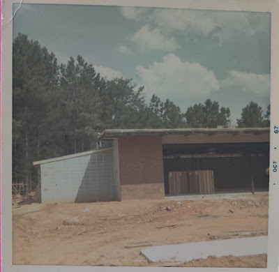 |
| Courtesy of Rick (Blog Contributor) |
"The additional space . . . to the left of the building [the cinder block structure we see above] was actually added for the sole purpose of housing returnable soft drink bottles. There were cases and cases of them always, stacked floor to ceiling. Coca Cola & Pepsi bottles were worth 5¢ each, back in the mid-70s and they would tend to go missing at night."
This structure was demolished at some point in the late 1970's or early 1980's to allow for a full expansion of the store off to the left. We'll see the modern photos below showing the newer addition blending in pretty seamlessly.
 |
| Courtesy of Rick (Blog Contributor) |
What I find crazy about this photo, is that if you look closely, the two men working on the pump canopy are standing on ladders which are just situated on the beds of those two trucks! I may or may not have used the tactic myself, but doing something like this on a modern construction site would most definitely be an OSHA violation!
 |
| Courtesy of Rick (Blog Contributor) |
We'll take one last glance at the store while it was under construction before jumping ahead a few years.
 |
| Courtesy of Rick (Blog Contributor) |
Just take a look at that car in the foreground! Is that a 1959 Impala?
"We never really had much of an issue at that location either until the gas shortages came, in the late 70s & early 80s. That store was located on Concord Road in Smyrna. I remember the line of cars waiting to get gas would be backed up at least a mile, in either direction. We had to use the police for traffic control. Again, back then it was two lanes and not four, as it is now. And when we ran out of gasoline with cars still backed out into the street it would occasionally turn ugly."
 |
| Courtesy of Rick (Blog Contributor) |
Rick also sent me several other random photos from his days at Sing, which I figured I would include even if I don't know the full context. This picture looks to have been taken just inside the front door. You may remember that Sing used to place the cashier counters in the dead center of the store and I'm guessing the wine display and freezer may have been placed for shoppers to see when they entered the store. I'm not entirely sure if the man in the photograph is Rick or if it is one of the store managers.
 |
| Courtesy of Rick (Blog Contributor) |
Here we can see the pump islands and the "dog house" just as they would have looked from the front of the store.
 |
| Courtesy of Rick (Blog Contributor) |
While I may never know why somebody took these two pictures through the front door, we can see a VW Bug with "Genuine Parts Co." written on the hood. It looks like the parts company may have needed to find a reputable paint shop too.
 |
| Courtesy of Rick (Blog Contributor) |
I also don't know the man in this photo, but it looks like his patch says his name is Steve.
 |
| Courtesy of Rick (Blog Contributor) |
Finally, we see a man unloading some boxes from the Mrs. Kinser's Home Style Salads truck.
 |
| Courtesy of Rick (Blog Contributor) |
"Most people wouldn't remember the insulated thermos cups (photo attached), from the earlier days, circa 1980 (I think). Most people think QT came up with them. I can prove that theory wrong. HA!!! I used to get my daily sugar high by filling it up at the Icee Machine. Banana flavor also made AMAZING daiquiris!"
It looks to me like Rick may have the larger version of insulated Sing cup because it seems like the proportions are different than my 16 oz variant. Cool how he still has one in such good shape, and I bet a banana ICEE would make a good daiquiri! I would guess that these cups were rolled out in the mid-1980's because Sing seemed to roll out the yellow and blue logo sometime between 1984 and 1986.
 |
| Courtesy of Rick (Blog Contributor) |
As for this photo, Rick says he thinks it was the Powder Springs store; however, the building above doesn't seem to match my photo. Regardless, this shot shows us a typical 1970's Sing Food Store on a gloomy winter day.
I personally love looking through these old pictures to get a glimpse of suburban design from the mid-Twentieth Century. If I knew anything about cars, these pictures would probably be that much better! Anyhow, I'm glad that Rick reached out and I hope you enjoyed this blast from the past! Now, let's take a look at the photos from my collection.
I wanted to point out a few things that differ at this station as compared to the later Sing Stores from the 1970's. The first of which are the road signs: this station received signs which were mounted to a single pole with Sing's circa 1964 logo. While a revised version of this hardware would be revived in the early-to-mid 1980's, just before the release of Sing's ca. 1986 yellow logo, most stations during Sing's convenience store era received signs similar to this one. Only the earliest of the Sing Stores featured the sign shown above, which were primarily installed at dealer-operated gasoline stations during the 1960's. Furthermore, this store also received the large arced florescent light fixtures in the parking lot and an older-style canopy compared to stores (like Thomasville #5) which would open in the early 1970's. The concrete footings for these old signs and fixtures often remain long after the original hardware was removed, but this station was lucky enough to still have both 1967 light arms gracefully standing over the parking lot until 2020. You can check them out and see the remaining footings in the street views below.
 |
| Smyrna - around 1967 Shortly after station opening - View from Concord Road SE |
This store opened its doors to the public late in 1967, making it one of Sing's original Stop 'N Shop stores (along with Tallahassee #3, Columbus #2, and LaGrange #1) and the first Sing Store in the Atlanta Metro. Likewise, it also sported one of Sing's early backlit canopies, which would have probably been removed during a 1970's renovation. It is so cool to see this store just after it opened, with its freshly laid asphalt parking lot and its shiny yellow ribbons floating in the breeze. While the station doesn't look nearly as polished today, at least it still stands for us to tour!
 |
| Smyrna - around 1971 Shortly after a rainstorm - View from Concord Road SE |
By the early 1970's, the asphalt didn't look nearly as pristine, and the yellow plastic convenience store branding had faded to a dreary beige color (or maybe it is just the stormy looking day doing that). I also find it interesting how the price for regular gas seems to have decreased by 4¢ since the station's grand opening, unless "Super Regular" ended up being called "premium" in the end. Regardless, I wish gas prices were still 30¢ a gallon!
 |
| Smyrna - around 1966 Aerial photograph taken for site evaluation - Looking southwest |
This station also happens to be the only one in my collection where I have record of the site selection process. We can see above an aerial photograph taken from a small aircraft of the area surrounding the intersection of Concord Road and North Cooper Lake Road, with the proposed site drawn in pen. With Sing Oil Company being based out of South Georgia, I'm sure the site planners made a number of such trips to areas like Atlanta, Columbus, and LaGrange to decide which intersections were ripe for expansion. While the degree to which this occurred is unknown, at least we get a little slice of this region's past before the store was built!
 |
| Smyrna - around 1966 Aerial photograph taken for site evaluation - Looking northeast |
For those who aren't familiar with the area, Smyrna is a suburb located to the Northwest of Atlanta. The town is located just outside the I-285 perimeter, and is home to The Battery and Truist Park, the new home of the Atlanta Braves baseball team. Smyrna also has two Nam Dae Mun locations (former Publix #580 and a former Winn-Dixie / Save Rite), but neither of them are quite as interesting as the former Publix #520 or #535 which we toured a few weeks ago.
With that being said, let's move on to the modern convenience store!
While they may be hard to see in my pictures above, I believe the black sconces mounted to the wall on either side of the windows are original to 1967. They seem to match the style used on other stores and look like they are the same shape as what I see in the older pictures.
We can also catch a better glimpse of the addition on the left side of the store; I would've thought that Sing built this during their mid-1980's delicatessen roll out, but aerial pictures seem to indicate it is older than that. Maybe the store just needed more space for all of those Coke bottles!
A former Sing wouldn't be complete without the pair of air / vacuum lights! These fixtures look like they were swapped out by Amoco at some point during the 1990's, but I believe the poles they are mounted on are original to Sing.
While nothing immediately stands out to me about this awning, there always is the possibility that it uses the 1967 structure (similar to Perry #1). Everything that I see looks modern, however. At least the placement seems to match where Sing would have positioned theirs.
I believe I took this picture to highlight the wood paneling in this old window frame: a telltale sign that Sing Oil Company was in the building! The cashier counter is located just behind this wall in the store.
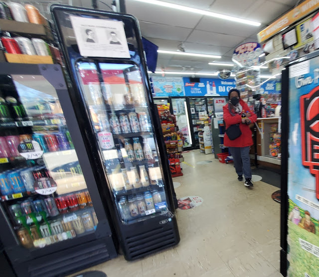
Stepping inside, I was greeted by a lot of mobile drink coolers and a customer looking directly at me. I had to be quick with this shot!
Thanks to Blogger's annoying photo uploading patterns, we'll look at these photos in the reverse order of how I took them. Oh well, you'll get the point! Regardless, here we have a slightly severely obscured view of the cashier counter, cash ATM, and cryptocurrency ATM. Maybe I should pay more attention to cryptocurrencies, but I feel like a 55-year-old convenience store would not be my choice location for making a purchase! It also seems as if this store performs quite well with alcohol sales, judging by all of the signs on the exterior and all of the wine in this shot. Furthermore, the only picture Google Maps has from the interior is this store is one of a cooler full of MD 20 20 and Wild Irish Rose.
While it is hard to tell from this photo, the wine rack we see here was also home to a stick of burning incense (if you zoom in, you can see some of the smoke rising to the right of one of the lights). While pickles and wine can create a mood, incense and wine truly enhance the sensual experience of this store! I, however, find this addition to the store's ambiance to be a bit insensitive to those with allergies or asthma.
Since I have seen these floor tiles in other former Sing Stores, I'm inclined to believe that they are a remnant from the 1980's (or earlier). Hopefully they don't contain asbestos . . .
I also think these cabinets look pretty vintage. I have no idea if they are from Sing, but they look like they are old enough to be!
If you haven't noticed, this store was very crowded (with stuff, not people). That being said, it was pretty hard to figure out what pieces of the layout were original to Sing Oil Company and what had been moved. I also didn't want to hang out too long; otherwise, all of my clothes would have smelled like incense for days.
I do feel confident that these Formica cabinets date back to Sing, but I'm not sure if they would have been located in this section of the store. Most Sing Stores from this era would have placed their cash register here; on the other hand, based on the fact that the window closest to the register was covered with paneling makes me wonder if Sing left their register there.
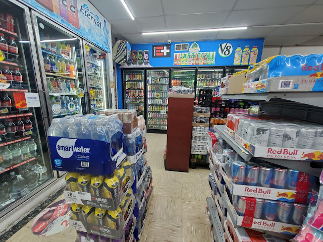
Stepping back a bit further, we can see the entire length of the back of the store. I do wonder how long it will take this store to sell the copious amounts of bottled water we see here!
These drink coolers look old enough to be original, but I don't believe I have seen Sing place them along this wall of the store. Standing at the front door, these were located against the left wall of the store, in the addition.
Here we have a nice overview of the store from the back left corner. I believe the addition space begins approximately where the fire alarm bell is mounted to the wall.
Now we'll take a look at the back left corner, from the front left corner.
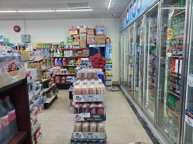
Our last look will be from the front door, looking to the left down the front aisle of the store. It still amazes me at how much product some of these stores have in them; this one was filled to the brim!
Now that we have seen the inside of this store, let's take a look at some aerial and street views before we dive into Kroger #451.
Street Views
Aerial Views
 |
| Historic Aerials - 1960 Future site of the Smyrna Sing Store |
 |
| Historic Aerials - 1968 Newly built Smyrna Sing Store |
 |
| Historic Aerials - 1972 Smyrna Sing Store - Notice the small shed on the east side of the convenience store |
 |
| Historic Aerials - 1981 Smyrna Sing Store with new addition on east side of building |
 |
| Google Earth - October 2021 Former Smyrna Sing Store |
Art DeKroger
As you have probably learned by now, I am much more knowledgeable about Publix than I am with other grocery chains; however, it is fun to explore some other stores every now-and-then. This location in particular had me intrigued, especially since it happens to be the only location I am aware of with Kroger's Olympic Spirit or "For Goodness Sake" décor package. Feel free to correct me if I miss a detail, but I'll try to provide an overview from what I have learned.
As always, click on the MTC logo above to check out all of my other fun grocery store tours!
Some Background
I first discovered this store after I came across the Perry, GA Kroger which features a sign reading "Kroger For Goodness Sake". I was very confused by this catchphrase, and immediately tried to find its historical significance. Luckily, fellow blogger Retail Retell had a nice set of pages documenting various Kroger interior packages through the years, with the Olympic Spirit being one of them. Basically, I've gathered that "For Goodness Sake" was a tagline used by Kroger during the 1990's, which coincided with an interior package Kroger rolled out for the 1996 Atlanta Olympics. It seems that this Kroger interior may have only been used in the Atlanta-regional stores for the company, so that already puts it in a limited number of stores. Additionally, it seems that all of the stores which received this package, save this one, have since been remodeled or closed outright. So, with that background, let's take a look at this unique store!
Kroger #451
Vinings Village
4715 South Atlanta Road
Smyrna, GA 30339
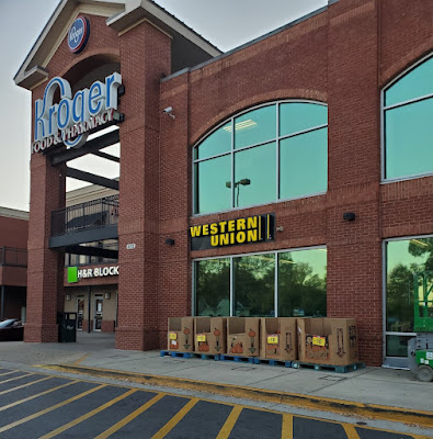
Although this store isn't technically inside the Atlanta city limits, it is still in a very urban locale. That being said, it received a compacted façade and unique orientation to allow it to fit within the constraints of its lot. The combined entrance / exit to this store is located under the archway in the photo above.
I find it interesting how this store is located at "Vinings Village"; however, it is not in what is considered the Vinings neighborhood of Atlanta. For those who don't know, Vinings occupies a small area bounded by the Chattahoochee River to the East, I-285 to the West, US 41 to the North, and a series of tributaries to the South. This store lies just to the South of those tributaries; meanwhile, there is a Kroger at the Riverview Shopping Center which happens to be in Vinings. Both stores are located in Cobb County, as compared to Atlanta proper being in Fulton County.
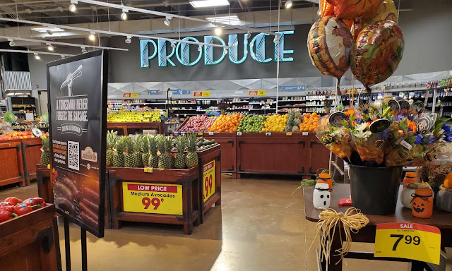
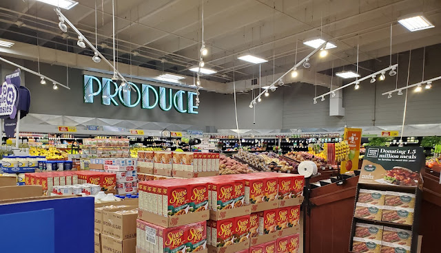
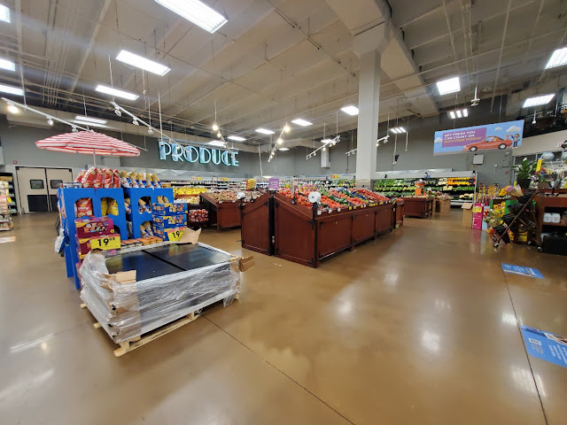
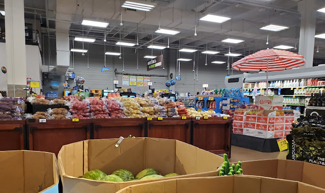
Anyway, I managed to visit this store in late-October, as shown by the pumpkins and Halloween merchandise in other pictures. When you first walk into the store, you enter a long, skinny vestibule on the corner of the store where you will find buggies and seasonal merchandise. Stepping through the second set of doors, you are greeted by the produce department. I'm not certain, but it seems that this store has a unique layout due to the space constraints of the lot. If I remember correctly, the produce department encompassed the entire width of the building, except for some space used for the bakery kitchen.
I thought the Art Deco-style neon signage in here was cool, and I miss the days of seeing grocery stores use neon in unique ways. Although this sign looks blue in the picture, it was actually green (very fitting for all of the green produce they sell).
I forgot to mention another unique piece of this store's history: it was built in 2002. While others thought that this package was discontinued at the onset of the Kroger Spirit / Millennium décor, it seems that it might have been implemented into the early 2000's. This is possibly the last store to have received this look.
Here we see the back aisle of this store where the majority of the service departments were located, looking from the produce department. It also looks like this store has either featured stained concrete floors from the beginning or did a very good job at removing signs of any old flooring.
These signs may be a bit excessive, but I bet you won't get bored looking at them! The corrugated metal also reminds me of other design trends of the era (ehm, I'm looking at you Metallic Marketplace).
Other than the fact that this sign is a bit over-the-top (of the bakery counter), I feel like it doesn't quite match the rest of the signage. Maybe it is the lack of neon?
The deli, meanwhile, has plenty of neon. I do think the lowercase "e" looks a bit odd since it is so much larger than the other, uppercase letters. Lots of Art Deco vibes!
I managed to get a nice overview of the aforementioned service departments, looking toward the front of the store. Produce is located just around the corner by the bakery.
Am I the only one, or does this rotisserie sign make anybody else think of Albertsons "Grocery Palace" interior?
Returning to the front of the store, we'll take a quick overview of the express checkout lanes. It looks like this store now has the Flagship Script-style cubes and signage, as compared to something which would've matched this package.
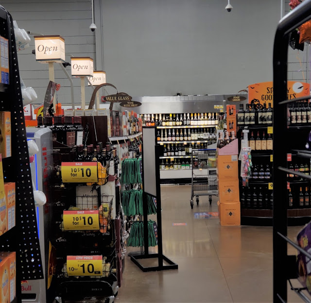
We'll take a quick look at the "front" edge of the wine section, which is located behind the registers on the left wall of the store. I do find it interesting how the category sign lists "value glass" wines for the section closest to us, but last I checked, cardboard is not a type of glass!
I believe those wine category signs are from Kroger's Flagship Script era (since that's also where the checkout cubes are from). They must not have been up to snuff because they were gone by the time I made my second visit to this store.
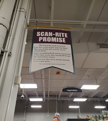
I also noticed this sign on one of the aisles because the shape reminded me of the pennants used in the Kroger Spirit / Millennium package.
Are they fine wines or are they "spooky wines", your guess is as good as mine!
Taking a look down aisle 3, we see one of the aisle markers used in this package. They seem to be made of a wire-mesh frame with the number attached to the top and the categories attached to the faces. I do find it interesting how the main sign lists "Oriental Foods" and "Mexican Foods" while the category signs mention "Asian Foods" and "Latin Amer. Foods".
Walking back toward the service departments on the right wall of the store, we see the neon sign for "Fresh Seafood". I think this one looks really neat in person and makes me think of a restaurant I would see food at near the coast.
The pharmacy, located between the wine and the ice cream freezers, is over on the left wall of the store. It looks like a few lights were burned out behind "MACY" but at least the neon is fully functional!
Popping back to the other side of the store, we see the meat section, and the secondary sign for luncheon meats. I'm not sure what was supposed to be there, but Kroger must've had a steal of a sale on whatever product was below the "Low Price" sign on that cooler! I do find it interesting how the "Meats" and "Produce" signs are the only two in the store to explicitly use the same style, while the others either vary in font or entire composition.
We see aisle 11 (and the edge of aisle 12, for some of you fans out there!) which is the temporary resting place for all sorts of housewares, napkins, and plastic bags.
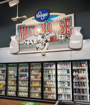
Apparently, the dairy section was so important that it received two signs, neither of which seemed to match the other. While the "Dairy" sign comes close to matching those for produce and meat, it uses a different font, lacks the design inside the letters, and utilizes the back of the letters for the mount placement rather than the top.
The Kroger Milk House is also where shoppers can find some iced tea.
We'll take one last look over the right side of the store from the back right corner before we head over to frozen foods.
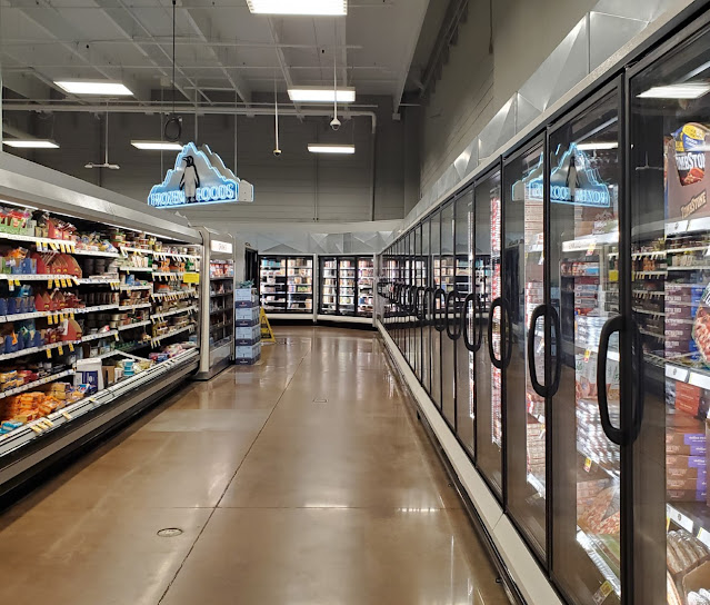
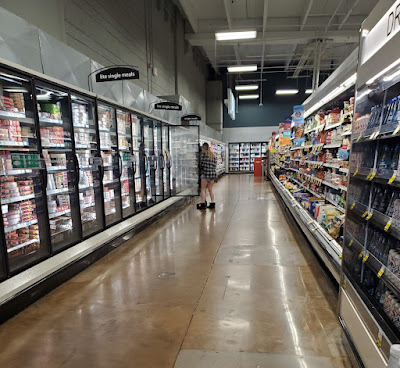
It seems that Kroger liked to use penguins in their freezer signage, which is a fun nod toward the climate in this section of the store! It looks like this store was also receiving some freezer upgrades at the time of my visit.
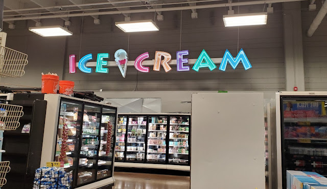
I scream for ice cream! I think it is fun how the ice cream freezers got their own dedicated signage, and the colors on this sign really make it pop.
We'll see Mr. Penguin one more time as he guards the cold beer aisle and the not-so-cold freezers which are undergoing maintenance.
So cool!
As we near the conclusion of our trip to Art DeKroger, we'll take a look at one of the self-checkout line's bag carousels. I'm not exactly sure why I took this picture but figured I might as well include it for posterity's sake!
We'll take one last look at the other standard checkout lines before we head out the door (which can be seen off in the distance). The customer service counter was located to the right of me in this shot, but I don't recall it looking too special. It seems like the signage resembled that which I have seen in other Kroger stores.
So, there you have it, possibly the last Kroger store to feature the Olympic Spirit décor. I'll be curious to see when this store comes up for a remodel, especially since it will reach its 20th anniversary this year. Although hopefully this rare décor package will continue to shine long into the future! If you would like to, you can check out a street view of this store here and see why it seems to use a non-traditional layout.
Until next time,
- The Sing Oil Blogger
Update: As of August 2022, this store still features its Olympic Spirit décor. Read on to see what other changes have occurred.
June 2022
While passing through the area a few months ago, I decided to stop by Art DeKroger to see how it was doing and get a few more shots to add to the post. It was on this visit that I ran into a surprise.
No, the surprise wasn't that the store uses sliding glass doors, but I realized that I previously didn't get any good pictures of the entrance or vestibule.
The vestibule has a lower ceiling than the rest of the store due to the presence of office space above.
Stepping inside, everything seemed to be just as I had left it.
At first glance, I didn't see anything too surprising in the produce department.
The checkout lines and customer service desk look the same too.
However, that all changed once I walked toward the bakery. The section previously used for natural foods was all disheveled with temporary product placements and empty shelves. I had noticed a few shipping containers in the parking lot, and I was beginning to think my nightmares of this store receiving a remodel were coming true.
It's never a good sign to see a handwritten aisle sign!
The one surprising piece was how none of the department signs looked like they had been touched. Was this store just going to receive a department reset without a full remodel?
Aisle 2 still seemed to look the same, complete with the original category markers on the aisle sign.
Ditto for aisle 3.
Aisle 6 was full of random boxes, but the neon pharmacy sign continued to be on proud display off in the distance.
I didn't notice anything fishy about the seafood department either.
Likewise, all was quiet on aisle 8.
I'm still confused as to why the H&BA aisles in this store received new aisle signs at some point, but they were the same ones we saw in October.
Aisle 14 had a mysterious tarp over one of the shelves. It appears that some product was about to find a new home.
At least the dairy aisle knew its purpose.
It also seems that the freezers were back in working order (since all of them were undergoing maintenance in October).
We'll take one last look at the pharmacy before heading back to the vestibule.
I only noticed this as I was leaving, but the vestibule was also being used to temporarily store some product.
Was this the chart for new product placements? I think so!
Regardless, I concluded my journey with the suspicion that Olympic Spirit didn't have many more days on this Earth. The suspense would lead me to take another trip to Kroger #451 in order to learn its fate.
August 2022
As I drove up to the store on this trip, I wasn't sure what I would find inside. I was only slightly reassured when I saw the familiar old Kroger logo attached to the front of the building.
My fears also began to subside when I noticed the Flagship Script checkout cubes were still in place. Out of all the things in this store, I feel like those would be very easy to replace.
I did, however, notice that the produce department had received some new display stands. The previous ones didn't have exposed legs like these do.
And wouldn't you know, Olympic Spirit has survived into August 2022! It looks to me like Kroger isn't quite ready to eradicate this décor package, which really makes me wonder if they will ever remodel this store.
I also didn't see any signs of construction, which makes me think the June shenanigans only culminated with a department reset.
Likewise, the aisle looks much the same as it always has.
As does the rear actionway.
Wow, aisle 16's signage has resurrected from the dead, and found some original category signs along the way (Note, I'm just referring to the ones on the aisle sign, as the arched ones for "charcoal," "napkins," etc. are also used with current Kroger packages). The product on this aisle does seem to have changed, since it used to feature soft drinks.
Mr. Penguin still claims domain over the frozen foods as well.
As does the ice cream sign.
The pharmacy looks to be unchanged.
On the other hand, some of the interior grocery aisles are where things begin to get weird. I noticed that the sign on aisle 7 (along with those for other grocery aisles) featured a mix of old and new category markers. It looked like Kroger had integrated the natural foods into the standard grocery aisles and replaced the corresponding signage for each respective organic category. It just looks really strange to see this mix of category cards; why they couldn't swap out all of the cards, I don't know.
I'm also surprised to see that Kroger went through the effort of figuring out how to attach modern category cards to the old wire signs. I don't think the combo of the old sign with the new cards looked bad, per se, I just think the combination of old and new cards looks tacky (and lazy).
Overall, this was an odd "remodel" to witness, but I can't really complain since the vintage décor remained mostly in-tact.
The biggest change I noticed is how wines moved to one of the grocery aisles and the former wine space now hosted H&BA products. I wish I had taken a picture, or at least taken note, of what was on the old H&BA aisles, but I do remember seeing the same mismatched aisle signs were still in place featuring category cards which were falling all over the place.
Here is a wider shot of the old wine section, followed by the checkout lines in the distance.
The last thing I took note of on this visit was how the store still had its old Fujitsu self-checkout machines. I've heard that newer stores use Toshiba units but have never really paid much attention to the brand of the self-checkout machine I'm using. I just know that Publix (among other companies) now uses NCR terminals.
November 2022
I'll just say that this store has caught my attention! When I was back in the area last fall, I noticed something had changed: this store had received the new Kroger logo out front.
I figured that the new logo could only mean one thing – this store must've undergone a full remodel.
Okay, maybe the first photo is a bit too foreboding. We'll take a slightly brighter look before jumping inside to see how much of the original store's interior remains . . .
Well, pretty much everything remains. Kroger Atlanta continues to perplex me with its decisions, but at least this is one I agree with! I suppose somebody at corporate likes this package because 2022 would have been the perfect time to annihilate it considering how this store underwent a major department reset and signage change.
What's even more confusing is how most of the original category cards have survived. I will say that this sign looks odd with the lonely organic pasta & sauce card amongst a sea of 20-year-old green placards. Many of these items have migrated from aisle 3 over the past year.
Aisle 10 received a standard-issue H&BA aisle sign at some point over the last decade or so . . .
However, aisle 11 has kept its original sign for some reason. This aisle also happens to be one which uses exclusively new-style category cards. I wonder if Kroger made special magnetic versions just for this store! This aisle was previously home to housewares, charcoal, and picnic supplies.
I can't visit this store without capturing another picture of my favorite sign! Many of the elements of this store remind me of a theme park rather than a certain decade which may be why Kroger has let them stick around.
Finally, since I neglected to take any pictures before, here is a quick glimpse toward the vestibule from this store's set of doors facing the checkout lines / customer service counter. If we walked through these doors a few steps and took a U-turn, we would be standing in front of the other set of doors which lead to the produce department.
It looks like Kroger is in no hurry to fully remodel this 20-year-old store and maybe that is because it sports such a unique interior. If companies would keep up locations (like they seem to have done here), I wish there were more one-off stores like this that have been preserved as a time capsule of sorts to showcase an otherwise long-lost interior. Winn-Dixie is another company who has the ability to undertake such a task, but I feel like they've let many of their "Golden Girls" stores stick around for too long at the detriment of their image. That being said, it still could be cool for the chain to breathe new life into a Marketplace to make it some sort of "vintage" attraction.





















From what I know the package dates back to 1993, and lasted all the way to 2004 at a then-new store in Durham, NC.
ReplyDeleteCool! You would know more about this than I would! I find it crazy how Kroger can manage having so many simultaneous interior packages – and how they decide which one to install in each store.
DeleteReally cool photos of the Sing store from the Sing days, and it's certainly interesting seeing the site selection in process there with the aerial views of the site. A mostly residential area works well for a gas station/convenience store like Sing, so the people living in that area had a, well, convenient place to go without having to venture onto the main road in the busier part of town. Very interesting to see the convenience store looking mostly original in the present day too!
ReplyDeleteKroger's Olympic Spirit decor is probably my favorite of all of Kroger's decor packages. I know it wasn't the most widespread or common package, but I really like how it shares a lot of similarities with Grocery Palace with its over-the-top designs and overall fun aesthetic. I definitely got the Grocery Palace vibes from the Rotisserie sign, and the bakery sign too. I really like the Ice Cream sign as well - that has to be my favorite sign in the entire store!
Thanks, it is really neat to see how a convenience store looked over 50 years ago! From what I have seen, it seems like Sing did primarily target residential areas for their early stores. As you mentioned, it makes sense for a convenience store to be more convenient than a supermarket.
DeleteI agree, I really like the Olympic Spirit package – especially the Ice Cream sign! It seems like over-the-top designs were a popular trend of the era. I wonder which came first: Olympic Spirit or Grocery Palace?
Going off what BatteryMill said above, Olympic Spirit would have come first. Grocery Palace didn't make its debut until 1999, 7 years after Olympic Spirit.
DeleteOh wow. Maybe Kroger started a trend then!
DeleteReally cool seeing the vintage Sing photos, as well as the store today, even if it's not totally obvious where things would have been located within the building back then. Like you and AFB said, the aerial site selection process from that time period is also very unique to get some more insight into.
ReplyDeleteThanks for the links in the Kroger section of the post, and I'm glad you enjoyed seeing the décor! This one crossed my radar when I was searching out a store with this package to visit, but ultimately I went with a different location instead. I'm happy with my choice because now both stores have been documented. I'm jealous yours had the original aisle markers and that Ice Cream sign!
Thanks! I love when I am able to match some vintage photos to a modern store, especially when I can get a more in-depth perspective of a location like this.
DeleteAs usual, thank you for all of the info in the links! If it wasn't for you, I never would have known about the Vinings Village Kroger or the Olympic Spirit interior. I'll be interested to see the store you visited (as I don't think you have posted about it yet) and how it compares to the Smyrna store. I'm also glad that we were able to document both stores before they were remodeled or closed! As far as I'm aware, it's not too late for you to make the trek to Atlanta and see the store for yourself!
You're welcome, and my pleasure! Way late in replying to this, but here's my album of the Marietta FGS store: https://www.flickr.com/photos/130271900@N03/albums/72157691477922383
DeleteOh, cool, I'll check it out! I'm glad we were able to document the last two stores with this rare package.
DeleteSitting here today reminiscing and found myself searching for information on this all but forgotten, but very important neighborhood grocery & gas.
ReplyDeleteI was associated with Sing, for 56 years. I have a few interesting images (photos of photographs) that you might enjoy, from its inception, the first location in metro Atlanta. I'll be happy to email you a copy of them if you'll provide an address. Cheers!
I'm glad you found the blog and enjoyed the post! I'd love to see any pictures or hear any stories you have to tell. You can find my email here on the Contact page.
DeleteThe additional space that you speak of, to the left of the building, was actually added for the sole purpose of housing returnable soft drink bottles. There were cases and cases of them always, stacked floor to ceiling. Coca Cola & Pepsi bottles were worth 5¢ each, back in the mid 70s and they would tend to go missing at night. ☺️
ReplyDeleteWow, it is crazy that space had to be added just for returned soft drink bottles! I love hearing stories about all of these stations from people who have a personal connection!
Delete