
Memorial Drive - Stone Mountain, GA

Memorial Drive
Sing Food Store | Deli
Stone Mountain, GA 30083
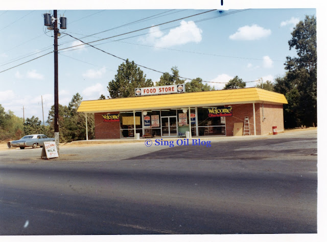
Similar to my last post on the Winters Chapel Sing Store, my primary purpose for writing about this location is to cover the nearby former Publix #535 as a More Than Convenience segment. I have been to many run-down convenience stores along this journey, and those are often the ones which lead to the most interesting discoveries. However, I do still value my safety and my ability to be an incognito photo journalist. There is a reason why I have been putting off a trip to this former Sing Store, which was reaffirmed by my first visit to the nearby former Publix #535 (you'll get to hear that story later on in this post). The photo above is probably the closest I will ever get to this convenience store, especially since I have come across news articles of people being shot here over the last few years.
 |
| Courtesy WSB-TV - Former Memorial Drive Sing Store - May 9, 2021 |
Finding news photos of this station as a crime scene from a quick internet search is even more alarming. Needless to say, we will not be getting a tour of the interior of this store.
 |
| If you look at the sign bracket just below the Texaco logo, you can see the curved piece of metal which is a remnant of Amoco's oval sign. |
I did manage to find where Sing Oil Company held a land lease on the property with the following terms:
I also managed to find where Sing Oil Company leased an adjacent building to Genuine Auto Parts, effective 02/01/72 - 05/31/92. I'm not sure which particular building this was, but I'd guess it is the one housing a barber shop to the southwest of the convenience store.
This station was also used to temporarily store Sing's tank bottom waste water in drums for the Atlanta and Macon areas, before shipping the material back to the Thomasville home office.
 |
| Courtesy DeKalb County Property Appraiser - Memorial Drive Amoco - February 20, 2003 |
 |
| Courtesy DeKalb County Property Appraiser - Memorial Drive Amoco - March 4, 2003 |
With those views in mind, I also managed to grab a shot of the station as a Texaco from 2007. It looks like Amoco ultimately sold this station in August 1996, so it must have been a pretty profitable store for them to hold on to that long — or nobody wanted it. Regardless, I imagine it converted to the Texaco brand shortly after these 2003 pictures were taken and has remained that ever since.
 |
| Courtesy DeKalb County Property Appraiser - Memorial Drive Texaco - February 10, 2007 |
Somebody had moved into the addition by 2007, as we can tell by the sign on the front of the store.
 |
| Michael Patterson - Google Maps - November 2021 |
The current occupant of the addition is Sun City Caribbean & American restaurant. They certainly give their customers (and passersby) a lot to look at!
With that, we will take a look at some street views before we move on to the former Publix #535!
Street Views
Google Street View - August 2011
Google Street View - January 2022
Aerial Views
 |
| Historic Aerials - 1972 Undeveloped Sing Store site |
 |
| Historic Aerials - 1978 Fairly new Sing Store on Memorial Drive (under the letters "Hist") - notice how the original pump canopy had a different orientation |
 |
| Historic Aerials - 1981 Now you can see the yellow roof of Sing's pump canopy |
 |
| Historic Aerials - 1988 Sing Store with new roof on canopy and addition on store |

The Classiest Pastels I've Ever Seen
I received a number of comments on my last post (which covered former Publix #477) mentioning the former Publix #535 and all of its quirks. By the time I read them, I had already visited the store twice and discovered many of those things first-hand. Again, I have to thank AFB for making this whole series possible and invite you to check out Part I if you haven't already. With all of that being said, let's go surf some waves!
If you haven't figured it out yet, this series focuses on Publix's attempts to appeal to a broader market as part of their rapid expansion into Georgia during the 1990's and early 2000's (the Wavy Pastels / Metallic Marketplace era). While many of these stores have been highly successful and remain open to this day, we'll look at some of the cases where they failed to do so — forcing the company to say goodbye to locations and close them. While it is not the primary focus of today's post, I wanted to highlight another ex-Publix I found and a trend it helped me to spot.
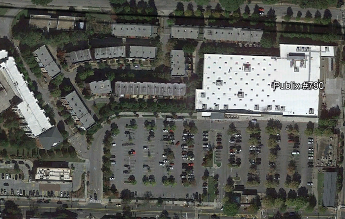
Former Publix #790
Historic Westside Village
825 Martin Luther King Jr Dr NW
Atlanta, GA 30314
Wow, what a hot topic! This controversial store probably needs more coverage than I can give it at this time, but I at least want to provide a brief overview for some additional context.
Publix #790 was planned as part of a larger community revitalization effort adjacent to the Atlanta University Center in Downtown Atlanta. A longstanding food desert in the area called for a grocery store which was easily accessible to the neighborhood's residents and the MARTA transit system. Numerous delays and endless red tape surrounding the public-private project led to Publix hesitantly agreeing to join the $130 million mixed-use development. The store finally opened in May 2002 and was touted as "A Dream Fulfilled" which was over 25-years in the making. Publix ended up opening a 28M store on the site, with the developers anticipating other businesses, such as shops, restaurants, a movie theater, and a hotel, to join the complex. In the end, Publix was the only major business to sign a lease and build a store here, with most other proposed tenets vaporizing before construction could even begin. It is also stated that Publix was the first grocery store to serve the food desert since the 1960's.
 |
| Google Earth - Historic Westside Village - April 2010 |
In December 2002, Publix celebrated its 10th anniversary in Atlanta by publishing a special in The Atlanta Journal Constitution touting all of its community accomplishments over the past decade. Publix published a similar feature in 2005 to celebrate their 75th anniversary, and both included sections highlighting the company's diversity efforts in the region. Although they touted their results in these features, as we learned with store #477, Publix sometimes misses the mark when attempting to adapt to serve different communities.
 |
| Courtesy Newspapers.com - The Atlanta Journal Constitution - December 19, 2002 Publix gave us a small glimpse of this store's Wavy Pastels interior behind Mr. Palmer |
The reason I bring this up is because I noticed a trend: any store which Publix highlighted in these press releases for "Embracing Diversity" or "Support[ing] African-American Initiatives" did not survive the test of time. I have a feeling that the company saw these stores as evidence of their good intentions to reach communities not typically served by the chain, which is why they were given such prominence in the advertising booklets (rather than, say, store #282 which serves the affluent Buckhead neighborhood). The only problem is, every store I read about that was applauded for its diversity efforts seemed to mysteriously close within a decade of opening. We will see one more example of this in Part III, but maybe this is a sign for the grocer . . .
All of this felt to me like a Publixity stunt to justify these stores' poor sales. Ultimately, economics would take over and lead to all three stores closing without replacement. After all, the articles were essentially paid propaganda; it seems like their primary goal was to get a "great job" sticker from the community rather than to discuss how profitable these stores actually were.
It didn't take long for the tone of the Historic Westside project to pivot. Then-mayor Shirley Franklin was quoted as saying "This is historic — it's a historic mess. This is just a horror story. There is no question about it." This came in 2003 after a federal audit of the project discovered mismanagement of funds, causing HUD to threaten pulling funding. Looking back, the development is cited as being a huge failure for the city, especially after Publix decided to close store #790 in 2009. No other anchor tenants ended up joining the project, until it was announced that Walmart would move into - and expand - the former Publix space, opening in 2013.
 |
| Google Earth - Walmart Historic Westside Village - October 2021 |
As an odd twist to this story, Walmart didn't tear down the old Publix, but instead expanded the building to the West. If you look closely in the picture above, you can still see the outline of former Publix #790 on the right side of the Walmart. Even more interesting, it looks like Walmart uses the former Publix space for its grocery department. I've never been to this store, but judging by pictures online, it looks like the only way to tell where the Publix once was is by looking for the absence of skylights in the ceiling.
This "boondoggle" of a project was back in the news last year when Publix announced they would open a store in Atlanta's Summerhill neighborhood. Hopefully the new project will be more successful than Historic Westside Village, but only time will tell.
With that behind us, let's move on to former Publix #535!
Part II
 |
| Courtesy Patch.com - Publix #535 - 2013 |
Nam Dae Mun #2 / Former Publix #535
Memorial Bend Shopping Center
5158 Memorial Dr Ste 402
Stone Mountain, GA 30083
Judging by the picture above, you would never guess that Publix was planning to close this store in a matter of days. The only sign of its fate is a Publix-style green and white banner carefully placed to the left of the doors reading "This Publix will close Wednesday, January 9 at 7 p.m."
 |
| Courtesy Patch.com - Publix #535 - 2013 |
Thanks to some articles I found on Patch.com, we at least get some idea of how the exterior of this store looked before the fateful day in 2013.
 |
| Courtesy Patch.com - Publix #535 - 2013 |
According to one of the articles, Publix stated that this store had been underperforming for years, so executives decided to close it. The developer of the site noted that his company was having discussions with Food Depot, Little Giant, and the broker for the Nam Dae Mun Farmers Market before Publix had moved out to see if any were interested in the space. Interestingly, the article also mentions that one of the readers suggested reaching out to Nam Dae Mun, who would eventually occupy the site. Now that we have a bit of a glimpse into why this store closed, let's hop into the time machine and look at this store's opening.
Some History
Contrary to what the tax records state, Memorial Bend Shopping Center was built in 1969 with the following tenants (among others):
- J.C. Penney
- Sears
- Henderson Furniture Store
- Swiss-Trim International
 |
| Courtesy Newspapers.com - The Atlanta Constitution - August 14, 1969 |
Since I already had a lot of content, I didn't dive much deeper into this particular shopping center's story between its construction and Publix moving in; however, I did find where the center had a large fire in April 1985 which was started while one of the stores was undergoing renovations. Now it makes sense why the tax records indicate the plaza was built in 1985!
 |
| Google Earth - Future Publix #535 - January 1993 |
When Publix decided to move here in the mid-1990's, an entire 80,000 sq. ft. wing of the shopping center was torn down, including one of the anchor stores. It was big news for this area, which had struggled to keep businesses in the recent years. Winn-Dixie had recently closed a store in the shopping center across the street, and the Memorial Bend SC had been purchased out of foreclosure while only having 60% occupancy. When Publix decided to build a new store, occupancy instantly sprung up to 100%, with TJ Maxx deciding to move in as a junior-anchor, and other businesses deciding to move or expand. This stretch of road had also struggled due to the installation of a concrete median which was designed to prevent traffic accidents on the busy corridor. As we can see above, there was no easy access to this shopping center, so the developer is said to have paid $300,000 to install a traffic light and median cut-through.
 |
| Google Earth - Publix #535 - February 1999 |
The new Publix would open by October 18, 1995, and seemed to draw a fair number of customers based on the photo above. The store design is what I like to call the 56N (you can read about the various Publix store prototypes here), and is the newer iteration of the 56D store we saw two weeks ago. I'm not certain whether Publix overestimated the number of shoppers at this store, or if the demographics shifted that much, but I wonder if this location could have survived had they built a 37D or 47N store instead of a 56,000 square-footer.
Regardless, I do believe the demographics of some of Atlanta's eastern suburbs have changed dramatically in the last few decades since the store's opening, which could be one of the reasons for its decline. Much of the Stone Mountain area is known to be home to refugees from Africa and the Middle East, and not the same affluent shoppers of the North Metro Publix stores. Currently, the closest Publix is over 4 miles away, which shows that the company is no longer interested in this neighborhood.
The Store
As you are reading through this post, I invite you to look at AFB's coverage of Publix #577 during its Wavy Pastels days. Both of these locations use Publix's 56N prototype and would have looked nearly identical when they opened.

As was the case with former Publix #477, the façade of this store looks largely the same as it did when Publix left nearly a decade ago. The current tenant, Nam Dae Mun Farmers Market, opened in 2014 after performing only minimal work to the store. That being said, let's head into that iconic 1990's trapezoidal vestibule and see what we find inside!

As I mentioned in the previous post, all three of the former Publixes I visited for this series used the stores' former cart storage area for something different; this one just happens to be the most boring, as it was used for storing cases of water bottles. At least they left Publix's original Wavy Pastels / Metallic Marketplace tile pattern in-tact! One thing that I didn't manage to get a picture of in here was an odd cutout behind me that lead straight into the store (possibly through the old photo-processing center). Even with the cutout in place, Nam Dae Mun still kept the vestibule's interior set of doors, which I thought was strange.

Even though I had looked at the store online before I visited, I really had no clue what sort of experience I was in for. I'll just say that this store, for better or for worse, has been my most memorable photo journalism experience.
As you turn to the left leaving the cut through, you are immediately greeted by a large produce department — and a giant Wavy Pastels sign for it! I was shocked that I was actually able to see one of these signs in person and wanted to find out if it was the real thing. After I overcame my excitement, I soon realized that something was very off about this décor. Why are there faux windows on the wall next to the produce sign?

Anyway, before I get into that, let's take a look at the customer service desk, which is just to the left of the entrance (I believe Publix's original location). I took this picture from an aisle that was devoted to all sorts of housewares, so I apologize for the clutter.
The first fishy thing I noticed, was the Nam Dae Mun logo on the otherwise Wavy Pastel-looking sign. Did they make an entire sign to match a 1990's Publix interior, or just place their logo on a vintage sign? This is one mystery I was not able to solve while in the store; although, the "Customer Service" font is very convincing. The text does seem a bit more condensed than the other signage, but maybe I am just looking too closely!

I decided to take a wider shot of the front left corner of the store, which brings me to my next point: why are the awnings painted olive green, and why is there so much crown molding? It wasn't long after I stepped inside that I realized I was looking at a store which had been remodeled to Classy Market 1.0 before it closed! If that is the case, why are there Wavy Pastels signs on the walls?
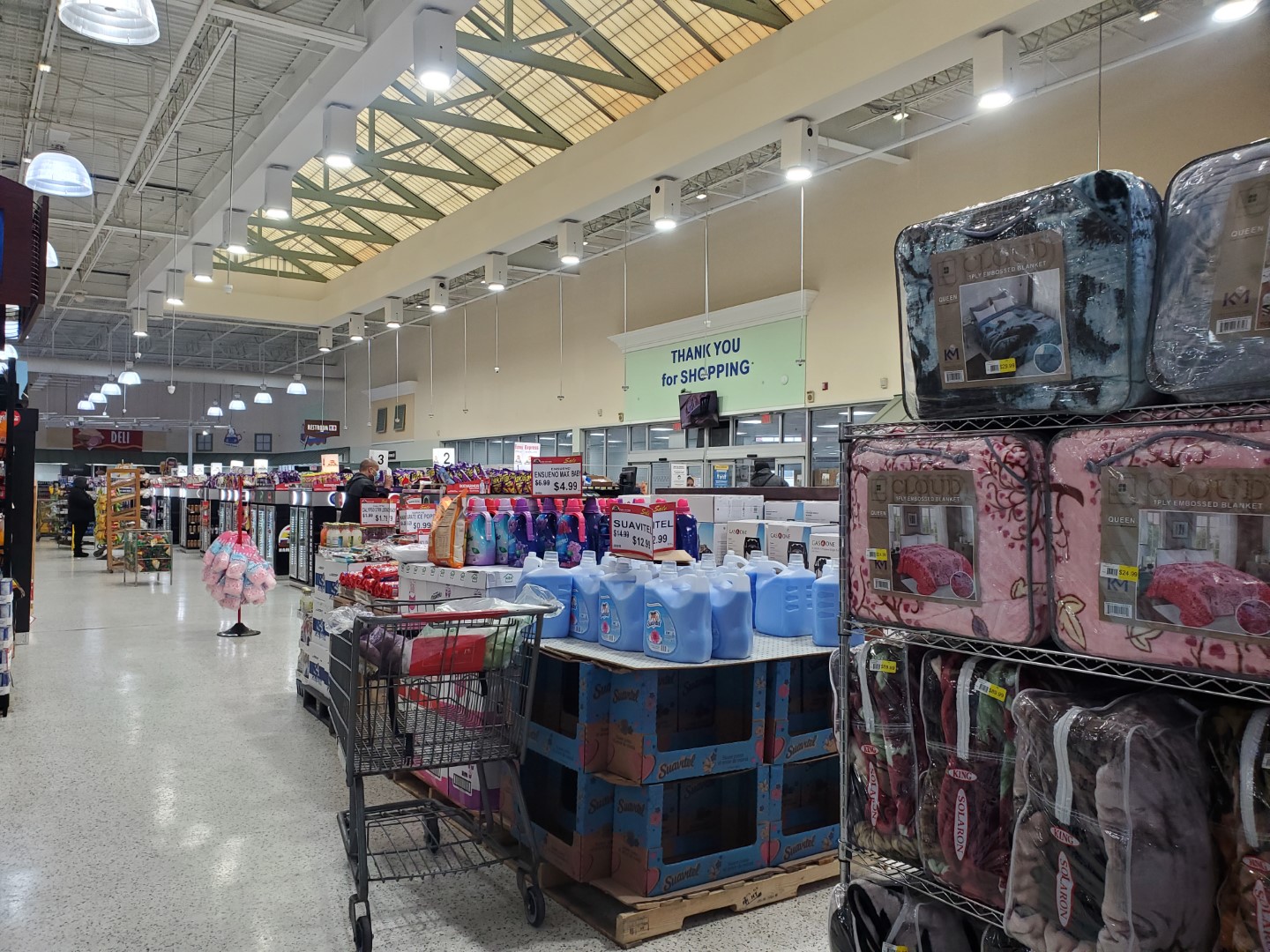
With that in mind, I took another picture with an overview of the front-end. We can see where the skylight support beams were even painted olive-green, which reaffirms my theory.

We'll take one last look at the perplexing Customer Service sign before we head back to produce.


I made sure to capture a number of pictures of the produce department, especially since I had never been to a store with "Classy Pastels 1.0" before. The picture above would have been looking toward Publix's pharmacy counter over several shelves of health & beauty products.

I've read some comments which claim Nam Dae Mun used bootleg Wavy Pastels signs throughout the store; meanwhile, I am convinced of the exact opposite. While I agree that Nam Dae Mun did make a few of their own signs, I am confident that this produce sign was made by Publix. I also thought it was very cool to see the 3D effect of these signs in person. I'm sure they weren't cheap to manufacture!
Taking a look at the wall behind the sign, we can see where the paint was patched after Publix's Classy market 1.0 signs were removed. I imagine the sign for the pharmacy or for cosmetics was originally here.

Another thing I noticed was how Nam Dae Mun left several of Publix's Classy Market 1.0 chalkboard-style category markers in place, even if the corresponding product had since moved.

The only salads here are made of fruit. I have a theory that the coolers in the photo above originally came from the dairy section of this store, so I'm not sure why Nam Dae Mun decided to place incorrect category makers over them.

Looking toward the rest of the produce department, we can see how much larger it is than what Publix originally intended; it takes up the entire left side of the store. If you zoom in on the picture above, you can also see the track lighting trellis which would have encompassed the majority of Publix's produce section.

Here is a closer view of the original produce area. I'd also like to note that Nam Dae Mun added the display cases on the right side of this shot when they moved in. If you need a refresher, this is how the department would've looked in 1995, from a similar perspective.

Here's one last shot looking toward the old pharmacy, which can be seen in this photo from #577.

Anybody want some "getables"? I believe the cooler with the carrots and broccoli marked the end of Publix's produce section, while the one to the left was moved from the dairy section to the Health & Beauty area.

Now we'll take a look at Publix's intended location for the produce signage. I find it interesting how Nam Dae Mun made this sign fit here, especially since it was originally intended to be suspended from the ceiling, not attached to the wall. Comparing it to the other produce sign, it looks like they chopped some of the empty space off the sign to make it fit, and moved the 3D produce closer to the white letters.

Here are some more produce coolers which would have been in the back of the department. This picture does make me really want "Fruit Drink," especially since the sign says there is apparently only one left on the shelf.

Turning a little to the right, we can see where Nam Dae Mun hung a banner over Publix's cut fruit station. The coffin coolers of frozen seafood were also added by Nam Dae Mun. At least the signage for "Juices" is intact and in the correct location! I believe Publix would've also used these coolers for juice, based on this photo.


A few last close-ups of some Classy Market 1.0 category markers. In addition to mushrooms, this cooler had a large selection of kimchi and tofu.
Something I haven't yet mentioned is how this store seemed shockingly empty compared to the former #477. Even in its second life, I wonder if this location struggles to draw customers as much as Publix did. After I left, I wrote in my notes that it was "nowhere near as
crowded as the other two stores," which makes me wonder if I just came at an off time or if the location really is bad (most grocery stores never seem to be this dead on a Sunday afternoon). I did, however, notice a crowd of people leaving the Islamic Community Center next door so there are plenty of people who come to this area of Atlanta.

Turning a bit further to the right, we see the rear aisle of the store and a skeleton hanging from the produce department's old light fixture.
 |
| Courtesy of Redz P. on Foursquare - October 31, 2012 |
If I closed my eyes and pinched my nose (to block out the intense smell of fish), I could almost picture myself back in Publix. While walking around this store, I heard several Publix hits including: "Accidentally in Love" by Counting Crowns, "How Bizarre" by OMC, and "The Way You Love Me" by Faith Hill. These really added to the ambiance. The only things that detracted from the Publix vibes were the pungent seafood smell throughout the entire store, and the fact that there was an international grocery store sandwiched between the dull terrazzo floors and olive-colored awnings.

Over by the seafood department, I spotted a few of these old endcap coolers. Interestingly, this one has a teal cart bumper which dates back to Wavy Pastels, but a sign that dates back to Classy Market 1.0. The original Wavy Pastels sign would have looked like this.

Finally, we get a view of one of my favorite Wavy Pastels signs: seafood. I particularly like the shade of blue that was used in coordination with the orange wave and the 3D seafood cutouts. Nam Dae Mun ended up carving the seafood counter out of Publix's former dairy section.
This picture also marks a major turning point in my tour. Several seconds after I took it, one of the patrons standing by the seafood counter turned and looked directly at me as I attempted to get a better shot of the seafood sign. My heart began pounding, as I quickly turned to look at the IGA-branded popcorn to my left. I soon heard, "That man took picture of me!" several times. If only he had known that I absolutely, positively did not want a picture of him! I only wanted the sign above him! Needless to say, I made a B-line for the door through the first empty checkout lane I found because I did not want to encounter any confrontation. I wish I had a chance to take pictures of the meat department, deli, and bakery but I was in a hurry to go anywhere but the former Memorial Bend Publix. It had me in a tizzy!
I have since discussed the encounter with others and found that it is simply something that happens from time-to-time in retail photography. This just happened to be my first (and only, knock on wood) instance of getting caught, but it could've ended with a talk to a manager, or worse, a fight. That being said, I managed to convince my friend to go back to this store with me and "stand guard" as I was taking my pictures. These next pictures are all from my second visit to this store, and hopefully my last after the experience above!

I was hesitant to take a photo of the seafood sign considering my last experience and the numerous customers at the counter, but my acquaintance encouraged me, "we came all this way, you're taking that picture." I did, reluctantly, manage to take a telephoto picture of the seafood sign on my second trip.

I didn't take many other pictures of the seafood counter because it was by-far the busiest section of the store; however, I did get a picture of this gigantic fish tank to the right of the counter. Anybody want tilapia or catfish? Well, you are out of luck. I guess only the early bird gets the fish!

Moving further toward the right side of the store, we see a bunch of pallet drops in the middle of the actionway. I also noticed that this store's dairy coolers are where Publix's seafood counter would have been.

Due to the number of other oddities about this store, I didn't take extensive photos of the grocery department. I did notice, however, that Nam Dae Mun reversed the aisle sequence when they took over the space. Originally, Publix's aisle numbering would have begun on the right side of the store at the deli / bakery and ended on the left in the produce department. This store has aisle 1 next to produce, presumably because shoppers are funneled to the left side of the store as they enter. Between produce and the cleaning supplies aisle is the large housewares section I mentioned above.
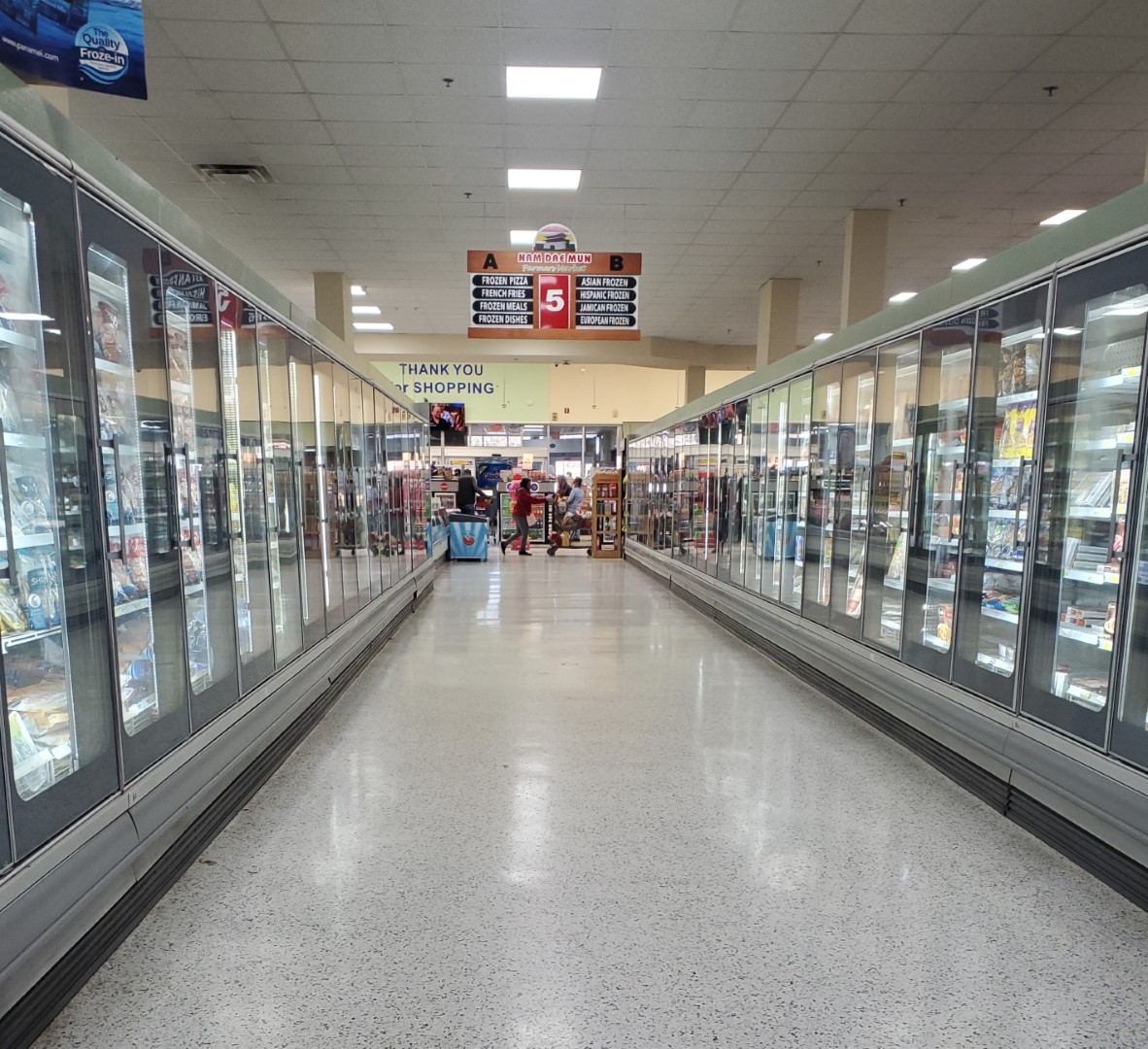
Similar to Publix, frozen foods occupy the middle of the store, in what looks to be this store's original freezers. Back in 2013, this would have been Publix's aisle 9, home to the likes of frozen entrées and pizzas.

Dry goods take up a large portion of the grocery aisles on the right side of the store, including aisle 10.

I popped out of the end of aisle 10 to get one more look at some of the Classy Market faux shutters which were hanging over the restrooms.

As I mentioned before, this store carried a number of IGA branded products even though it didn't mention an IGA affiliation anywhere else.

I also wanted to capture some of the variety offered in this store and thought Chick-fil-A sauce was a perfect example of that. Even in a Korean farmers market, which primarily serves Middle-Eastern and African cultures, you can still find something from the Atlanta staple! I feel like this picture is very descriptive with regards to the yellow signature sauce: it is sandwiched between BBQ sauce and Dijon mustard, two of the most noticeable component flavors.

Returning to the back of the store, the next sign for me to capture is the one for dairy. As I mentioned before, this section of crown molding would have designated the seafood counter back in 2012.

We'll take one last look over the back of the store before we move on to the meat department. At this point, you may be wondering why I haven't addressed the elephant in the room: where in the heck did these Wavy Pastel signs come from? The short answer is, I don't know. I wonder if Nam Dae Mun purchased them at an equipment auction, with the intent to hang them up in another store, or maybe Publix left them in a back office or storage room. Regardless, I am confident that NDM did not make all of these signs from scratch because they have another location (in a former Target of all places) which uses obviously bootleg versions of Wavy Pastels signs. I am also confident that NDM didn't pull these signs from a different Publix they own. I just have to say, please hold any other theories you may have about the signs in this store until Part III comes out in two weeks; it will certainly make things clear as mud.
That former Target also has some aisle signs which look remarkably similar to Sweetbay's, but that could be a total coincidence.

The next area we will take a look at is the meat department. Unlike some of the other sections in this store, the back right corner remains largely unchanged from the way Publix intended it to be. As you can see in the picture above, it even managed to have quite a large selection of beef.

No bull here, I spy a Wavy Pastel square tile pattern behind the butcher counter!

It looks to me like the coffin coolers are still in their original configuration, too. Those metal cart bumpers on the corners look like something Publix would have installed.

In addition to the wide variety of beef, you can also buy goat whole for $7.99/lb.

To compliment the goat whole, why not buy whole lamb for $6.99/lb.?

All jokes aside, this meat department mostly harkens back to Classy Market 1.0 with its olive awnings, grey cart bumpers, cream walls, and faux windows.

Spinning around, we see the remainder of the grand aisle, which has also maintained Publix's original layout. Does the bakery shelving remind anyone else of something you might see at Fresh Market?

Similar to before, authentic (albeit, possibly modified to fit in the space) Wavy Pastels signs have been secured to the walls to signify these departments. NDM also decided to utilize the extra space in front of the deli to house wine.

We can also see some more of Publix's track lighting fixtures hanging over this portion of the store.


Something I noticed behind the deli counter was one of the iconic Wavy Pastel tile patterns. It looks like there may be another motif on the left side of this picture, covered up by a metallic sticker. I do wonder what Publix did with these during Classy Market 1.0 and 2.0 eras, but I know they place stickers or tile over them as part of Sienna remodels. Maybe they will reappear with Evergreen, who knows!
I believe I have seen a couple of stores where Publix physically removed the pink-and-teal tiles, just to replace them with similar white tiles. That seems like it would get expensive!

Just for reference, I saw another motif popping out from behind an unplugged bug-zapper.

Publix's old hot foods section is now home to the "farmers kitchen." This sign is obviously a bootleg imitation, but it still uses a very convincing font. While this sign did make me question whether or not the others were authentic, I'm still confident that the ones for produce, seafood, dairy, meats, deli, and bakery are legit (even if they were slightly modified to make them fit on the wall).

I believe this corner of the store would've been the Pub Sub station. Now it is used as a "substation" for charging electric scooters.


We'll also take one last look at the deli / farmers kitchen / wine section.

And there you have it, possibly the only example of Publix's rarest décor that nobody asked for: Classy Pastels 1.0. While many of Publix's modern Classy Market packages can mesh well together, the bright colors of Wavy Pastels don't quite blend with the muted Earth tones of Classy Market 1.0. Now that we know Wavy Pastels isn't entirely dead in 2022, we'll see even more proof in two weeks when I release Part III of When Publix Waves Goodbye. Stay tuned!
- The Sing Oil Blogger
Aerial Views
 |
| DeKalb County Property Appraiser - Publix #535 - March 4, 2003 |
 |
| DeKalb County Property Appraiser - Memorial Bend Shopping Center - January 24, 2007 |
 |
| DeKalb County Property Appraiser - Publix #535 - December 20, 2012 |
 |
| DeKalb County Property Appraiser - Nam Dae Mun Farmers Market - January 28, 2015 |
 |
| Google Earth - Nam Dae Mun Farmers Market - December 2020 |
Update: I also found a few pictures on Flickr shortly after this Publix closed but before Nam Dae Mun moved in here & here.

Additional Resources:
Sing Parcel ID: 18 091 08 003
Publix Parcel ID: 18 068 01 004
DeKalb County Property Records (Nam Dae Mun)

I have so many questions about the decor in this place but just as few answers. The Bakery, Deli, Customer Service, Meat, and Produce signs look identical to the original Wavy Pastel ones, but like you, the Farmer's Kitchen one is really throwing me off. As far as I'm aware, Publix never had a concept called the Farmer's Kitchen. If Nam Dae Mun had someone make all these signs bootleg, then I don't know why they didn't go back to those same people for the signs used in the old Target they took over!
ReplyDeleteIt's so much more apparent in your photos that this store had CM 1.0 when it closed, as opposed to the Google pictures. Seeing signs from the decor package CM 1.0 replaced meshing with the CM 1.0 remnants is the weirdest thing, and adds so much more to the mystery of how the decor came to be.
At least it was only a customer that saw you take a picture, and not an employee, although getting caught by anyone isn't ideal. I've been caught by a few customers taking photos, 95% of them just curious as to what I was doing and not mad at all. Interestingly, one guy even apologized for getting in my way as I was taking a picture of the exterior of a Publix store! Only once do I feel a customer ratted me out to management about taking pictures with a not-so-great outcome, and that was my incident at the Royal Palm Beach Winn-Dixie, but that's a long story for another time if I haven't shared that experience with you already. At least the guy who caught you here was only freaking out to whoever he was shopping with, and didn't try to confront you in the aisle about taking a picture (either verbally or worse, physically). He certainly didn't sound happy from what you describe, so I don't blame you for getting out of there quick before anything could have escalated. As least you had a friend willing enough to come back out here to join you for the re-shoot and stand guard!
I never heard the story about Publix #790 before, but with its 2002 opening, that has to be the newest Publix store to close yet for any reason (be it outright or for some kind of replacement). #790 is certainly up there with #460 in Statesboro for being Publix's biggest flop of a store, although #460's problems were much different than what #790 faced. I agree, #790 (and some of the others that closed outright) appear to have been nothing more than a "Publixity" stunt, an expensive write off for some good PR for the new chain in town to gain good growth momentum. The way Walmart repurposed #790's old building is certainly odd - I've seen former Publix stores get turned into Walmart Neighborhood Markets before, but not expanded into a full Supercenter like that, keeping the original building too! Lots of strange things from Publix past were covered in this post, that's for sure!
I agree, there is so much about this store that doesn’t make sense. One thing I did notice is how the motif on the “original” signs (produce, bakery, deli, meats, dairy) featured 3D elements while the obviously bootleg components (the chicken logo on Farmers Kitchen and the NDM logo on Customer Service) were 2D. Comparing the Farmers Kitchen sign to the signs in the old Target really throws me off. Maybe we will get a bit more clarity after Part III, but I know some things will remain a mystery.
DeleteEven though we could see a few CM 1.0 remnants on Google, they were blatantly obvious in person. I just wish Nam Dae Mun had thrown in some Metallic Marketplace pieces to really seal the deal. Now we just need to find an in-tact Metallic Marketplace store!
Yes, I am glad it was only a customer who noticed me and not an employee. If I saw somebody else taking pictures, I would just try to turn away and mind my own business. At least you were able to make it out of the Royal Palm Beach Winn-Dixie to tell the story! I’m also glad that I was able to convince my friend to go back for some moral support.
I was shocked when I first learned about Publix #790’s existence from a news article, and I’m glad I’m not the only one. I’m actually not sure if it is the newest store to close; there are a few other Atlanta area stores from the same era which have also come to the same fate (#804, #860, & #875). Interestingly, both #860 and #875 also closed in 2009, but I have no clue what the reasoning was or what the surrounding areas are like. I imagine these stores had problems similar to #535, as opposed to #460 or even #790. Looking back, an expensive write off seems like a good way to describe #790 and I’m sure it is only a drop in the bucket compared to the rest of the chain’s revenue. All around, this post was very interesting to research even if it led to some strange realizations.
Heh, "Publixity stunt" -- love it XD In all seriousness though, you explain the (odd) scenario behind that store very well -- you definitely have a gift for investigating and writing that sort of thing. (I'm awful at coming up with words most of the time!)
ReplyDeleteI was aware of the wonderful mystery that is Nam Dae Mun and its some-real/some-reproduction Wavy Pastels décor already, from discussions on Discord a few years back. While it's exciting to finally see photos of this place, what's even more exciting to me is that you got to experience all of this firsthand, without already knowing what you were getting into -- I'm sure it was tons of fun unexpectedly encountering this, and then doing all that sleuth work and photo examination trying to piece together what exactly is going on!
My inclination all along has been to believe that these signs are all reproductions, but I suppose if both you and AFB, who are way better Publix experts than I am, believe them to be real, I'll just have to defer to y'all on that. The surprisingly well-done Farmer's Kitchen sign, to me, calls into question the legitimacy of the rest of the signage, notwithstanding the ugly bootlegs in that former Target: clearly, they had a better designer at one time, so the Target signs don't automatically discount the argument that the other signs at this location could be fake (at least, to me). That said, to play devil's advocate, Nam Dae Mun could easily have purchased these at auction and installed them here. In either case, I question why they bothered removing the existing décor to put up this new décor, haha! But that's enough speculating, especially since you said to hold that until the next post in the series (whoops :P )
I'm sorry to hear about the encounter you had, but definitely glad it didn't escalate any further and that you quickly got out of there. I fear things like that all the time (doesn't help that I'm a paranoid person anyway, lol), but from what I've heard from others in the community as well as even just random online reviews is that international grocery stores, for whatever reason, seem to be a lot more consistent in having issues with people taking photos. Even worse, a language barrier can also sometimes come into play, as it did for PlazaACME. Needless to say, I've avoided going to any international stores for pictures, which is a shame because they are also quite consistent for having rare/unique/outdated/anomalous decor, as is the case here. Glad you were able to go back a second time, with backup and without issue. (Friends don't let friends take retail photos alone, haha!)
Well I’m glad somebody appreciates my writing style! I feel like I am typically bad at coming up with words like “Publixity,” but sometimes they seem to just fall into my lap. I probably spend too much time researching these old stores; I just get caught up in learning the stories of some of these places.
DeleteI’d say that the former #535 is certainly a “wonderful mystery.” I was very excited to learn about this store and the others in this series; especially since I got to experience them! Thanks to Google Maps, I did have an idea that this store didn’t close with Wavy Pastels, but it was still fun to theorize about the reasons behind that with AFB before and after I went. It was really fun to try and piece together the mysteries of these stores.
If these signs were reproductions, then Nam Dae Mun had the exact template Publix used. The 3D motifs on the department signs (produce, seafood, dairy, deli, bakery) seem to match original signs I have seen: https://flic.kr/p/kQ4mP (from store #474 in Columbus, GA). It does look like the stuff on the sign may have been moved to make it fit, since some of the elements feel a bit squished. That being said, the Farmers Kitchen sign still throws me off (as I mentioned before to AFB, that sign did not feature any 3D motifs, similar to NDM’s customer service sign). I do wonder why they would bother removing the Classy Market 1.0 interior when they took over this store. It is fair to say that there is plenty of room for more speculation, but Part III will certainly add a bit of spice to the argument!
I can say that I feel much more comfortable taking pictures in a normal Publix or Winn-Dixie rather than a former one. I’m just glad that I got out mostly unscathed (and I feel like the end product was worth it)! I do feel like the international grocery stores seem to have more issues with people taking photos. Maybe you can find a friend to venture to one with you. Indeed, friends don’t let friends take retail photos alone!