
Camilla #2 - Camilla, GA

Camilla #2
Sing Food Store | Deli
Camilla, GA 31720
Circle K #5153 | Former Flash Foods #283 | Former Sunrise Pantry
Scroll Down for my More Than Convenience post on former Harveys #2411 / #1669
Welcome to June! We here at The Sing Oil Blog typically don't acknowledge many special occasions, but I wanted to be sure to celebrate this time with people across the country and across the globe. The month does, after all, mark one of (in my opinion) the most joyous times of year: the arrival of summer! What better way can you think of to celebrate exploring some photos from the original home of Sing Oil Company: Mitchell County, GA.
My how time does fly, as it seems like it's been a minute since I've written a post on a former Sing. That will all change today since we are back on track following my two-part Disco Diversion. For today's topic, we'll head down to Camilla, Georgia to take a look at Sing's second station and first convenience store in the town, located just minutes from where the company was founded. In addition to the Sing, we'll take a look at the area's only remaining stand-alone full-service grocery store to see what pieces of the past we can dig up inside the IGA (spoiler alert, there are a lot).
Without further ado, let's dive into Camilla #2!

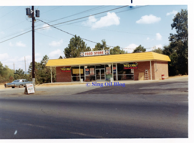
Located just south of Camilla's downtown, this former Sing is positioned in the crux of the curious intersection of South Boulevard Street and South Butler Street. It's obvious that Sing was situating itself to be more of a neighborhood store rather than an oasis for travelers considering it was built on the relatively quiet two-lane Georgia Highway 97/112 rather than the newly-constructed US 19 "bypass". The reconstructed Highway 19 may today represent most of Camilla's commercial activity, but I'd imagine most businesses were still located in downtown proper when Sing picked this site.
While I wish I could give a more concrete answer, the precise history of this
station isn't exactly crystal clear. Camilla doesn't have any readily-available digitized newspapers, and the only potential vintage photos I have of this location are undated. I still, however, believe these three black and
white photographs were taken under this
station's pump canopy.

As a quick aside, I'd like to point out how the octane ratings we see for regular and ethyl (premium) gasoline are higher than we are accustomed to seeing today. According to EESI.org, "The octane rating is a measure of a fuel’s ability to avoid knock. Knock occurs when fuel is prematurely ignited in the engine’s cylinder, which degrades efficiency and can be damaging to the engine." Essentially, the higher the octane, the less prone a given fuel is to creating engine knock. Most standard gasoline engines will run just fine on a modern 87 octane regular gasoline, but high-performance or turbocharged vehicles will still call for 91-93 octane premium gasoline to prevent knock and enable higher compression ratios the engines were designed for.
Before it was phased out in 1996, tetraethyl lead was added to gasoline to increase octane and reduce engine knock, with the highest levels being used in the namesake ethyl premium grade. Unleaded gasoline began to be rolled out during the mid-1970's after the Environmental Protection Agency mandated the availability of at least one grade for use in 1975 model year and newer vehicles. These cars were the first to use catalytic converters to reduce tailpipe emissions and required unleaded gasoline to prevent damage to internal components.
So why does this matter? It seems that octane ratings for a given gasoline grade dropped following the advent of unleaded gasoline and computer-controlled ignition in vehicles. That would explain why the Sing Super Premium boasted a 100 octane rating while modern premium gasoline in Georgia has a 93 octane rating.

Back to the photographs; the two men shown are unidentified, so unless somebody reading this has an idea of who they may be, that will just be something else lost to time. Based on how they are dressed, it appears that the man on the right was Sing's gas station manager while the man on the left was a pump attendant. I'm presuming these photos were taken for some sort of advertisement.

As for how I know these photos were taken at Camilla #2, the key is the house located behind the man in this picture. It appears to be a perfect match for the one we see here on South Butler Street.
So, what?
Well, the Mitchell County Property Records indicate this store was built in 1982, but the pump canopy in the photos appears to be a design that Sing last used around 1970. Furthermore, the exterior of the convenience store matches a 1970's model Sing Store rather than one from the 1980's.
 |
| Courtesy Andy Callahan (Flickr) - Former Flash Foods #282 - October 3, 2009 |
What adds to the mystery is the fact that somebody has added onto the left side of this store, leaving us with an annoyingly off-centered setup. This 2009 photo shows us the addition which not only juts out past Sing's original sidewalk, but also sticks out past the original front of the store. At least Flash Foods centered their sign on the current building even if the door to the store (which was originally centered) is now awkwardly located behind a pump canopy column. The setup also looks strange with how Sing's original columns (painted grey here) are now dispersed almost randomly across the front of the store.
To add to the intrigue, if you zoom into the photo above, you can see some vintage Sunrise Pantry décor shining through the windows.
Who is Sunrise Pantry again?
 |
Circle K - Former Sunrise Pantry / Flash Foods #281 - Pelham, GA |
You may remember me mentioning Autry Petroleum in my post on, say, Thomasville #6, or Thomasville #5, or maybe waaay back with Albany #3, for being the company who purchased several of the South Georgia Sings from Amoco following the 1990 merger. In addition to the aforementioned stores, Autry also purchased the Camilla station and converted the convenience store to its Sunrise Pantry branding (similar to what we can see above in Autry's former Pelham station). Autry held onto the stores for roughly 10-years until they were sold to Flash Foods in 2004.
 |
| Courtesy Andy Callahan (Flickr) - Former Flash Foods #282 - October 3, 2009 |
It honestly wouldn't surprise me if all Flash Foods ever did to the interior of this store was swap out the beverage branding to their signature Cumberland Island Coffee look while leaving everything else in place. They certainly didn't do anything during the first five years! As even more of a surprise, Flash Foods continued to operate Sing's former delicatessen at this location.
 |
| Courtesy Flash Foods - June 26, 2019 |

That'll bring us to the present state of this former Sing, so let's jump inside to see what has changed.

Wow, save $2 when I buy two packs of Marlboro cigarettes?! Save 20¢ a gallon on premium gasoline on Thursdays?! It looks like I'd save more money here than I even do at CVS; what a deal!
Sarcastic savings aside, this place also has some herringbone wood paneling which is an intimation of a former Sing.

The pump island, on the other hand, doesn't have much of anything which screams "Sing Oil Company" to me (considering it was built in the mid-1990's). If only that dastardly pump #1 didn't block my view to the old Sing vacuum light!

On the other side of the store, we can see how the addition sticks out from the left side of the building and how the original concrete walkway was extended when the new pump canopy was built.

Wow, sometimes I do a terrible job photographing a store!
Part of the reason is I never want to look suspicious in a convenience
store (tight spaces will do that to you). Anyhow, at least I managed to
get a few shots that posed even more questions for me to investigate.
Our first poorly-framed photo showcases the entrance to this store and brings to light one inquiry: why is the vinyl flooring two different colors?

Ahh, that's a better angle! Looking across the front right wall of the store, we see this Circle K's extensive collection of coffee cups followed by the Polar Pop and Froster machines off in the distance.

About the flooring: here's a better look at the change in flooring in front of the cashier counter. What trips me up is how the vinyl in the majority of the salesfloor matches what we saw in LaGrange #2, Columbus #4, and Thomaston. I believe the lighter flooring and red stripe were under Sunrise Pantry's deli counter we caught a glimpse of in the 2009 shot. Is this actually original to Sing? Why is that red stripe there?

Well, the red stripe continued all the way to the drink coolers along the back wall of the store. Since I haven't seen this in any other store, my guess is that Autry ripped up Sing's old flooring in the middle of the store and along the back wall when they remodeled the space but left the rest intact.

As for the bubble graphics surrounding the drink coolers (with the set we see above being along the back left wall of the store), those would also date back to Sunrise Pantry since they appear to match what I found in Pelham. Maybe one day I'll find myself in the area again and can take some better closeups of these!

Along the left wall of the store, we find a common sight for 2023: huge stacks of Bud Light for sale. The recent controversy has certainly caused sales to decline, but different news outlets disagree as to whom is now on top of the beer market. Regardless, I was recently at a large sporting event where I would typically expect to see hundreds, if not thousands, of people indulging in a Bud: I counted precisely two cans of the blue beer in people's hands and another possible two that were slightly obscured. I certainly did see hundreds, if not thousands, of beer cans from other brands! Then again, that experience is totally anecdotal, and I am certainly not a market researcher.
It was only when I was looking back through my photos that I noticed how much more Bud Light was stacked against this wall compared to the other brands. In retrospect, I wish I could have taken a wider shot to get an accurate comparison to the other labels. The actual reason I took this picture is to point out the mysterious doorway all of this beer was blocking—I have no idea what it led to but it must not be anything important. This was located on the side of the store with the addition, so it could just be an alternate entrance to more storage space or some back offices.
Above the door sat a sheet of paper reading, "Best potential placement for games. Please check for power. - Thanks, Island Games." It looks like this Circle K may be next in line to receive some "gambling machines" which are certainly a hot commodity in today's convenience stores; I'm surprised it didn't have some already!

The red tiles can also be seen on the left side of the store and are really showing their age on the portions next to the drink coolers. Maybe that's from condensation dripping down on the floor?

Our last look inside will show more of the awkward flooring transition in front of the cashier counter, while leaving me wishing I had pointed my camera up just a little bit more!
And with that, let's take a look at some street and aerial views before heading down the road to Camilla's HIGA (Harveys IGA, that is).
Street Views
Google Street View - January 2008
Aerial Views
 |
| Historic Aerials - 1968 Future site of Camilla #2 Sing Store—it looks as if the pump islands may be under construction |
 |
| Historic Aerials - 1983 Camilla #2 Sing store (believe me, the building is there) |
 |
| Google Earth - 1993 Sunrise Pantry / Amoco; Former Camilla #2 Sing Store and original pump canopy |
 |
| Google Earth - 1999 Sunrise Pantry Food Store and new pump canopy |
 |
| Google Earth - November 2014 Flash Foods #282—notice the bright roof of the addition on the left side of the store |


H&H HIGA

Hendricks & Hays IGA
Former Harveys #2411 / #1669
Camilla, GA 31730
The last two weeks have been a bit crazy for me, so I'd like to apologize in advance for the lack of spunk and spice in this post; furthermore, HBO's Succession doesn't exactly provide the best fodder for PG-rated content!
Hopefully my seven-layered snark can return by next post, but in the meantime, I still managed to crank out this post which covers an interesting piece of Harveys history. Let's find out what makes it so special.

Before I get too deep into the Camilla Harveys story, make sure to read my post covering Harveys #1671 if you haven't done so already because I go into detail on the history of the formerly Nashville, Georgia-based company.
Part of that history includes the fact that Delhaize Group purchased the family-owned supermarket chain in 2003 while continuing to operate the brand as what seemed to be a separate entity. In the early years, the only noticeable changes were the various Food Lion stores across South Georgia and North Florida which were mysteriously changing to the Harveys brand. I've seen one such location in Statesboro, GA (in addition to a cheap Office Max to Office Depot conversion I was very confused about) but there are tons of other examples out there—some of which have even returned to the Food Lion name!
Delhaize eventually decided to change things up with Harveys by closing the Nashville, GA, offices, eliminating the Harveys name on private-labeled products, and consolidating many business operations with Food Lion. Most of these things aren't typically good signs for a chain, but I suppose Delhaize did still improve some aspects of the brand by debuting a new logo and much needed interior refresh with Ocilla's store #2400 in 2007.
 |
| Courtesy Charles Burgess Jr (Flickr) - Former Harveys #2398 - Americus, GA - June 28, 2013 |
I want to pause for a minute and take a look at the former Harveys #2398 in Americus. In a twist of fate, this store was constructed in 2007 to replace two other Harveys in town and happened to be the final location to open with the Harveys Grid interior. If you think back to my previous post on the current Americus Harveys, 2007 was the traumatic year for the town due to a devastating EF3 tornado. That tornado ripped apart the town's Winn-Dixie Marketplace and also apparently caused damage to the old Harveys next door. This prompted both Delhaize and WD to build new stores in town, both of which would be the first in the world to debut new design aspects. The Beef People decided to use Americus to showcase the first ever Transformational Store layout (even though it still featured an outgoing interior package). Likewise, Delhaize used the brand new Harveys as the first store to exhibit the newly-redesigned logo. This store eventually converted to a Food Lion around 2013 which makes me think Delhaize decided to hold onto it for some reason following the sale of Harveys to BI-LO holdings. Now I wish I had stuck my head inside this Food Lion while I was in town!
Anyhow, I think it's interesting how the same twister brought about two firsts for the Southeastern retail scene!
Like I alluded to above, Delhaize continued to improve the Harveys fleet of stores by replacing several aging locations with brand new buildings between 2007 and 2013. These new stores served as a stark contrast from the inherently "cheap" nature of how Harveys previously felt, but I would have to guess that less than 10 supermarkets were ever built using the new layout and only 5-10 existing stores were remodeled to the new interior.
Most of this momentum seemed to stop following the company's sale to BI-LO holdings (now Southeastern Grocers) considering how I've only seen the oddball Winn-Dixie conversion here and there since then. To add to the quirks of the former Albany WD, SEG even went through the effort to install Delhaize's package in 2013 before remodeling the store again to Yellow Down Down in 2016.
Between 2016 and 2018, SEG managed to eradicate the Harveys Grid interior through Yellow Down Down remodels and subsequent bankruptcy-related store closures while holding onto a meager two locations with the 2007 Delhaize package.

The store we'll be looking at today has a surprisingly long history to it as well: so long that I don't even know where it begins! The Mitchell County property records indicate the original Harveys was built between 1978 and 1981 and I don't necessarily have anything to disprove that. It's also worth pointing out that Harveys could've previously had a smaller store downtown since the company has considerably deep roots in Southwest Georgia.
 |
| Courtesy Andy Callahan (Flickr) - Former Harveys #2324 - January 24, 2011 |
The original Harveys in this shopping center was a minuscule 16,000 square feet and served the local residents until roughly 2011. I really wish I could have seen this store before it closed because the exterior is certainly intriguing; this is the epitome of a hometown grocery store!
It wasn't long after this photo was taken that the small and dated supermarket moved roughly 30-feet to a shiny new store courtesy of Delhaize.
 |
| Courtesy Andy Callahan (Flickr) - January 24, 2011 |
On the other hand, it appears that construction was not yet underway or still in the very early stages in January 2011 because the brand new store was built immediately to the left of this late-1980's Rite Aid. I'm personally surprised it took over two decades for this strip center-style pharmacy to gain a neighbor to its left considering space was seemingly allocated for such.
The new Harveys did prompt Rite Aid to update the façade of this store, but I'm not entirely sure if the exterior construction brought an interior remodel along with it.
 |
| Courtesy Charles Burgess Jr (Flickr) - Former Harveys #2411 - May 3, 2012 |
The brand-new 21,000 sq ft Harveys would open its doors to shoppers sometime in late-2011 or early-2012 using a building design Delhaize first rolled out in Ocilla. Doesn't this exterior setup remind you a bit of a 1990's Food Lion?
 |
| Courtesy Charles Burgess Jr (Flickr) - Former Harveys #2324 - May 26, 2014 |
As for the old location, it sat vacant for several years before Farmers Home Furniture moved in and updated the façade.
On May 3, 2014, the 2+ year old Harveys #2411 would permanently close its doors to give way to Harveys #1669 on May 9th. This was part of the conversion from Delhaize to BI-LO holdings, but the "remodels" only consisted of clerical changes (like the store number) rather than physical changes in most cases.
Harveys #1669 permanently closed in March 2018 as part of Southeastern Grocers' massive 2018 bankruptcy closure round. It was at this time that local IGA operator Bob & Jeff's decided to seize the opportunity for expansion. At a minimum, I know the company acquired three former Harveys locations (here, Dawson, and Thomasville) to convert into the IGA nameplate. It still confuses me why the IGA franchisee seemingly pretends that the various locations are independent by using different names but common sales flyers. I've come across even more stores that seem to be owned by the same group in Bainbridge, GA, Madison, FL, and Monticello, FL. I'll just say that this won't be our last run-in with Bob and Jeff . . .

Now that we know a little bit about this location, let's see how it looked in 2022.

I guess you could say that this photo was taken during "golden hour"—it's just that the harsh lighting also seems to make the signs on the building nearly illegible. Even if I didn't take this photo, I could've told you that it was taken during late-Fall / early-Winter due to the extreme sunset lighting and the clear, slightly hazy sky. South Georgia is seemingly always full of humidity (and thus clouds) unless it is the dead of winter!
I like how Hendricks and Hays kept the Harveys façade in place, as the checkered design is really an interesting way to dress up an otherwise boring building.

It's also worth taking a quick look at the former Rite Aid next door. It's façade appears to have been redone around the same time that the new Harveys was built based on the 2011 photo we saw above. Like many former stores I've seen across Georgia, this location closed following the Walgreens buyout since a newer Walgreens is located 8/10th of a mile away on US 19.
 |
| Happy Fall, y'all! |
I really had no clue what kind of store I'd walk into here since there
weren't any recent pictures posted online, but I can tell you right now
we are basically standing inside a Harveys!
 |
| Isn't broccoli usually refrigerated? |
Let me formally introduce you to what I call Delhaize's "Southern Farmstand" décor. It may not look like much, but this circa 2007 package was a much needed upgrade to the aging "Harveys Grid" interior. I will say that we won't get to see a perfectly intact version of Southern Farmstand today because several of the accent pieces have been removed; however, the "Fresh Produce" sign, green checkered vinyl tile, and wood paneling are all original: well, sort of. The biggest thing that confuses me is why the original paneling, which used to feature agricultural graphics, was replaced by the plain paneling we see here.
 |
| No Barefoot today . . . |
Turning down aisle one, we see this store's wine department housed along Harveys' former "Wall of Values". I didn't notice this while I was in the store, but the "Wine" sign was custom-made by the current tenant and doesn't quite match the originals . . .
I'm also not a wine drinker, but it appears that the IGA has kept its wine selection in line with what Harveys would have offered: plenty of Yellowtail and Barefoot.
Speaking of wine, I noticed a paper sign taped to one of the shelves which read, "No alcohol sales today it is election day." I can't think of anywhere else I've seen local codes barring alcohol sales on Election Day, so I wonder if this was an initiative embarked on by the store owner.
 |
| Quality |
Retail Retell, here is another subtle design cue for you! A clever piece of the Southern Farmstand package is the fact that the floor tile colors coordinate with the adjacent department. As we saw before, Produce features a green pattern, meat features a red pattern, dairy features a grey pattern, and the deli/bakery features a brown pattern.
The wooden design behind "Quality Meats" sign is one of the only original adornments left behind besides the department signs themselves. I'm glad this has remained, but I will say that the rest of the walls feel pretty empty since they now lack some of the Harveys-specific graphics. Oh well, at least they aren't grey!
 |
| How many supermarkets stock pure cane syrup? |
Meanwhile, the grocery aisles and front end of the store use a simpler tan tile pattern. All of these different flooring designs remind me a bit of Southern Farmstand's sister package: Rutherfordton.
How much shelf space can a store dedicate to ramen noodles?! At least all of the grits on the right make a bit more sense considering how this store is in the heart of the Deep South, and its former tenant would have also focused on carrying similar Southern specialties.
 |
| Cardboard boxes make the best display pieces! |
Jumping back to the rear actionway, we see the dairy department come into view along with the corresponding flooring transition.
 |
| Since when did Ruffles release "Ridge Twists"? |
I'd like to point out how the dump bins in this part of the store (one of which can be seen in the center of this shot) were built out of the same wood paneling we saw in the produce department that looks to be straight off the shelf of a Lowe's. I honestly applaud the effort Bob and Jeff's put into little things like building custom dump bins, but that still makes me wonder why they had to change out the paneling in the produce department in the first place! Did they not like the agricultural graphics? They don't seem any tackier than some of the other pieces of the package. Did Winn-Dixie remove these for some reason? I doubt it since SEG didn't even design the package, and only held onto two stores with the interior following the 2018 closure round. Did Bob and Jeff want to make this package easier to replicate? Hmm . . . I may be onto something.
 |
| Juicy |
Taking a look down aisle seven, we see this store's selection of snacks and juices. I think it is interesting how Delhaize chose to use a number "7" with a line through it, as that isn't a common thing to come across.
As a random aside, I began to draw a line through my sevens during one of my college math classes after seeing a professor drawing his like that on the board. I can vividly picture the professor and the class, but I can't exactly figure out why I decided to change an aspect of my writing style on a whim like that.
The same professor also wrote his ones like a carrot (^) symbol which was very confusing during the first week or two of class. Thankfully, I did not pick up that habit! I guess I didn't want to confuse my sevens with my "normal" ones?
 |
| Water you looking at? |
Another thing I appreciate about this package is the fact that the aisle signs seem to be divided to indicate which items are on which side of the aisle. Aisle 9 makes that obvious with frozen items being exclusively listed on the right side of the sign while water and charcoal are on the left.
The restrooms and bakery in the front of the store can be spotted off in the distance.
 |
| Freshly-baked White Claw |
Since I mentioned the bakery, it is in the front left corner along with the deli. Does this store's general layout remind anybody else of a 1990's Food Lion?
It appears that Bob and Jeff have decided not to stock a bakery or deli in this store, despite the fact that the original signage is still in place. That's a bit surprising because I think Harveys did a good business with its Cheap Chicken Mondays.
I will say that one of my pet peeves with independent grocers is the use of neon-colored price labels. This store wasn't nearly as bad as others I've seen (ehm, Food Depot), but the tags still seem to detract from an otherwise put together store. I suppose they do accomplish the goal of grabbing my attention!
 |
| That was a Cold One, I never will get back |
I will admit that parts of this décor are a bit kitschy, but they aren't really out of place. The majority of Harveys stores at the time were located in rural South Georgia farm towns and the agricultural theme really works in the context. I can also hands-down say that this is the classiest environmental package I've seen in a Harveys (which isn't hard when it is up against the green grid and Yellow Down Down).
Beer, too, was off limits on the day I visited, which still makes me wonder if shoppers could have just driven down the road to the tiny (70,000 sq ft) Walmart Supercenter for their fix.
 |
| River Deep & Mountain (Dew) High |
Just because this store was designed by Delhaize, doesn't mean it lacks any remnants from Southeastern Grocers. If you zoom into the photo and look at the wall to the right of the double doors, you'll see a "SPILL SPILL SPILL" sign that is a common site in Winn-Dixies across the region.
 |
| Somebody needs to restock the Pepsi cooler . . . Isn't Georgia Coke Country? |
Heading back up front, we can see how both Winn-Dixie and Bob & Jeff retained this store's original checkout lane lights—if only I had taken a better picture of them!
I'd also like to point out the irony of the sticker display in the center of this photo: there are several Georgia-themed designs marketed by "Carolina Decals". Enough said.
Stepping back outside, we come across some familiar friends: two Delhaize cart corrals.

The sunset supernova really seemed to do me in for this shot of the old Harveys and adjacent Family Dollar; even though you can't really see the Family Dollar on the left, you can the Farmers Furniture which found its home in the old 16,000 sq ft supermarket.

Even though the sun totally ruined my last shot, I managed to snap one more picture of the dollar store through my very dirty windshield: here you go! I'd like to point out how Farmers Home Furniture has also removed the old decorative columns the building used to boast.
In addition to the former Sing and Harveys, I've come across some other retail "treasures" in Camilla over the years.

The first example is this other convenience store over on Highway 19. I happened to be passing through one day in 2019 when I saw the station was being converted from a Kangaroo to an Inland Sun Stop (a local South Georgia brand based out of Bainbridge, GA). This apparently wasn't Inland's first time at the location because they operated this station back in 2008 as well and seem to have owned the property since 1994. Back then, the canopy still sported a re-faced version of BP's iconic 1990's design before it was redone for the Kangaroo / Valero design.
The
thing is the 2019 conversion revealed something that made me do a
double take: 1990's BP convenience store branding! I wish I could have
taken a better photo! Anyhow, we can still clearly see the green and
yellow "Shop" branding used on BP stores during the late-Twentieth
Century.

Our
next relic will be the town's former Winn-Dixie located a mile up the
road. The tax records indicate this store was built in 1982 which seems
plausible to me.
 |
| Courtesy Charles Burgess Jr (Flickr) - Former Winn-Dixie #175 - June 28, 2011 |
This "Beef People" store lasted until 2013 when the neighboring Wal-Mart decided it had outgrown its circa 1985, 37,000 sq ft store next door. Walmart built a brand new, 70,000 sq ft "Supercenter" one lot over replace the outdated building and Winn-Dixie decided to call it quits around the same time.
 |
| Courtesy Loopnet |
A few more Winn-Dixie pictures from a 2011 robbery news story can be found here.

The old Wal-Mart was replaced by Marvin's and Hibbett Sports; however, the Winn-Dixie space has remained vacant to this day. I couldn't pass by without taking a peek inside, and the results were certainly anti-climactic.

Somebody has gutted the space over the last decade and ripped out most remnants of a grocer past. The only possible clue I see is the red or pink stripe running around the perimeter of the space. It's possible that this is from a cheap version of Winn-Dixie's Rose & Teal Marketplace interior but too much had been removed to tell for sure.
 |
| Courtesy James D. Teresco - July 8, 2008 |
Dang, you don't know how many "retail regrets" this photo stirs up in me; regardless, I'm glad I found it! Thanks to James Teresco's extensive documentation of his road trips, we can see how US 19 looked back in 2008. I spy: a Popeyes in an old Hardee's (which used to be a surprisingly common sight across South Georgia), a 1980's Winn-Dixie sign (with the misleading "Market Place" shopping center name), and the sign for the old Wal-Mart (which also used to feature a pharmacy).
That will wrap up our tour of Camilla, but I hope you'll check back in two weeks to see what other nearly-extinct grocery store interior I found myself in the midst of.
Until then,
- The Sing Oil Blogger

Additional Resources:
Sing Parcel ID: C0140-115-000


Compared to the former Sing stores in Tallahassee that became Circle Ks, at least this Circle K had some relics from the previous tenants inside, even if they may or may not date back to Sing. That floor has certainly been around for a while though, as it's quite worn, and probably should be replaced with all the stains on it. I'm quite intrigued about that secret room behind all the beer too, and what could possibly be back there.
ReplyDeleteIt's always fun seeing a grocery store keeping alive the decor of its past tenant. I'm not really too well versed in Harvey's decor packages pre-Yellow Down Down, but the 2007 decor is certainly nicer that the discount-warehouse-esque Harvey's Grid interior. I can see how this was the sister package to Rutherfordton, although the Harvey's version used a much stronger farm theme than Rutherfordton, which was more rustic than farmy. It's a shame SEG had to wipe away most of the older Harvey's decor packages with the abomination that was Yellow Down Down. Even if IGA didn't keep the full version of this package, at least the basic design was kept to serve as an example of what it looked like. I also have a feeling you've been to one (if not both) of those two remaining active Harvey's stores that use this decor, so hopefully we'll get to see more of this decor package in the future!
You have a good point: I suppose historic relics of any form count for something! The floor in the Circle K was really worn, and was a perfect case of how bad vinyl flooring can look without regular maintenance (a stark contrast to the shiny floors in the Pinson Winn-Dixie). I’ll have to see if I can find a reason to head back to Camilla soon so I can do some more investigating about that secret room!
DeleteConsidering that, to my knowledge, only one store in Florida ever received the Southern Farmstand package, I’m not surprised you aren’t familiar with it! I think Delhaize did a good job of keeping Harveys grounded in its agricultural roots while giving stores a much needed upgrade from Harveys Grid. It’s interesting that you bring up how the Grid package reminds you of a discount warehouse because it likely made its debut as Harveys was scooping up all sorts of divested FoodMax and Piggly Wiggly discount grocery stores on the heels of Bruno’s 1998 bankruptcy. I feel like the package made much more sense in those exposed-ceiling stores than it did in the converted Food Lion locations. It is a shame how SEG had to wipe away all of these packages with Yellow Down Down, so at least the stripped down IGA looks undeniably better than most modern Harveys. You also know me too well!
Happy summer! Well, I say that, but except for Northwest Retail, we're all in the south where summer is, well, hot. Really hot! I'm not sure if that is something to be happy about, but hey, at least our supermarkets are all air conditioned. At least I hope they are all air conditioned!
ReplyDeleteI must admit that I know very little about Delhaize decor packages and really all I know about Harvey's comes from this blog and AFB's blogs. Unfortunately, since Yellow Down Down Harvey's posts are about the equivalent of looking into the sun, I'm not even sure if I've picked up all there is to know about these stores from the various blog posts due to me suffering from temporary blindness. That said, what is left of Southern Farmstand at this IGA seems to look pretty good. It would have been a little retro even when it was new, but I think it looks okay especially in what is a smaller town supermarket. The store does have a layout a bit similar to the 1990s Food Lions that were in Houston, but the store actually looks more modern in many ways than those Food Lions even though those Food Lions had decor that was intended to look modern whereas this decor was intended to be a bit retro (I guess). Huh, go figure!
There was a time when I was in school that I made my sevens with the line going through them. I also did this with Zs for a while. Hey, why not have some artistic flair? Lol.
The no alcohol sales on election day thing is quite strange. I'm not sure what the story is there. Perhaps someone, maybe the store owners, are trying to discourage drunk voting? Maybe they don't want people to get drunk after favorable or unfavorable election results? Who knows!
One odd thing you'll see in Texas, especially in Austin, is that a few Randall's stores have in-store voting. Hey, why not stop to vote while you buy Ruffles Ridge Twists! I'm guessing Safeway has no problem selling beer and wine on election day so one can buy alcohol during their voting trip! Here is a photo of a voting booth at an Austin Randall's: https://photoblog.statesman.com/wp-content/uploads/jays-faves-0015.jpg
On the topic of dirty windshields and gasoline, I have a random rant. My local preferred gas station, a Mobil, recently switched brands. Since I use an ExxonMobil card, I prefer to use their stations so I had to find other places to fill-up. While the old former Mobil had good quality squeegees, plenty of washer fluid, and paper napkins to wipe any streaks left behind by the squeegee, I'm finding the other Exxon and Mobil stations I've been using to be rather lacking in those areas. Some have one of the three, or maybe two of the three if I'm lucky, but I really need to have all three to have a nice, clean windshield! One of the Mobils I use a 7-Eleven C-store so I can say that with this 7-Eleven at least, their windshield washing supplies are a bit lacking! Another Exxon I use, a Timewise C-store, was owned by Shell for a while until just very recently. Yes, you read that correctly, a Shell-owned Exxon station. I know this oddity needs explanation and Mike from HHR is on this and will have an explanation here soon on HHR!
Fortunately, I have a car that is intended to run on 87 octane unleaded and it has port fuel injection and an atmospheric engine so fuel quality is not a huge issue. I do remember back in the day though when people did have knocking and pinging issues with certain gasolines especially when leaded/high octane unleaed gas faded away from major stations. That was certainly a different era in terms of gas stations!
I can easily say that every Southern supermarket I’ve been to over the last few years has been well-equipped with air conditioning! Summer has been cranking up the heat in my neck of the woods, and it was especially hot and muggy when I was in Florida a few days ago. On the topic of supermarket air conditioning, I remember looking through some building plans a few months ago and seeing where all of Publix’s new stores use Carbon Dioxide for a refrigerant in the store fixtures rather than an older HFC refrigerant. I don’t know much about HVAC systems, but I have a friend who was really intrigued by this since CO2 is allegedly more eco-friendly than HFC or even older CFC refrigerants. That friend also noticed that Publix uses a central compressor system the HVAC and freezer/refrigerator systems, but has to use a heat exchanger to "convert" from the codenser’s refrigerant to the CO2 refrigerant system. I probably totally butchered that explanation, but it sounded interesting nonetheless!
DeleteMy Delhaize décor knowledge is limited to what’s in the stores I’ve posted about here and on MFR, so I can’t say I’m far ahead of you! I at least have a bit of an advantage when it comes to Harveys, and I’m glad I can remember the supermarket’s days before Yellow Down Down. Haha, thankfully you won’t need to put on any sunglasses to brush up on your Harveys knowledge from this post! I agree that Southern Farmstand was even a little retro back in 2007, but the good thing about a kitschy farm look is that it doesn’t particularly lend itself to becoming dated as easily as an “ultra modern” package. I’m not saying that this design would look good in, say, a Houston Kroger, but I think it works in a small town supermarket. That’s an interesting thought puzzle that you bring up too—maybe the taller ceilings and fresher paint in this store make it look more modern than a “futuristic” Food Lion!
I suppose “artistic flair” is a nice way to describe drawing lines through 7s and Zs!
It seems like Election Day alcohol bans date back to Prohibition andare still present in other states. In this case, I’d assume that it is either the store owner or a restriction imposed by Mitchell County to discourage drunk voting. Regardless, it was certainly an odd notice to see in the store!
In-store voting?! I thought the in-store car tag renewal kiosks in some larger Georgia counties were odd, but voting in a supermarket is different! Florida has enough trouble with holes (or lack thereof) in voting ballots, so I couldn’t imagine having voting machines next to the doughnuts in a Publix!
People do not realize the importance of of having paper towels when cleaning a windshield! I remember way back when my grandfather taught me to run the squeegie across the windshield from top to bottom, while making sure to dry the squeegee with a paper towel after each pass. It’s amazing how much drying the squeegee helps to prevent streaks! Most of the gas stations I frequent have at a minimum squeegies and washer fluid, and many have paper towels as well. I don’t have a station-specific card, so I bounce between Circle K, Race Trac, Quick Trip, Kroger, and the occasional nice BP depending on where I travel. I’ve noticed that the (presumably) corporate-owned stations like Race Trac and Quick Trip tend to be better stocked and cleaner than some of the hit-or-miss independents. A Shell-owned Exxon station is very strange, and makes me think of that time when Texaco and Shell were in cahoots over 20-years ago. The Wikipeida page for Texaco mentions how Shell and Texaco had several joint ventures in the late-1990’s, but many of those were dissolved following Chevron’s purchase of Texaco. I remember a time when Texaco credit cards were discontinued in favor of Shell branded ones, and I’d assume that was part of the deal.
DeleteI have a car that runs just fine on 87 octane as well and I’ve never experienced engine knock with it. I suppose it helps that it was manufactured well after leaded gasoline was phased out!
"Large sporting event," eh?
ReplyDeleteThanks for the shout-out/links and for pointing out that subtle design cue! Definitely a fan of that. The store as a whole looks nice as well, and I can definitely see the Rutherfordton similarities.
I wrote my 7's like that for a time as well, but have never seen anyone wrote their 1's just as a carat symbol! That's crazy...
Great stuff with the former Sing and other Camilla finds as well! Unless my eyes are mistaking me, is that 1990s BP image you linked a rendering rather than a real photo?
Haha, I cracked up when I first read your comment; you know exactly what I mean! 😉
DeleteYou're welcome! As usual, thank you for all of your previous work! I'm really curious how close the designers of the two packages worked together, and even if they were the same people. I recently visited another former Harveys and the dark "ambiance" of that store was even more reminiscent of a Rutherfordton store than Hendricks & Hays was.
I know that I wasn't the only one in that particular class to be thrown off by the professor's 1's!
Thank you! I don't think the 1990's BP photo I linked to is a rendering, but I could be mistaken. I can see two people standing next to one of the gas pumps that appear to be real; additionally, there appear to be weeds and imperfections in the pavers under the sign. I do know that the sky is "blown out" which makes it look like a rendering, and the station is the British variant rather than the slightly different US variant.
This page has a blurry picture of a 1990's station on Baymeadows Road in Jacksonville in addition to a clearer shot of a cheaply-remodeled Helios station in the UK. I came across that website 10-15 years ago and used to love looking through the various pictures; maybe it was part of my inspiration for this blog as well!
Americus was a holdup in the Bi-Lo Holdings acquisition of Harveys since there was both Winn-Dixie and Harveys competing in a small community. With the deal in limbo and no buyer to be found, Delhaize had no choice but to convert the Harveys to a Food Lion. The Americus Food Lion was the only store in operation outside of the Savannah/Augusta area of Georgia for quite some time. I'll have to inquire as to why a portion of the produce décor was changed in the Camilla store. The dump bins were part of the Ian McLeod era of SEG and had a yellow cardboard "SALE" or "BOGO" sign that slid into the sides of the metal bin. Jeff acquired these with the sale of the store and simply had a wood panel made to cover the metal skeleton of the bin. Of note, Ian McLeod made SEG source these dump bins from a company in Australia (at a premium price). At one time, Camilla had some of the most restrictive alcohol laws I have seen. You were unable to buy alcohol on Election Day and some major holidays. A cashier would even have to go to the courthouse to obtain an "ABC" badge to sell alcohol to a customer. At this point, most alcohol laws in Georgia are rapidly changing though. Keep up the great work with the blog!
ReplyDeleteHmm, that's an interesting bit of info about Americus and would explain the random outlier store for Food Lion. Makes sense! It's still crazy that SEG decided to convert the brand new Winn-Dixie to a Harveys.
DeleteIt also makes sense for the Camilla paneling to have been swapped out if there was water damage.
I guess Ian McLeod brought more things to SEG from Cole's than we had thought! At least Jeff already had the paneling for these bins from the wall repair, too. It seems like there could have been a closer supplier for a similar product as well – hopefully he didn't have a relative who owned that company.
That's crazy about the Camilla alcohol laws, too! I know many counties recently allowed Sunday alcohol sales (like Thomas County), or even permitted their first liquor stores (like Coweta County).
Thank you for the kind words and the information!