Former Winn-Dixie #1220 - Westminister, SC
Ingles Markets #249
Former Winn-Dixie Marketplace #1220
Westminster, SC 29693
Marketplace Madness 2024: Something Borrowed
For additional news regarding the ALDI acquisition of Southeastern Grocers, click here.
Roughly one year ago, Ryan B. and I were discussing Winn-Dixie oddities we had come across over the years. It was during this conversation that he sent a picture from a mysterious South Carolina Ingles featuring what were obvious Winn-Dixie Marketplace relics on the walls. I immediately knew I had to see this store for myself but ended up waiting until a trip to Greenville in November before stopping by. (You'll eventually see that trip was well worth its own post considering the fascinating discoveries I made.)
On the drive back, I decided to take the 30-minute detour off the interstate to experience the small town amidst the rainy fall weather just before dusk.
In many regions where the Jacksonville grocer vacated long ago, Winn-Dixie is mere folklore in the minds of local residents. What many may not realize, however, is how smaller chains have given the long-gone looks a second life with a new outlook. The Beef People may have thought they would escape like a thief in the night, yet their essence remains evermore.
As for how this enchanted edifice was erected, the quaint town of only 2,300 people received its brand new 45,000 square foot Marketplace in early 1998.
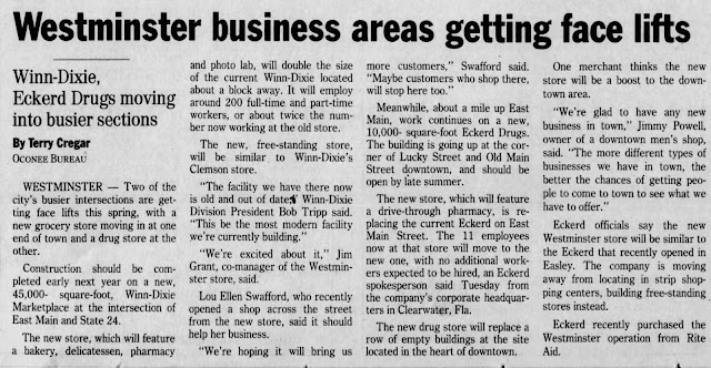 |
| The Anderson Independent-Mail (Newspapers.com) - May 7, 1997 |
The new location only lasted seven years before the company announced it was shuttering its entire Greenville Division, which included an estimated 47 outlets, in June 2005. According to Clemson finance professor John Alexander who was interviewed for the article, "Winn-Dixie faced stiff competition from Wal-Mart and Publix's entrance into the local market." It is interesting to see how Publix' expansion outside of Florida coincided with Winn-Dixie's downfall.
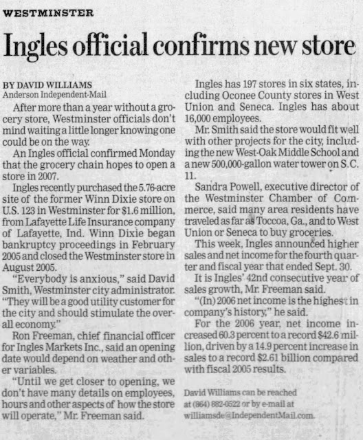 |
| Anderson Independent-Mail (Newspapers.com) - December 6, 2006 |
Following the February 2005 bankruptcy, the now-closed Westminster WD was sold to Ingles Markets at auction in August 2006. The Asheville, NC-based company then reopened the store on September 30, 2007, which was a relief to local shoppers who had to drive to nearby Seneca for over two years.
 |
| The Anderson Independent-Mail (Newspapers.com) - December 15, 2011 |
Despite thinking they were done with all of the beef, the city of Westminster was still dealing with the fallout of the Winn-Dixie bankruptcy into the 2010's. As part of the court proceedings, the flailing company exchanged stock for debt in which case the municipality received 1,149 shares valued at $12,639 in 2005 for $20,000 in outstanding utility bills. By 2011, that lump of stock was only worth half of what it was in 2005, leaving the city on the hook with close to $14,000 of Winn-Dixie's debt if the stock was sold.
I remember seeing a list showing a whole host of local governments and utilities that Winn-Dixie owed money to back in 2005, and I'd imagine that most ended up in a similar situation to Westminster where they were not made whole.
On that note, I'd imagine that local residents would like to forget about the grocer who once graced their streets. Unfortunately for them, that distant memory is not difficult to recall with the store we will be touring today.
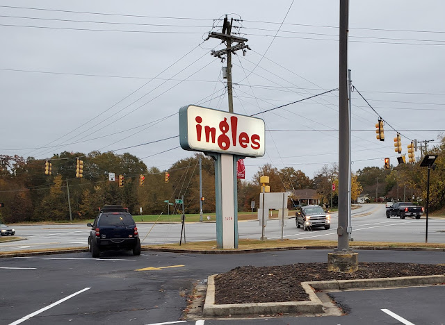
Pulling in, it was hard to miss that this was a Winn-Dixie, as
it was a bit jarring to see the "figure 8" Ingles logo affixed in an
obvious Winn-Dixie sign frame. Talk about an alternate universe – I don't even think this store has been painted since The Beef People left!
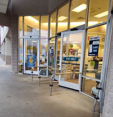
Walking up to the entrance, I could already tell this was going to be a good one . . . simply based on the fact that the original swinging doors remained in place. Oh, and what was clearly visible through those large windows . . .
Just inside, this store immediately took me back to my visits of the Eufaula WD and the LaGrange Pig-Dixie as it was essentially still a Rose & Teal Marketplace in all but name only. The sepia picture of the truck may be from Ingles, but all of my other surroundings were straight outta Jax.
Here we find an assortment of promotional items and "Food Bag Donation's [sic]" in the nook just beyond the cart storage area at the front of the store. WD may have originally used this space for its wine department; however, it was relegated to promotional products in later years.
Over in the Produce Patch
Green Grocer, we find an eclectic mix of old and new, borrowed and blue. With that, the only major changes were made to the temporary and permanent department signage and a few of the stand-alone fixtures. I still wonder why they even bothered with that; maybe Winn-Dixie had a trademark on the "Produce Patch" branding?
Even without one form of alliterative branding, the message is still clear as to what this space used to look like.
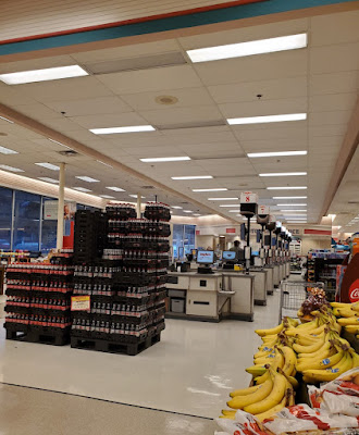
It also must be a thing with Carolinian grocers to have the checkouts where customers roll the buggy straight up to the cashier who then unloads items as he or she is scanning them. I know The Fresh Market does this as well.
Also, that is a ton of soft drink bottles.
As for above the register lines, we find our familiar lower ceiling fixture where all of the center florescent lights are interestingly switched off.
It's hard to fault grocers in smaller markets, but it often makes me appreciate shopping at a store that receives a higher traffic volume. For starters, more people mean less produce and fresh foods that look to be past their prime. This Ingles seemed to do well with the staples, but like Winn-Dixie, the more obscure vegetables, like radishes and eggplants, looked a little worse for the wear. I suppose that is a tough balance to strike between variety and freshness.
While I do appreciate the vintage photographs, I feel like the cornucopia cartoon horrendously clashes with the otherwise pristine Golden Girls aesthetic. Oh yeah, and that "Harvest Fresh Produce" text is another leftover from Winn-Dixie (if you have not already realized that).
Turning to the left, we see Marketplace scenes galore, featuring the familiar floral department (albeit with an Ingles sign), along with the delightful neon deli in the distance.
Ingles determined that the former "Wall of Values" would be better suited for a bountiful selection of bread. At least the teal background on the bead sign sort of matches the teal diamond's background.
Oh my gosh – an intact Deli Café!
Probably the most interesting piece of this store was how Ingles had left Winn-Dixie's old Deli Café in place. This at least makes sense considering how every Ingles I have visited in recent memory had a salad bar; however, I've never seen this setup remain in a "modern" Marketplace. Winn-Dixie removed these long ago in order to cut down on spoilage following the bankruptcy, and the similarly well preserved Pig-Dixie only kept the "Cheese World" sign. I suppose that's why it is important to see both examples of a store that is still under its original ownership and others that have been divested long ago.
Likewise, the coolers just out of the frame to my right still featured pre-packaged luncheon meats, as was original to this store's layout, rather than cold beer like a WD of this stature would currently boast.
Otherwise,
the store felt like most of the other un-remodeled Winn-Dixies I've been
to, for better or worse. Honestly though, I've come to appreciate these throwback supermarkets much more than I once did considering how they have become surprisingly rare. I never thought this day would come!
I will point out how Ingles removed a bit of the old pink and teal tile under the café seating area. If you zoom into the off-white squares, you'll see how they are perfectly spaced to line up with the tile pattern seen here (just not diagonal).
Continuing past the deli and meat counters (which must've had people there or else I would have snapped a few more pictures), we find our first example of a truly Laser-etched Winn-Dixie scene.
Part of the draw for me about these 1990's Marketplace stores is not that I particularly like the color choices (Pepto pink is a choice, though) but more because I appreciate the effort the designers put into the package to cover the store with ornamentation. It's gaudy, yes, but it is bold, and it is undeniably cohesive. Most importantly, it is memorable. It's really a shame that this package has gone down as one of the most dilapidated and forlorn because it was quite impressive in its original form.
Thankfully, this Ingles still felt put together despite boasting a decades-old package from a bankrupt competitor. Despite the imperfect modifications and maintenance, the space still felt clean and presentable.
And that leads me to a broader statement regarding the Ingles stores I've visited: they typically aren't ultra-modern or flashy, but they often seem to be well-stocked and well cared for. They also have an amazing fresh muffin selection at the bakery (well worth the 600 calories each).
Here's a perfect example: Winn-Dixie's old "Thank You for Shopping at America's Supermarket" tagline still has all of its letters in place and has a nicely placed Ingles logo to boot!
Speaking of that logo, I'm still immensely confused as to why the NC company uses this "fox tail" logo on all of its branding except for its storefronts. I don't recall seeing a single building with this badge, even modern stores; meanwhile, I haven't seen a single modern product or display with the old "figure 8" graphic.
Continuing on, we find the customer service counter boasting the same signage it has borne for the last quarter-century, just with the old W/D icon blocked out.
Taking a quarter turn to my right, we find one of the frozen foods aisles featuring the iconic Marketplace diamond floor design. Considering how there are former or current Winn-Dixies in at least six states that still have this tile pattern must mean that it has withstood the test of time (or it just requires too much effort to remove). Like South Carolina, several of the other states that come to mind haven't even had a Winn-Dixie since 2005!
Judging by the different model of freezers on either side of the aisle and the patched tiles on the left, I'd say that this store originally had the familiar line of coffin coolers running down the middle. It appears that Ingles found some fixtures which are even older than the circa 1998 ones The Beef People installed!
Continuing on, we find the "Fresh Meats" sign devoid of its "America's Supermarket" or "Beef People" tagline and WD chek. We also see more tile that has been replaced under the pedestal cooler in front of us.
Another thing Ingles managed to do is keep all of the original neon in working order. Some WD stores also managed to keep up the signage, while others weren't quite so lucky. I suppose the Asheville, NC-based grocer still uses neon in quite a few of its stores so maybe they have a repairman handy.
I also just realized how the deli sign is placed above the pink accent bar while the meat and seafood sign splits it. It's interesting how the sign for the latter is so much taller.
Furthermore, I've noticed several other active Winn-Dixie stores have the same 2D text on this "Frozen Meats" sign rather than the 3D lettering like all of the other department signs. I wonder if this was an early department shift that all of these stores received, considering how this 2005 casualty received the signage, or if the sign was just different to begin with.
Conversely, none of the Winn-Dixie category markers have survived, as the polar bear ones we see are standard issue from Ingles.
I believe the aisle markers are from Ingles' latest package and are by far the element that clashes the most with the WD stock. Rustic wood and 1990's Rose & Teal do not mix well! The previous ones at least partially matched the rest of the store's design.
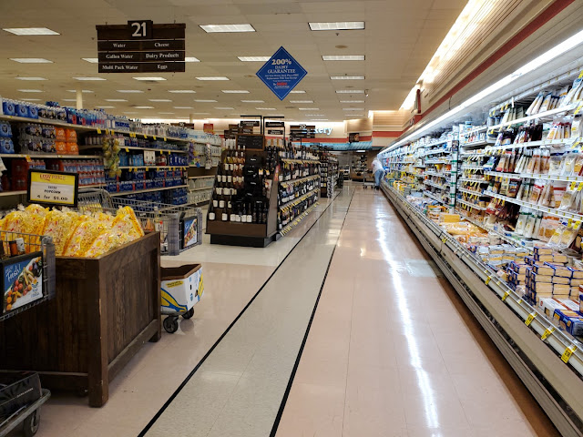
Ingles decided it was best to sacrifice the old double-wide dairy aisle to make room for a larger wine display.
While mimosa mixologists were disappointed by my last post, they can again rejoice at the sight of champagne and orange juice being together again.
This picture is so moody: on the one hand, you have the massive, soft, half-lit department sign looming at the top of the frame while on the other, you have the perfectly stocked yogurt display illuminated with a harsh 5000k florescent light. The juxtaposition creates quite the visual interest!
That interest is slightly marred by the chaotic scene on the rest of the aisle, though. I guess we are gifted another strange juxtaposition between a 2020's Ingles on the left and a 1990's Winn-Dixie on the right.
It's a bit washed out, but we can see Ingles' own neon bakery sign over the namesake counter. I'm guessing the original WD stock burned out and the current owners decided to replace the sign rather than repair it? Regardless, I've seen this same lettering in plenty of modern stores.
This store had no pharmacy, despite Ingles running health care operations in select other locations. I suppose Westminster is just too small for their liking.
Closing out our adventure, we'll take one last look at the store's front end before checking out. What did you think of this Ing-Dixie?
I feel like this store really did capture the essence of "something borrowed" considering how Ingles made it look as if the company was just another brand of Southeastern Grocers. Closures and acquisitions can do a lot of strange things, and while we may see all of the remaining WD Marketplaces disappear soon following the Aldi acquisition, there will still be plenty ghosts of grocers past haunting our memories.
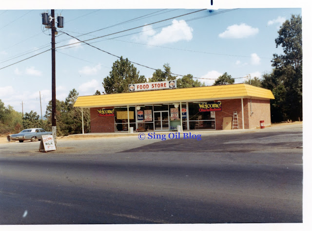
And that will conclude this week's coverage, but make sure to check back in two weeks for this year's fourth and final chapter of Marketplace Madness: Something Blue. Also, take note of the ladder in the corner of the frame. That's a clue from my other adventure of the day . . .
Until next time,
- The Sing Oil Blogger











I got excited when I saw the top image because I was excited to finally see a blog post about an Ingles. I had heard a lot about them, and I've seen some photos of theirs online, but I thought it would be interesting to see a Sing Oil tour of one. Well, instead of an Ingles, we get a Rose & Blance...err...rose & teal Wingles-Dixie Marketplace! It is still pretty neat to see the Wingles-Dixie Marketplace decor live on at a supermarket which probably has a better reputation than The Beef People themselves.
ReplyDeleteThat Deli-Bakery sign on the right side of the front of the Wingles-Dixie is giving off some serious vibes of another North Carolina-based grocer, Food Lion. Then again, the similar sign on the left saying that Ingles is 'American owned' is probably a direct result of the Mama's Family-related controversy about Food Lion being foreign-owned! "We're like Food Lion, except we aren't!"
Well, inside this store, there most certainly isn't a Food Lion vibe. It is pure Winn-Dixie! My understanding is that Ingles stores are generally pretty nice and that they are perhaps more old-fashioned in their operations many other modern grocers. Well, this is certainly an example of that! The condition of the Marketplace decor is probably nicer than some Winn-Dixies with much newer decor. It is interesting to see how this looks when someone has maintained it.
The roll-up checkstands aren't a surprise to me. I take it Ingles put those in and not Winn-Dixie? Those were common back through the 1990s. Kroger used them at most locations here as did Safeway and many others. It was a convenience to the shopper since they didn't have to unload their carts themselves. I'm glad Ingles is keeping that around. A few Krogers here still have roll-up checkstands, like December's The Year of Kroger subject, the River Oaks Kroger, so they aren't completely gone here. Does this Ingles have self-checkouts?
Although those standing freezer cases do look a bit older, they are certainly more modern than the coffin coolers that Winn-Dixie would have likely used here. Also, I knew you'd sneak a link in of that Arlington, TX K-Krog-Dixie!
The Ingles logo situation is quite strange. Perhaps given their slightly old-fashioned reputation, perhaps they felt the need to keep the older logo around on the front of stores?
Anyway, this Wingles-Dixie is pretty neat. I'm glad you were able to capture Rose & Blanche...err...rose & teal in pretty good condition somewhere.
That article from 1997 discussing the Eckerd in town is pretty neat especially since it says Eckerd purchased the Westminster operation from Rite Aid. I wonder if those operations became boomerang Rite Aid operations in the 2000s! Speaking of Eckerd, I saw an ad of theirs in an old Houston newspaper, probably from around 1971 or so, where they were using the slogan "Where Saving Is A Pleasure." Huh, did every Florida retailer use some variant of that slogan and which retailer copied which retailer? Maybe Winn-Dixie said "Where Buying Meat is a Pleasure?" Maybe "Where Losing Out on our Stock Isn't a Pleasure?"
Well, I’m glad that I could fulfil at least some of your heart’s desires! Despite this being a Rose & Blanche Winn-Dingles (I think Swifty’s name does take the cake), at least you get to see some form of Ingles. I have at least two other Ingles stores in my photo archives, so I’ll get around to sharing an authentic store at some point.
DeleteYou’re right – that deli / bakery sign on the exterior does look like something out of Food Lion’s book! I’m confident that this store was never a Food Lion, but I suppose the two companies did play off each other (and Ingles had to capitalize on being American owned). I also watched a few episodes of Mama’s Family the other night when I was flipping through channels in a hotel.
Your description of Ingles is fairly accurate. I can’t complain about some of the stores having an old-fashioned feel because every Ingles I’ve been to has still felt clean and respectable. And I’d agree that this store felt nicer than several other Winn-Dixies (and most Harveys) that I’ve been to.
Yes, Ingles most certainly installed the roll-up checkstands as I’ve never seen such in a WD and many still recently had standard lines dating back to the 1990’s. Despite this store having roll-up registers, it didn’t have the older flip-up carts. This store also didn’t have any self-checkouts, but I’ve been in plenty of other Ingles that do.
Yep, I couldn’t miss out on referencing the Arlington K-Krog-Dixie!
I can’t really explain why Ingles keeps two active logos; at least they are consistent with their uses. Maybe the company thought it would be too expensive to replace the exterior building signs, and then decided to stick with the old logo?
It looks like the old Westminster Eckerd did boomerang back to a Rite Aid. I had noticed another store recently that looked like a 1990’s Rite Aid but had the Eckerd pill sign hardware and was a bit confused – maybe it was also sold in the same deal as this store. And I know which Winn-Dixie slogan the townspeople of Westminster would pick!
Ing-Dixie is good. Winn-Dingles is better :)
ReplyDeleteI've never understood the Ingles logo thing, either. For as long as I can remember, they've used one logo for all of their exterior store signage, and another for marketing and advertising and in-house displays—and even on their website. Despite this, absolutely no one seems to care. No one is confused by the different logos. And no one will give me a straight answer why they use two logos.
Ingles isn't quite as remodel happy as Publix (or, lately Winn Dixie). There's the elusive Ingles in Boone, NC that still has the neon pre-rose/teal package.
https://www.google.com/maps/place/Ingles+Markets/@36.2050729,-81.6968895,3a,75y,90t/data=!3m8!1e2!3m6!1sAF1QipM65-Pc6c4cgrWH37CNt4Tnwq7B84dRLAXX70a_!2e10!3e12!6shttps:%2F%2Flh5.googleusercontent.com%2Fp%2FAF1QipM65-Pc6c4cgrWH37CNt4Tnwq7B84dRLAXX70a_%3Dw203-h360-k-no!7i2268!8i4032!4m7!3m6!1s0x8850f09c7ffcbf43:0xfc94aeac1873a421!8m2!3d36.2051147!4d-81.6968187!10e5!16s%2Fg%2F1tlbk82b?entry=ttu
Ha, Winn-Dingles! I like that better than Wingles-Dixie, though admittedly it probably fits a more 'dumpy' store than what we see here.
DeleteI agree that Winn-Dingles has a much better ring to it!
DeleteAt this point, it seems like the two Ingles logos are just “how it has always been” so they see no reason to change it. I still wish we could figure out how this came to be, or if one of the logos is actually older than the other. Back before I paid attention to supermarkets, I didn’t notice that Ingles interchangeably used two logos and I’d guess most people still don’t. Maybe the “cat tail” logo was easier to mockup on print materials before computers were commonplace?
Oh yeah, I’m well aware of that Ingles with the Chrome Interior! That one is definitely on my list, I just wish that Boon wasn’t so far away!
Interesting tour! I like to see this decor still marching on. Ingles seems to have a lot of stores with retro decor of their own, including many with neon like you mentioned. I've noticed the two logos thing, too. I really don't understand it. The one they use on the storefronts is really ugly and dated, in my opinion.
ReplyDeleteYeah, Ingles does have several vintage stores of its own (one of which I need to share eventually). The “I” used on the exterior logo just makes me think of The Incredibles. While that logo doesn’t particularly bother me, I can totally understand why you say it looks dated. At least it seems more memorable than the “cat tail” logo.
DeleteMarketplace is the decor that will never die no matter how hard Winn-Dixie tries! This was a fun Winn-Dingles tour (I think I'm going to have to give that one my vote on what to call this store!), and there were some photos where it really looks like we were touring an active Winn-Dixie and not an Ingles!
ReplyDeleteI'm not super familiar with Ingles, but they seem like a chain that doesn't update their stores often. I'm not saying that in a bad way, as their older stores are maintained well, as the Marketplace decor looked better in this store than it has in the few Winn-Dixies out there still hanging onto Marketplace themselves. Ingles did a good job of matching their versions of the wall signs with the pieces Winn-Dixie left behind. Those new aisle markers are the biggest clash out of everything. This was a fun tour for sure, and I'm hoping you have some other fun Ingles tours for us in the future (be they related to Winn-Dixie or not, as Ingles has some funky older stores of their own out there).
The in-tact deli cafe was a good find in this store too - I've never even seen one of those in person, even before the 2005 bankruptcy! (The Winn-Dixie we would go to most often in that era was basically a carbon copy of this store exterior-wise, but it didn't have the deluxe fresh offerings - it always had wine and beer where the deli cafe was, unless that store ripped theirs out not long after opening). That was a really neat find, and it was nice to see Ingles still had a use for the deli cafe area too.
That’s right: even if Winn-Dixie were to disappear tomorrow, Marketplace will still continue to live on in infamy. I agree that Winn-Dingles is the best suggested name for this store, and maybe, someday, we’ll get to use that again for the elusive Boone location.
DeleteSurprisingly, Ingles recently went on a remodel spree in stores that use the “latest prototype” (I put that in quotes because the store design has been around for at least two decades). Most of those stores seem to have the rustic woodgrain package, which matches these aisle signs. There are still plenty of older stores, though, that have looks which may even date back to the 1980’s. Again, Ingles is just a bit of a quirky company and some of this may reflect on them being a smaller operation out of Black Mountain. Ingles did do a good job of matching its wall signs with the remnants of Winn-Dixie, and most of this store still feels put together (just slightly less cohesive than it originally would have been). Like I mentioned above, I have a couple more photographed Ingles stores in my backlogs that should make for interesting tours one day.
Winn-Dixie must have started removing the old Deli Cafes around the time of the bankruptcy because this is the only original one I’ve seen either. I’d love to know if those cases were installed by Ingles, or if they, too, are original to 1998. I would still guess that your old Winn-Dixie probably had the Deli Café for a short time and originally had presliced deli meat in the beer cases. You can tell how WD typically had more space than they knew what to do with on this side of the store once the cafes were killed off.
My first experience with Ingles was on a vacation to Asheville. I was impressed, and we even ate at their salad bar one night for dinner, haha! That store looked exactly like the one in Franklin, NC, that you linked too, and I thought it was pretty modern. On a more recent trip to NC, I went to another Ingles, and thought it was weird that the chain had switched back to what clearly had to have been an older logo. Except nope -- that was in fact the new one, with the figure 8 version being outdated! If I hadn't found that out from looking it up, I'd never have guessed. The figure 8 one just looks so much more modern to me (not to mention better!). All of that to say, glad I'm not the only one caught off guard by that anomaly.
ReplyDeleteAside from that (superior) logo, this store is practically 0% Ingles and 100% Winn-Dixie! Like you said, it's neat that these Marketplace stores continue to survive under various other grocers' banners across the country. I especially like your close-up of the dairy sign.
Interesting that you point out the 2D Frozen Meats sign. I guess it could very well be true that that sign was always 2D, because even if there was a giant chainwide reset at one point that replaced whatever 3D sign may have been there at first... I'm struggling to think what other department could have been there, or what the sign could have read. No matter what happened there -- it is definitely a strange inconsistency.
The stock-for-debt exchange is wild: I assume a bankruptcy judge would've had to sign off on that, and it's a very strange deal, since obviously you can't really expect a bankrupt company's stock to rebound! Or, if this transaction took place after the bankruptcy was over and was simply agreed to by the town... well, I hate to say they should have seen that coming, but...
Most Ingles stores are pretty good, but I’d imagine one in Asheville would be decked out to the T. I’m not surprised that it looked like the one in Franklin I linked to because I think Ingles has used the same basic design since the late-1990’s. I guess why should they bother changing it if it still works? And I guess I wouldn’t say that I particularly favor either logo, but the figure 8 one does seem more memorable. I guess this mystery will just have to live on another day.
DeleteYes, besides a few quirks, this store still felt very much like a Winn-Dixie. I’m glad that we will still have good examples of the décor well into the future! And thank you!
The 2D Frozen Meats sign still drives me crazy because Winn-Dixie definitely did a chainwide reset to swap beer and lunch meats but didn’t bother to change those signs in most cases (some stores even just had them poorly painted over). Considering how I have yet to find a store with a 3D Frozen Meats sign, I may never know the answer to that question. It may also be the case that the sign originally said something like “Frozen Seafood” and WD decided to change the verbiage pretty early on but after most of the signs had been made. On a different note, I also just realized that it looks like Ingles just stuck a fake teal striped piece to the main diamond part of most of these signs; I’d imagine if you took that off, you’d still find the W/D logo still in place.
I agree! I’d think it is nearly certain that a bankruptcy judge had to sign off on the stock for debt deal, but I suppose a bankrupt company’s stock is worth more than getting paid nothing! I wouldn’t plan on a bankrupt company’s stock making a rebound either; I’d still be curious to know how the town fared once Winn-Dixie went private again several years after that article was published.