Former Bruno's #82 - Center Point, AL
Former Bruno's #82 / Food Giant #410
Bruno's Centre
Center Point, AL 35215
Hey there, welcome back! You may wonder why this post is dropping on a Monday, and the short answer is that I've been busy. Between vacation, my work schedule, and catching a cold, I haven't had the free time needed to polish up this post. I have, however, managed to add another 16 stores to my photo backlogs over that time and save some pieces of one of my favorite supermarket interiors from the landfill. I'm certainly glad to have those burdens off my chest because at least four of the supermarkets I visited are sitting on borrowed time.
By now, I hope you've had the chance to explore my previous posts on Cedar Key, FL, the Enterprise Sing and three of the seven Alabama Albertsons stores because today's post directly ties into the latter.
You may remember that I mentioned how all seven of those stores were reassigned store numbers 80-86 when taken into the Bruno's fold. This brought me to the question of why a seemingly unrelated store in the Birmingham Metro was recycling #82 by 2005.
 |
| The Birmingham News (Geneology Bank) - August 29, 1990 |
I soon learned that the reason was because former Albertsons #4336 / former Bruno's #82 in Montgomery was converted to a FoodMax in October 1988 when it was reassigned store #69, freeing up #82 to be used elsewhere.
(I'm still not entirely sure why Bruno's went through the effort to change a store number in this case because in later years the numbers would survive brand swaps.)
 |
| Birmingham Post-Herald (Newspapers.com) - November 19, 1990 |
What miffs me is, despite this part of Birmingham not being the worst I've seen, it's far from where I would place a high-end grocery store in 2024.
 |
| The Montgomery Advertiser (Newspapers.com) - August 6, 1988 |
The same can be said about former Bruno's #87 in Montgomery (the store which replaced Albertsons #4350 / Bruno's #83 shortly after the conversion). In any regard, the photo above can give us an idea of what Bruno's store designs looked like in the late-1980's when faux skylights were all the rage.
Based on the minimal research I've done (admittedly, most of which was from the Wikipedia page), the unincorporated area of Center Point experienced rapid growth during the 1960's and 1970's, making it one of Birmingham's largest and most thriving suburbs.
The article goes on to mention how crime and blight from the nearby eastern neighborhoods of Birmingham began to spill over into the unincorporated area during the 1990's. The real blow, however, came when the City of Birmingham began to annex parts of the suburb to relocate residents of lower income housing surrounding the nearby Birmingham-Shuttlesworth International Airport as part of an expansion plan. This seemed to push new development further East, outside of Birmingham City Limits, with the city itself infilling parts of Center Point and neighboring Roebuck.
The process of so-called "white flight" seemingly became a big issue for the area following the 1997 murder of Centercrest Baptist Church member Brian Tribble. A large group of concerned citizens, likewise, decided to meet with city officials in attempt to curb the recent crime uptick. Center Point residents wanted to further their control over local matters and decided to incorporate as a city in 2002.
This was still too-little too-late, as the combination of rising crime and the search for better schools eventually led to a total demographic flip for Center Point between the 2000 and 2010 Censuses. Many businesses also left the area during this time, with places like Lisa's Shoes moving all the way to Homewood and national retailers mostly jumping across I-59 to Trussville.
 |
| Birmingham Post-Herald (Newspapers.com) - August 21, 1996 |
Price comparisons between Winn-Dixie #414, Food World #38 (the first ever Food World store), and Bruno's #82 show The Beef People being the cheapest option for a presumably engineered mix of products.
Despite all three regional supermarket chains still finding some success in the area during the late-1990's, the first decade of the 2000's is when they would call it quits in Center Point. The Food World was the first to go in March 2005 which came as Bruno's closed 19 other locations and the adjacent Walmart decided relocate to a Supercenter just down the road. Neighboring the new Walmart, Winn-Dixie was the next loss and closed that summer as part of the 2005 bankruptcy restructuring; meanwhile, the Bruno's survived up until the Alabama grocer's 2009 bankruptcy closure round.
With those dates in mind, it's no surprise that the Bruno's is the only of the three supermarkets to still operate as such. The City of Center Point quickly lured local upstart Food Giant to move into the space later in 2009 by offering to use sales tax revenue to offset rent; city leaders didn't want to see yet another grocer gone for good. I suppose the rest is history.
With that behind us, let's see how this store has changed over the years.
Walking up, the
exterior of this store immediately reminded me of the Indian Lake Publix or the Tallahassee Red Elephant, the main difference being we see a narrower building with different windows here. All three still look distinctly like Bruno's, nonetheless.
Another trademark of these stores are the swinging doors on either side of the vestibule. You can understand why #119 was one of the rare cases where Publix decided to leave the original doors in place because it would be hard to fit much anything else here. I will say, though, Publix #119's doors look much cleaner than Food Giant's, which makes me wonder if the former's were swapped out for identical models at some point.
Stepping through the first set of battered doors, we enter a small interior vestibule leading the cart storage area under Bruno's signature 1/2 barrel vaulted ceiling.
To the right, the first department we enter is produce after passing the two angled counters for what was likely the old Central Bank branch and customer service. I unfortunately couldn't get any pictures of that area because the people standing there were looking right at me.
Produce appeared to have the original Bruno's vinyl flooring along with a hockey-stick ceiling inset that reminded me of Publix' old faux skylight
fixtures (it was mirrored rather than backlit, though). I presume the original freestanding cases would have originally followed along under the unique shape?
As for the décor, we'll touch on that more in a bit – just take a look at that cornucopia of fruits and vegetables on the wall.
Continuing on, it appears that the produce department has shrunk from its original size considering how a large portion of the space was filled with watermelon bins of sale items sitting on blue Chep pallets. Also, is that display of Swan (Swann?) slow cookers perched on a shopping basket rack?
Ignoring the merchandise for a second, I want you to take a look at the tile designs; both the green 'dog ears' at the edge of the grocery aisle and grey chevron pattern in the produce department seem to resist the typical counter-clockwise flow of shoppers, which makes me wonder if this store was designed to be shopped clockwise. Designers look for subtle mind tricks, don't they?
Continuing on, we find another
vaulted area in the back left corner which seemed to remain from a
former department: possibly floral. The store featured an identical ceiling inset in the dairy department at the opposite corner of the store as well. It looks to me like this used to be a backlit light box of some sort and Food Giant opted to install two new recessed fixtures rather than repair the internal fluorescents.
Comparing this again to the Tennessee Pubno's, instead of having the service
departments in the back right, this store had them in the front left.
I couldn't tell if the decor was original to Bruno's, but it is plausible that the Food Giant graphics were placed on top of old Bruno's stuff. The decor felt very 1990's to me, especially with the piece of wallpapered trim that ran around the perimeter of the store.
I'm certain the grid designs on the floor and ceiling date back to Bruno's.
I just don't exactly know where these aisle markers come from; there's a chance Food Giant had them custom made.
It's hard to tell what does and doesn't match in this store because everything is a bit garish. I presume that Food Giant picked up the crimson and teal colors for its signage from the flooring and front-end accent lighting, but more of this store could have been changed by them than I realize. I'm just a bit skeptical of an all-out remodel, and think they only changed a accents to blend with an otherwise complete interior.
At least I know that the checkout cubes match the ones we saw at the Eastchase Renfroe's Market in Montgomery.
Did I already mention that I was a bit uneasy about photographing this store? (The cashier even picked up on that, as I'll mention later.) These next few pictures help to provide proof!
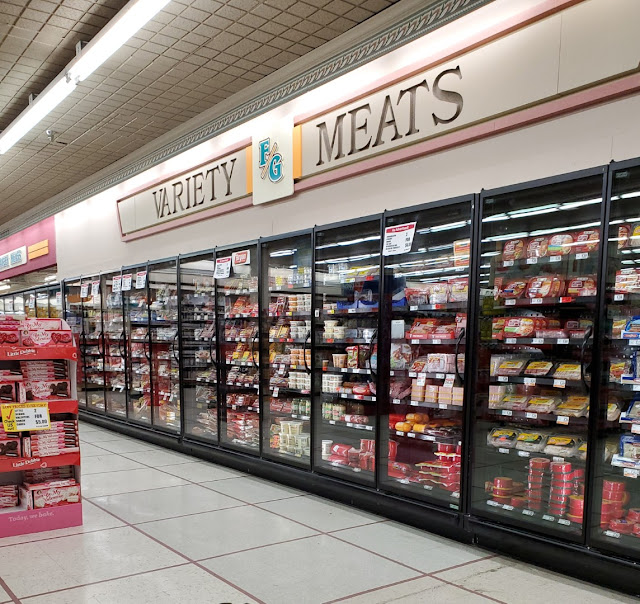
The "Frozen Meats" sign in the back of the store is almost certainly a new addition; however, the orange accents will appear in another department shortly . . .
Meanwhile, the meat and seafood counter featured its own net with all sorts of suspended sea life. We saw something similar in Biloxi!
For all of the extra detailing Bruno's added to this store, you would think they could have at least used inset fluorescent lights rather than surface mounted strips.
Here are those wonderfully orange accents I mentioned earlier!
At least Bruno's made up for the strip lighting by using some nice accent lights around the perimeter of the frozen aisles. Take note of how the floor pattern changes to stripes as does the pattern on the ceiling tiles. So many lines!
I feel confident that the coffin coolers have been replaced; however,
the signage for the likes of, "Pizza Pies, Pizza Rolls, Frozen Pizza,
and Pizza Treats," has to be original to the Italian family.
I have to wonder if Publix lowered the ceiling over the freezers in the Hendersonville store since it featured the same style of quarter-round trim. That would make sense considering how the Pub swapped out coffin cases for upright ones.
I wish I could have filtered out a few more of these photos; at a minimum I could have cleaned up my shot of aisle 11.
Wowzers, that is a lot of Clear Fruit (especially considering how I've never heard of the beverage). This does remind me of something I haven't thought of in a long time: Bug Juice. Did anybody else used to enjoy that stuff?
Since this aisle isn't too exciting, I figure it is the perfect time to mention that I had an old Earth Fare buggy join me on my tour. I also spotted a "spark"
Walmart Buggy in addition to some Food Giant branded carts. It was quite the eclectic mix of recycled retail remnants.
Since when is beer considered a dairy product??
On the other hand, take note of the vaulted ceiling overhead that I mentioned as matching the old floral corner.
Another thing that was overwhelming was the extensive reverse-cut dairy signage – talk about original! I'm inclined to say that the mustard-colored refrigerators are vintage, too, but Publix has been known to toy with exotic colors like this in recent memory. Yellow just doesn't work quite as well with Evergreen.
Let's take a quick look back toward the grocery aisles before continuing on.
In the front left corner of the store, the deli and bakery come into view in a layout reminiscent of a 1980's Winn-Dixie.
Similar to what we saw over the produce department, there was a section of lower ceiling running from the old pharmacy
area around the deli/bakery to dairy – it looked as if this was intended to define a secondary grand aisle of sorts.
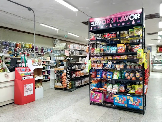
Unsurprisingly, the fresh deli and bakery departments had mostly been back-filled with non-perishable soft drinks and snacks. It seems like something at the deli counter could at least still draw a small crowd, though.
I'd have to guess that a pharmacy would have been just off to my right in the space now occupied by drink coolers. Is that a dining table used for a bakery display?
When I was checking out, the cashier asked, "you seem shy, or are you just cold?" I chuckled and said that, "I'm probably just cold and tired of all of this wet February weather. I'm ready for it to get warm again like it was last week." (It was in the 40's and rainy outside.)
I was definitely anxious taking pictures in this store
since I was unfamiliar with the area, but I didn't have a bad experience. All-in-all, it seems that Food Giant is providing a good service to the area which would otherwise only have the Walmart Neighborhood Market which replaced an old Delchamps in 2003. Competition never seems to be a bad thing, especially from local retailers who can quickly adapt to the needs of their clientele.
Back to the store fixtures, the Paraline arched ceiling over the registers was perhaps the strangest aspect (and also the hardest to photograph since most lanes were busy). It was designed as a semi-circle which spanned the entire length of the checkout lines and featured two suspended rows of light fixtures shining upon it.
 |
| Courtesy Glen Malone II (Google Maps) - June 2017 |
I understand the designers' intent to draw shoppers' attention to its grandiosity, but in the end, the low suspended lights and narrow checkout lanes ended up making the space feel claustrophobic. At least the metallic arch is one trait I'm confident in being original to Bruno's because it can still be found at the company's other former stores.
With that, let's reflect on our journey. In general, I can see how this layout was an adaptation of larger supermarket trends from the 1980's as portrayed in Winn-Dixie Marketplaces or Kroger Greenhouses. Aspects such as the large windows on the front of the store, crazy ceiling details, and geometric floor designs were in vogue at the time and likely influenced the "modern" transition to minimalism in design.
One can instantly feel like he or she is stepping back in time when inside this space, which may be fine for an independent, but isn't good for a regional or national chain trying to remain on the bleeding edge. The fact that this store still feels like 1990 after all this time also means that Bruno's didn't have the money or the desire to modify the interior for the two decades it resided here. It's crazy to see how Bruno's decision to close this once high-end location left the area on the cusp of becoming a "food desert". In any regard, Food Giant seemed to have its fair share of business during my trip and hopefully fits the needs of local shoppers.
So, what do you think? Is this store a museum of Bruno's past, much like the Montgomery Renfroe's, or is it just a showcase of funky designs from an independent? Let me know in the comments below!
You may also recognize this store's address from my previous posts on former Winn-Dixie #416 and former Winn-Dixie #500 / future Aldi #500 in nearby Pinson, Alabama. If it hadn't been for my spontaneous trip to the latter several summers ago, I likely never would have noticed this old Bruno's.
Until next time,
- The Sing Oil Blogger
Thanks to Henry H. for assisting with the background research for this post.




.jpg)


