
Publix #1010 - Atlanta, GA

Publix #1010
Publix in Atlantic Station
1380 Atlantic Drive NW Ste 14135
Atlanta, GA 30363
Welcome to a new year of The Sing Oil Blog, and welcome back to Atlanta! Today's post is a special one because it marks the last chapter of my Boredom Series written during July 2022 while I was still working at my previous job. You may have just done a double-take at your calendar, and yes, it is now 2025.
Why the heck did I wait this long to publish the story of Publix #1010?
Honestly, having posts like this in my backlog gives me a safety net for instances when time gets away from me, and that time is nigh. Despite me taking a weeks' long hiatus from posting, I've still dedicated the hours I'd normally spend writing to researching the current implosion of Southeastern Grocers, scraping what I can from the doomed website Foursquare, traveling to endangered retail locales, and most importantly, spending time relaxing with family & friends. These last few weeks have nevertheless produced some fascinating and exotic blog content; the only challenge will be finding time to flesh it out into a post (much less allowing my readers to find time to digest it all). That's why I'll take things one day at a time and I'll strive to hopefully hit the target for my next post (which is yet another 2022 tour).
The new year will also bring about some new changes. For starters, I've taken this time to freshen things up on the homepage (I'm sorry, but I was getting tired of the stock photo used as the background for both mine and Retail Retell's blogs) and I've migrated to posting on Sing Oil Sundays this year. I found myself scrambling to get content out on Saturdays and feel that shifting things by one day should help alleviate this pressure. With the change, I decided to follow along with another precedent set by The Albertsons Florida Blogger and add a handy email subscription widget to the left pane of the website. All it should do is send you an email whenever a new post goes live, which will help counteract my tendencies to post at sporadic times.
Today's tour will be the sixth I've presented of a Publix store with an Atlanta address (
it was set to be the second at the time I wrote it), following on the heels of its Midtown neighbors #1119 and #599. Thus far, all six Atlanta stores we've seen have been quite unique, and #1010 is no different in that regard. In fact, the Publix at Atlantic Station has the rare distinction of both being constructed by Publix and having no interior layout resemblance to any of the other 1300+ supermarkets in the chain. Let's see why.

Resurgens: from the ashes will rise a new beginning.

|
| Ruins of Atlanta Union Depot - 1864 |
For those not familiar with US Civil War history, you may wonder why the symbol for the City of Atlanta is a phoenix and the motto is "Resurgens", Latin for rising from the dead or resurrecting. All of this dates back to 1864 when General William T. Sherman held his March to the Sea, which was a military campaign designed to cripple the Confederacy by destroying factories, railroads, and other necessities of industry. General Sherman and his troops famously marched from Atlanta to Savannah and burned nearly everything in their path; this act of war delivered a crucial blow to the South and marked a major turning point for Atlanta, the railroad hub for the region. After the war ended, the people of Atlanta decided to "rise from the ashes" and create a city which was better than the first.

|
| The Atlanta Journal-Constitution (Newspapers.com) - September 24, 2001 |
So why do I mention this? Well, Atlantic Station not only rose from the ashes of the Civil War, but it also rose from the brownfield foundations of the old Atlantic Steel Mill. The site which was oft described as a vast industrial wasteland would soon be home to a new 138-acre mixed-use community with housing, shopping, dining, and offices. Over 165,000 tons of contaminated soil were removed from the grounds to make way for the development, which itself was given the Phoenix Award by the Environmental Protection Agency in recognition of its efforts in redeveloping an existing site.

|
| The Atlanta Journal-Constitution (Newspapers.com) - September 18, 2000 |
Plans from 1999 initially called for a new retail development just west of the Brookwood Split featuring easy access to transportation, and most importantly, a new Seventeenth Street bridge spanning Interstates 75/85 to connect Atlantic Station to Ansley Park. Home Park residents west of the circa 1951 Downtown Connector were thrilled at the chance to partake in shopping and dining experiences on their side of the interstate, while residents of "Atlanta's first automobile suburb," Ansley Park, on the east side of The Connector lauded the possibility of more traffic on their streets.

|
| The Atlanta Journal-Constitution (Newspapers.com) - January 1, 2001 |
The 17th Street bridge, however, was eventually pushed through, just not without its fair share of opposition from local residents. People in this part of Atlanta are quite picky, aren't they?

|
| The Atlanta Journal-Constitution (Newspapers.com) - November 1, 2000 |
Over the extended six year development process, Atlantic Station underwent countless changes to evolve into its current form. The map above shows one of the original site plans from 2000 and looks notably different from the final product – it is especially interesting to see where the double-decker Walmart / Sam's Club was slated to be built.

|
| The Atlanta Journal-Constitution (Newspapers.com) - March 24, 2001 |
By 2001, Mills Corp. fully withdrew its plan to develop the site into a giant retail center after "scaling back" from the site owner's initial hopes for a 1.2 million square foot open shopping center. This followed on the heels of Hines Corp. and Post Properties withdrawing plans to build office space and housing, respectively. All three companies cited the numerous site delays as the reason for leaving. These actions led to property owner Atlantic Station, LLC taking development in-house.

|
| The Atlanta Journal-Constitution (Newspapers.com) - October 20, 2005 |
Eventually, construction began to take shape, and new tenants began to sign on. Following Walmart's withdrawal and pivot to The District at Howell Mill, Ikea agreed to build a 366,000 square foot store on land that was also discussed to be home to the Georgia Aquarium ( before the latter instead opted for a place next to Centennial Olympic Park). Dillard's also signed up in late 2002 to build its new Southeast flagship store, and at the time, scheduled to open in Fall 2003 along with the rest of the complex. Whoops.

|
| AtlanticStation.com (archive.org) - 2003 Property Map |
Despite the delays, Atlantic Station finally held its grand opening in October 2005. Retail anchors of the new development, in addition to the two mentioned above, included a 16-screen Regal cinema (reduced from the originally-proposed 20-screen AMC), Target, and Publix: all of which were firsts for Northwest Atlanta.

|
| AtlanticStation.com (archive.org) - Map from December 2005 |

|
| View of parking deck directly below Publix |
Regardless, Publix #1010 has resided directly below a Designer Shoe Warehouse and directly above two levels of parking for its entire tenure. It's not often that you access a Publix via an elevator!
To close out this history section, take a look at this 2003 B-roll footage of the construction project from a WSB-TV newscast. It's crazy to see how much things have changed!

Publix #1010 held its grand opening on October 27, 2005, a short seven months before its sister location, #1061, would open across Seventy-Five/Eighty-Five in Midtown proper.

|
| Courtesy HKProductionsATL (YouTube) - April 29, 2009 |
A Publix which opened in 2005 typically wouldn't be of much interest to me, but this store has confused me since I first stepped foot into it. I have since learned that #1061 opened with an early, adapted version of the 28M layout, which was used through 2018, but #1010 was likely built as a prototype that was never replicated. This store opened while Publix was transitioning from the circa 1995 27M design to the circa 2003 28M layout and seemed to mark a time of experimentation for the company.

|
| Courtesy HKProductionsATL (YouTube) - April 29, 2009 |
The 30,312 square foot store is notably larger than its comparable small-format siblings, and features a layout that I haven't seen the likes of in another Publix. To make matters even weirder, we can see in the screenshots above from this YouTube video that #1010 rocked the serif flavor of the Kiwi / Classy Market 1.0 interior in 2009, which means it would have opened with that package. You'll see why that detail is important in a second.
Now that you have a bit of context, let's take a closer look.

Publix tends to prefer vast expanses of suburban land to build their stores, and this location is quite the exception. I've got to tell you, the parking setup for this store is straight up confusing.

|
| AtlanticStation.com - Map from February 2024 |
Customers are expected to park in a gated garage, where any duration under 2 hours is free. This garage has two levels: one with an entrance from Sixteenth Street and the other with an entrance from State Street. Drivers are then asked to navigate through a maze of columns to find the green supports advertising the Publix overhead before parking and taking an elevator to the front of the store at "street level".
I didn't photograph it, but one of two elevators plops shoppers between two sets of sliding glass doors labeled "entrance" and "exit", as they glance out over a small brick courtyard along Atlantic Drive.
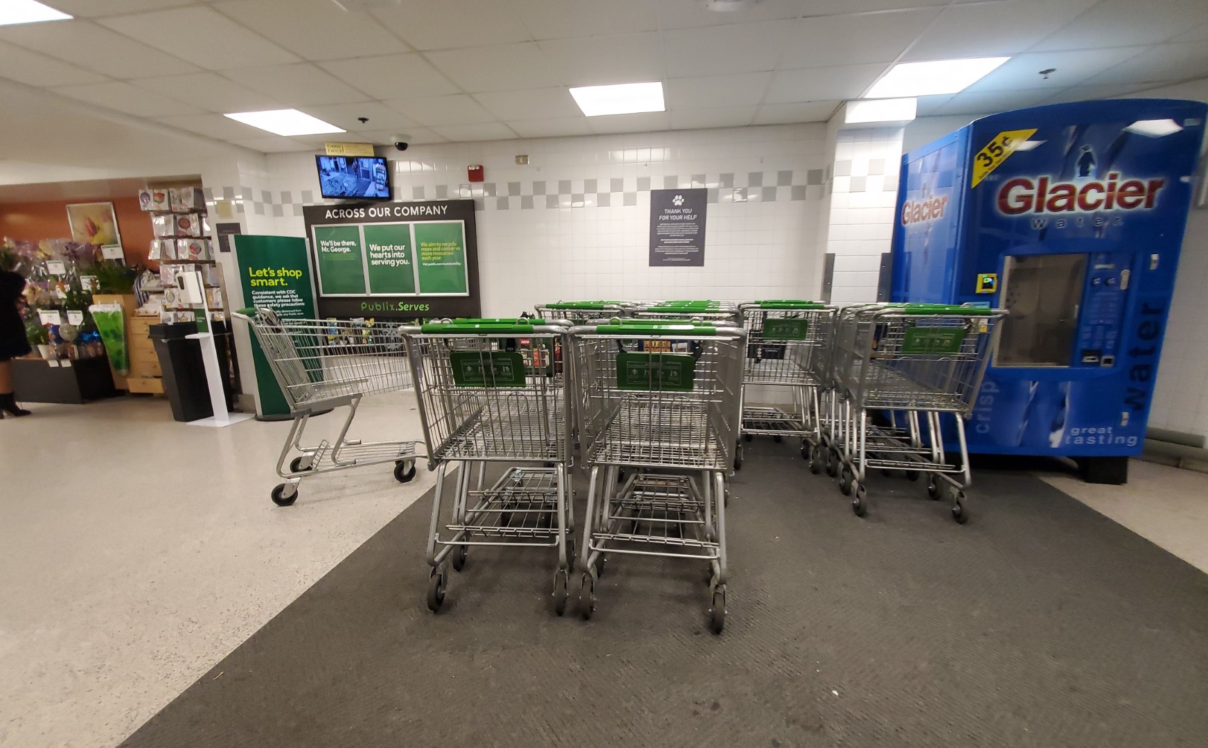
Since I chose to enter the store, I decided to turn to my left to walk through the automated "seeing eye" doors. I was immediately greeted by a small, carpeted cart storage area, followed by a short hallway flanked by the floral department and seasonal merchandise.

It isn't odd to see floral just as you enter a Publix, but a hallway like this is certainly strange.

Across the hallway is the typical "Welcome to Publix" lettering, but something is odd about this store's implementation. We will see later that this store has a post-2016 flavor of Sienna / Classy Market 3.0, yet the infamous green beans are nowhere to be found. Even more bizarre is how this store still showcases its 2-row grey checkered tile pattern, and didn't receive a green vinyl sticker to obscure the design.

Walking a bit further, we can finally see the grocery aisles, check lanes, and pharmacy, with the deli just off to my right. I already see a plethora of oddities, but we'll see if you pick up on them as well.
I took this shot as I was leaving, but it glances over the front right corner of the store toward the bakery and deli (the deli lines the front right wall).

My next shot of the deli/bakery was taken from the front speedway. I have to say it is strange to see these two departments in reverse order from the era. Publix hasn't really used 47M, 51M, and 56M prototypes of the late-1990's.

This store has also retained its extensive Kiwi crown molding, which is almost unheard of to see survive a Sienna remodel.

If you zoom into this photo, you can see how the store received the 2-row grey checkered tile pattern in all of its service departments, as opposed to the typical checkered tan and brown Classy Market 1.0 design.

|
| Courtesy Dj C (Foursquare) - April 6, 2013 |
This trait is usually indicative of a store opening with the "prototype" version of the design used almost exclusively in 61M and 45T stores.
The picture above from Foursquare also depicts this store with the Bamboo interior, which it remodeled to in late 2011.

|
| Courtesy Holland M (Foursquare) - September 21, 2011 |
Rewinding back two more years, we find this store's original deli department look, which honestly didn't change all that much during the Bamboo remodel.

Something else that didn't change much over a two-decade span was Publix' deli honey mustard packaging. The company has since begun to roll out its new Evergreen design for the packaging within the last few months, but it was one of very few products to survive the 2018-2019 "stacked P" deli logo refresh.

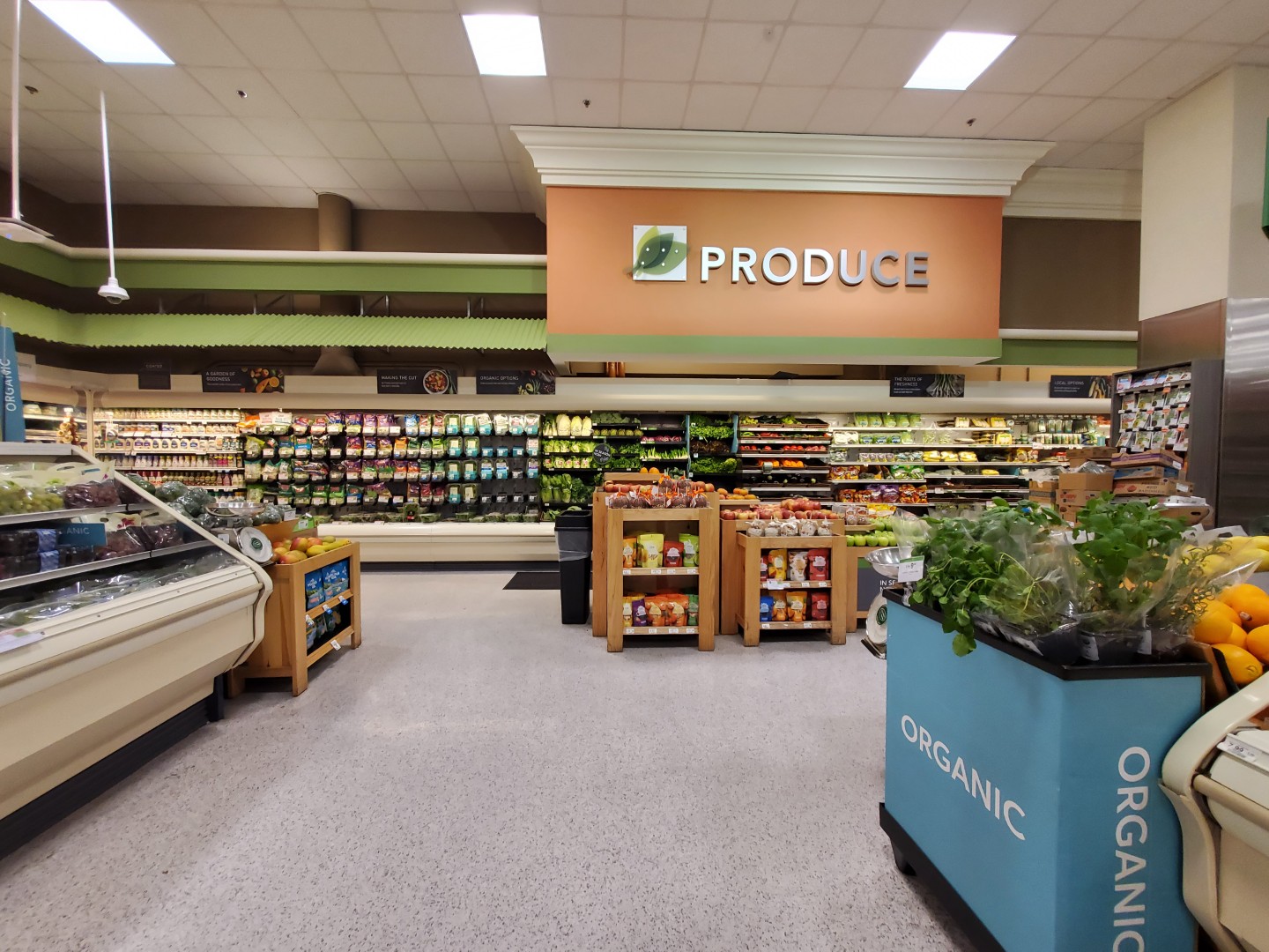
From the bakery, we turn our attention past beer and bread toward the produce department in the back right corner of the store.

It's quite odd seeing beer and wine take up the entire first aisle of a Publix, don't you think?

I still can't visit a Publix without checking out its local craft beer selection, and Atlantic Station had its fair share of "Georgia Local" brews.
The focus of this photo at the time was to highlight the evolving design language from warm brown and red price tags of the Sienna era to the cool grey and green graphics of Evergreen; however, this photo also showcases a sampling of the discontinued "tie one on" packaging from Atlanta's own Monday Night Brewing. I never know what kind of things I'll end up preserving with my photography!

Here comes our next surprise: Metallic Marketplace-style awnings! This store opened in late-2005, which is seemingly after Metallic Marketplace was discontinued so why are they here? Even better, why did they survive with Sienna until 2025?

With that being said, I don't think I have ever seen crown molding (at least the excessive amounts found in this store) installed in a store unless it was a new-build Classy Market 1.0 location. Then again, this store has the tile pattern which was used with Metallic Marketplace (and some with Wavy Pastels). So, what gives?

Like I mentioned before, this store opened with the "prototype" version of Kiwi which shared a lot of similarities with its sister package Metallic Marketplace. It wasn't until roughly 2005 that we started to see the more familiar traits of the design prevail; however, I'm still surprised to see a deluxe store like this open so late in that same year.
We'll take our first look along the rear actionway toward frozen foods in the back left corner of the store.

|
| Courtesy Jake (Foursquare) - March 17, 2017 |
This store appears to have gotten a light refresh in 2019 because the original wall sconces mysteriously disappear from photos between 2019 and 2020. Publix #1010 may have received a full post-2015 Sienna remodel with the upgraded checkout cubes, but it never got new pharmacy signage or vinyl stickers over the service department tile meaning the 2019 refresh seemingly didn't touch any other parts of the store.
Anyhow, doesn't Sienna look nice with all of these original interior traits!

|
| Courtesy Scott B (Foursquare) - April 6, 2013 |
It is quite shocking to see how cheap the Bamboo remodel was in the store. To me, it looks like Publix only painted the arches, installed new wall signage, and called it a day. At least Sienna brought with it some new panels for the refrigeration cases and new aisle markers.

Let's take a quick break from this history lesson and look down aisle 3. Nothing unusual here, other than some cans of soup and international foods. Oh yeah, and some of the banners that Publix has seemingly since discontinued.

Jumping back to the rear, we see how the produce department then guides customers toward the seafood and meat counters. It's odd that Publix installed coffin freezers here since that was a trend which also died off around the time this store opened.

I personally like how the crown molding compliments Sienna, and I think the elements of bygone packages often visually enhance some of Publix's newer, flatter designs (looking at you, Evergreen).

Although this store is much smaller than the standard Publix, it didn't feel cramped or awfully lacking in many departments.

Had this store opened with Metallic Marketplace, it wouldn't have featured the half-round trim piece on the bar above the shed roof accent; otherwise, that architectural feature would have looked identical to what we see today.

Here's a look down aisle 6 (with the Christmas 2023 banner this time). I won't lie that the first time I saw these banners in a store, I thought the entire place had remodeled to Evergreen!

This store was lucky enough to receive a pharmacy, but its location is another anomaly. Located in a box dividing aisle 7 & 8, it is very uncommon to see Publix place a pharmacy in the middle of the store rather than along a perimeter wall.

The box displays crown molding which matches the rest of the store (and has a pharmacy license which dates back to 2005), so it isn't like the department was added as an afterthought. This design seems to hearken back to the 51T which is the only other Publix layout to feature a pharmacy box, but it seems like an odd choice in this case.

Over on aisle 9, we find the dairy and packaged deli product coolers. Off in the distance, we see bottled water filling the shelves which back up to the wall of the pharmacy.

Here's the same aisle but looking in the opposite direction.

|
| Courtesy Pradyumna Suresh (Google Maps) - August 18, 2016 |
The end of the aisle with water bottles used to be home to the GreenWise organic section, which we can see in this 2016 Google Maps photo.
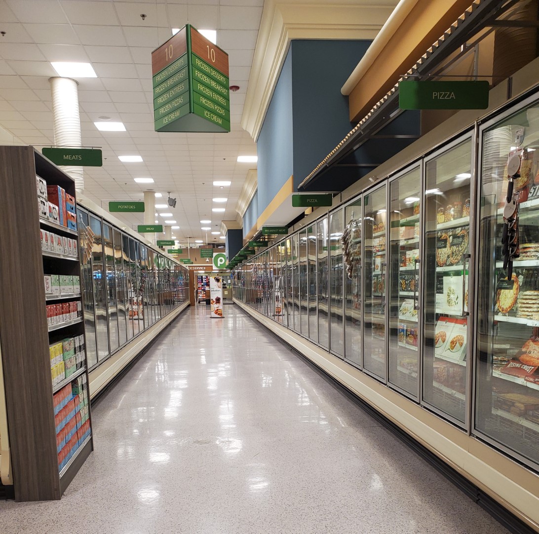
Finally, we find ourselves on aisle 10 looking toward the front of the store. Most 28M stores feature 9 aisles, so it is (surprisingly) strange to find 10 in this store.

Turning around, we also find the doors to the loading dock in the rear of the store. I primarily was curious as to what was inside the large box to the right of the last freezer case, and I think I discovered it was some sort of deli oven or display case. Maybe they were adding a new deli pickup station? This store sure still hasn't remodeled since I snapped this pic in 2022!

Since we are on the topic of loading docks, we'll teleport to the rear of this store and take a look at what it has to offer. Loading dock fans, rejoice!

Back inside, we again find ourselves on my favorite aisle in the store. Not only is this aisle home to Publix Premium ice cream, but it is also lined in its entirety by the MM-style awnings!

Doesn't it have a nice and homey feel? In case you were curious, I took this photo from roughly the same location as the YouTuber did back in 2009.

Anybody want to sample some Publix ice cream cones?

Heading back to the front of the store, we see where the former magazine section has been converted to an Instacart staging area. Customer service is also located up here, complete with the Publix "P".

The only shot I took of the front speedway looking toward the left can be seen here. Corona must've been in full swing, because the guy in the yellow shirt is surely showing some side effects! As a recap, aisle 8 will take you to the pharmacy box, aisle 9 will take you to the milk and butter, while aisle 10 will take you to the ice cream and frozen pizzas.

GOAT SOAP!

I bring all of that up to say that this store is currently the closest Publix to Georgia Tech. I'd imagine that plenty of college staples have been purchased here over the years! It also isn't common to see a flag hanging from the ceiling of a Publix, and here we see one for Georgia Tech proudly on display.

Not only did this store have a GT flag, but it also got a custom Classy Market 1.0 "Welcome Georgia Tech Community" sign over the checkout lines. I'm not sure how common custom signage was made for stores with the Kiwi package, but part of me is surprised how this store still has such a blatant piece of CM 1.0 on display! I figure most people wouldn't realize that though.

It also isn't common to see mini express checkout lanes like this in a Publix. This store is full of surprises!

After looking at this picture, I just realized this store still has the older-style regular checkout lines, too. The difference is that they don't have the angled bag station or the partition which holds an ad in front of the cashier's computer / scanner.

This brings me to my final observation about this store's uniqueness: it has a dropped ceiling! I can probably count on one hand the number of Publix stores featuring a dropped ceiling to have opened since the late-1990's, and this store is one of them. Maybe they opted for one due to it being in a mixed use development? Or maybe again, this space was originally designed for somebody else!

The customer service desk is oddly located in the exit hallway in front of the registers. I suppose it economizes space, but it feels really weird being over here. Across from the counter is a staircase leading to some second floor offices.

Lastly, we find the restrooms next to customer service and behind the Redbox (R.I.P.) machine.

|
| The Atlanta Journal-Constitution (Newspapers.com) - March 25, 2021 |
Speaking of those bathrooms, they made the news a few years ago. Just days after a terrible shooting at a King Sooper in Boulder, CO, police were alerted of a man carrying all sorts of long guns into this Publix' restrooms. Thankfully, any sort of planned event was foiled, but the story is still scary, nonetheless.

We'll exit the store through the end of the hallway and see a vestibule which is a mirrored image of the one we entered through. The restrooms were located just to my right, followed by the customer service desk.
Following many back-and-forth mental gymnastics, I have come to the conclusion that I believe this store opened with Kiwi / Classy Market 1.0. I'd like to hear your thoughts, if you have any, and if there was anything which I seem to have missed out on. Who knew a modern Publix could be so fascinating!
Thanks again for joining me on this adventure and make sure to stay tuned for what adventures we find ourselves in the midst of in two weeks!
Until next time,
- The Sing Oil Blogger


I like the new blog design! And having a safety net of posts must be nice, lol. I've certainly got the backlog but not anything pre-written and completed! Interesting history about the store's development and this part of Atlanta.
ReplyDeleteThank you! I've been unhappy with the outgoing look for some time now and am glad that I found some time to give it a refresh. I'm also glad that you approve!
DeleteHa! My safety net of posts has nearly dried up compared to what I used to have. That being said, I still have the rare occasion (this past weekend being one of them) where I'll be so inspired after visiting a store that I just have to jot it down.
Glad you liked the post as well!
I'm digging the new shiny redesign for your blog!
ReplyDeleteThis store really looks like it was planned as something else. I just have no idea what "something else" would have been in circa 2005 Atlanta. Whole Foods? Or maybe it was a one-off Publix prototype based on space constraints.
Thank you. That's nice to hear from a designer! Blogger is unfortunately a bit limited with the options it gives, but I tried my best to work around them for a nice outcome (don't ask what I had to go through to get that gradient, lol).
DeleteWhole Foods is about my only guess for an alternate grocer considering how Harris Teeter had already exited the market, Kroger had two stores nearby, and The Fresh Market is just up Peachtree Street. Then again, Trader Joe's may have been involved in Atlantic Station since since they were searching the market as early as 2002.
Regardless, I'm not sure we'll be able to solve that mystery based on what I found in the local newspapers. Maybe it was just a one-off Publix!
I'll add that I like the redesign and new template graphics too!
ReplyDeleteEntering this store, the reversed deli/bakery setup and drop ceiling gave me a Publixsons vibe, specifically one in a 1970's Albertsons building (as that's the only other time I ever see those departments arranged as such in a Publix). After that the layout just seems to go all over the place, so yes, this is certainly a weird Publix!
That said, I think this store is exactly that, a weird one-off prototype that may not have been of Publix's choosing, but more so forced upon Publix due to the store being in a development like this. At lot of Publix's urban mixed-use stores are a bit odd, and even if some (like #1531, for example) are mostly to spec inside, the stairs and elevators from the parking garage can lead to some weird design choices. However, when you start adding things like additional retail or apartments above, that changes the loads and such, and leads to weird layout choices due to column placement or the shape of the building in relation to the other building features. I think Publix was given a bunch of constraints to work around and this was the result. While there were a small number of normal Publix stores from the 2004-2005 era built with drop ceilings, I think the drop ceiling in here was more so to hide all the extra piping and beams and such due to having other retail on the floors above, which would have made the salesfloor look extra ugly.
The pharmacy island is strange, at least being in aisle 8 like it is here! While there are lots of quirks to #1010's layout, that one is the most striking to me! Still, #1010's pharmacy island looks pretty close to the design of the 51T's pharmacy island, just not anywhere near where the island would be in a 51T.
Having the store #1010, I believe that would have meant this store should have opened more in the early 2004 timeframe than late 2005. I think a lot of the quirks like the gray wall tile pattern and the MM-style wall awnings was due to the construction plans for this store being drawn up in 2003-ish, but due to whatever delays or issues from being part of a large mixed-used development entailed, led to this store opening later than intended, but still using the original, unchanged plans. Changing details like wall tile seems like such a minor thing to revise all of the construction plans for once the project was actually put in motion, so Publix probably never bothered and let it open with some of those earlier design characteristics.
Thank you!
DeleteThose departments are reminiscent of a Publixsons, now that you mention it. The only problem is that this store opened 3-years before most of those were in Publix' fold! I know that this store really threw me for a loop when I realized Publix mostly used standard layouts because there is nothing standard about it.
I agree that this store was likely forced upon Publix thanks to development constraints. Those constraints also probably resulted in this store getting a dropped ceiling, as you mentioned.
Part of me also wonders if this store's pharmacy was an afterthought from late in the design process, or if Publix simply ran out of room thanks to the front end being so narrow. Even then, you would think it would have made more sense to put the pharmacy directly in front of the registers where the greeting cards live. It sure does stick out considering how it is smack-dab in the middle of aisle 8.
The low-1000 store numbers are a bit all over the place, with some opening in 2004, as you mentioned, while others opening as late as 2010. Regardless, I don't think the MM-style awnings were a holdover from a swapped decor, but rather a consequence of that era of Publix' design language. All of the 45T and 61M stores seemed to use the similar deluxe / prototype version of Classy Market 1.0 / Kiwi, with the 45T stores specifically receiving the same metal awnings. I still wish we knew more about that small design window!