
LaGrange #1 - LaGrange, GA

LaGrange #1
Sing Food Store
LaGrange, GA 30240
Hop-In
Scroll Down for my More Than Convenience post on Publix #540 & keep on scrolling for my MTC post on Big Lots #64
Welcome back to The Farm (or as they say in France, La Grange). Today's tour de Troup County will first take us to (as evidenced by the photo above) one of Sing's oldest convenience stores, followed by a gallivant through LaGrange's first Publix store. If you stick with me long enough, we may even get to see a surprise bonus store that I only stumbled across during my research this week (you probably won't want to miss that one). So, what do you say, shall we begin?

According to The New Georgia Encyclopedia, "LaGrange was named at the suggestion of Colonel Julius Caesar Alford (known as the “War Horse of Troup” in Congress), who in 1825 overheard [the Marquis de] Lafayette remark on the similarity between the west Georgia countryside and LaGrange, his wife’s estate in France."
LaGrange grew in the Nineteenth-Century to become one of the largest cotton producers in the state; likewise, the region later became home to numerous textile mills. Most of the mills have since moved offshore, but vestiges of the old mill neighborhoods still remain with small downtown areas surrounded by compact houses. Guess what: there's typically an old mill nearby too!
Speaking of the mills, many of those previously found in LaGrange had direct ties to the Callaway family, the same Callaway family which went on to start Callaway Gardens several miles down Highway 27 in Pine Mountain. Needless to say, the Callaways proved to be very successful in many endeavors (including one of their more recent ones with bottled water), and likewise, the city of LaGrange has benefited from the financial boost by boasting luxuries such as two art galleries, a symphony orchestra, and a ballet company. Oh yeah, and another massive Callaway estate that now has the town's second Publix named after it. For those who are tracking, this happens to be the same family who successfully lobbied for Interstate 185 to bypass Pine Mountain rather than travel over it, so yeah, they had some influence.
According to my brief research online, LaGrange is still on economically stable footing as it is now home to a Walmart distribution center, the North American headquarters for Caterpillar's forestry division, a Duracell battery plant, and now Remington Firearms' world headquarters. All of this is in addition to the many suppliers for the massive KIA plant several miles down I-85, just outside of West Point.

As for Sing Oil Company's place in LaGrange's history, things go back pretty far. How far, you may ask?
 |
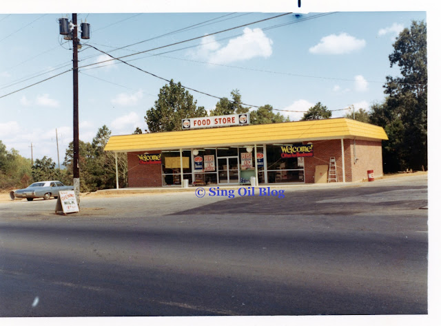
| Just look at those cars! |
According to what I could dig up, it appears that this circa 1965 Stop 'N Shop was either Sing's second or third convenience store to ever open (following Columbus #2 and either preceding or following Tallahassee #3). The fact that these pictures are still black and white lead me to believe they date back to the mid-late 1960's (along with the presence of the plastic backlit awning) considering how the bulk of my station pictures from the 1970's are all in color. The prints that I scanned also weren't in the best condition, but they are far better than nothing!
 |
| Don't you love that vintage Reddy Ice logo? |
It's difficult to discount the anecdotal evidence from a former Sing Oil company executive, but it's also hard to shun the shaky empirical evidence I've uncovered. After all, the former is just that—anecdotal; however, the latter leaves much room for error just being based off of county land records with questionable data practices. One states that Tallahassee #3 was the first Sing Stop 'N Shop to ever open while the other hands that title to Columbus #2. Regardless, this station was one of the first three Sing convenience stores to ever open, and likewise, has a number of pictures for me to share from my historical photo archives.
It's hard to believe that 84% of Sing Oil Company convenience stores that I've found still operate as their intended purpose; it's even more surprising how six out of Sing's eight 1960's convenience stores (that I'm aware of, at least) still operate as convenience stores to this day. Think of how many 1960's supermarkets, department stores, or even local businesses you walk into to this day . . . not many. It's especially hard for me to believe that today's gas station is 55+ years old, as I'd think I'd be more apt to see something like that in Del Webb with all of that grey hair!

That house in the background still stands to this day and was the best clue for me to identify the pictures that were previously strewn around in a box. Thanks to that house, we can also see that this store received a makeover during the 1970's to bring it in line with Sing's station branding at the time. The backlit awning was cool, but maybe the light bulbs were a pain to change when they burned out? Or maybe the panels just started to look dingy over time. Regardless, this same store has since been remodeled at least 2-3 more times since this sunny day nearly 50-years ago.

The Soviet Union has since collapsed, the Berlin Wall has fallen, America has elected nine presidents (but endured eleven, impeached two, and resigned one), yet this station appears to have stood the test of time. Let's take a look to see how things have changed over the last 58 years.

Starting at the front, Summit #29 / Moneyback Food Stores / McDonald Oil had recently given way to Hop-In by the time I made my trek to this store. If you remember from some of my earlier LaGrange posts, Hop-In purchased all of McDonald Oil's stations back in 2019, whereas McDonald originally bought the stores directly from Amoco during the 1993 Sing Selloff.
The first interesting thing I notice when looking at this station is how Sing added the wooden columns around the perimeter to match the late-1970's cypress look we saw at LaGrange #4. I'm honestly surprised that this store underwent two exterior remodels in its first fifteen years in business, but I guess that goes to show it was profitable.

Unlike many of Sings later stores, this location is just a block away from LaGrange's courthouse square on the fairly busy Vernon Street (US 29). Likewise, the lot needed to be carefully laid out in order to accommodate both the convenience store parking and the gas pumps. This is one of the only times I've seen somebody build a zig-zagged gas pump canopy like this!

Stepping inside, we are greeted by a similar layout to what we saw at Tallahassee #3 where the right side of the store offers snacks, and the back has some drink coolers under an overhang.

Rather than being relegated to the grueling heat outside, the ice chest can now be found on the right wall along with some wall paint that probably wasn't meant to be exposed (look at how the painters slapped on the coat of grey around the gondola shelving that used to sit to the left of that "bingo" machine).
Oh my gosh, that bit of blue paint that dripped down below the mirror also seems to match the wall color I saw in Thomaston! That means that Thomaston likely hasn't been remodeled since at least the early-1980's considering how Sing had adopted the dark blue interior look by the mid-1980's.

I believe the soffit area was built to accommodate the store's HVAC system, which I only just now realized was likely added during one of this store's remodels since central A/C systems still weren't the norm back in the mid-1960's. I know the old pictures I have of Tallahassee #3 show a wildly different configuration (including the store's exposed roof trusses), which would make sense as to why Sing had to lower the roof back here to install air ducts. About the only thing cold in Sing back then was the iceberg lettuce!
It looks like the "modern" A/C system may be showing its age based on the bucket underneath that vent . . .

The drink coolers may have been replaced since Sing left, but I feel confident they are in the same location Sing left them (even if the layout isn't original to this building's construction).

Turning back to the left, we find the soda fountain and coffee station atop some strikingly familiar cabinetry . . . Also, don't I recognize that blue and grey paint from somewhere, along with that trim piece separating them? Oh yeah, that was also in Bogalusa, Columbus #4, and LaGrange #4, just to name a few places. I'm still shocked at how some of these former Sing Stores haven't even bothered to paint the walls in over 30 years—that makes me wonder what other routine maintenance has been neglected.

This store may not have been a Summit when I visited, but somebody forgot to take down the sign over the drink coolers. It also wouldn't surprise me if the sign was still up to this day. Like I said: routine maintenance may not be a top priority.

Turning further to the left, we find the cashier counter lining the left wall of the store. Based on the pegboards (which Sing used to fill with film), it looks like the cabinetry is also likely vintage and has just been reskinned over the years.

I swear, most of what I've learned about Sing's 1980's interiors has just come from common threads between these convenience stores I've been to. It helps how places that have followed different lineages can provide so much insight into this station's past. Like I said when I started this project, it is all just one big puzzle.
As for how this picture comes into play, I don't immediately see anything new. I do spy more of the yellowish paint hidden in the corner, along with the continued grey cabinets and blue strip of wall; however, I figured it still provided more value than one of those cheap cellphone chargers or that crusty old dust bucket.

Back outside, we find a shed with restrooms located to the left of the convenience store. I can't quite figure out the history of this because I see what looks like a mid-century Standard/Chevron station off to the left of this store in the 1970's picture, but I don't see there being room for this shed. Maybe it is just a remnant of that old Chevron station (which was likely operated by Sing since the convenience store doesn't have room for pumps out front. Also, one of my older old photos shows a Chevron gas price sign standing next to the road on the right side of the store). Regardless, it looks pretty old and shows this station's age since it does not have interior restrooms.
 |
| Troup County Property Records |
I may have been late to the climb, but I still managed to reach the Summit thanks to Troup County's property records. Our parting shot will show us the old Summit livery before we take a look at our street views and aerial views. Don't forget to keep on reading to learn about LaGrange's only Publix (at the time I took these photos) as well.
Street Views
Google Street View - February 2008
Google Street View - July 2013
Google Street View - February 2019
Google Street View - November 2022
Aerial Views
 |
Historic Aerials - 1962 Future site of LaGrange #1 Sing Store |
 |
Historic Aerials - 1981 LaGrange #1 Sing Store and adjacent Chevron (?) |
 |
| Google Earth - January 26, 1993 LaGrange #1 Sing Store, shortly before Amoco sold the station to McDonald Oil Co. |
 |
| Google Earth - April 16, 2023 Former Summit #29 / Current Hop-In |


2012'd: Publix Edition

Publix #540
LaGrange Plaza
LaGrange, GA 30241
Once upon a time in a land far, far away, there was a green blogger who had no clue what he was doing other than the fact that he wanted to document the past in order to preserve it for the future.

If you didn't figure it out, that blogger happened to be me and the time happened to be two years ago, right around the time I started to photograph supermarkets across the Southeast. This Publix was one of the first Bamboo stores I came across in Georgia, and thus was only the eleventh Publix I ever photographed (and the fourth Classy Market 2.5 store, for what it's worth). Considering how I've now photographed at least 10x that many Publixes, it should tell you that I dug waaay back in my archives for today's post. This photoset even predates me documenting the LaGrange Pig-Dixie!
As of last month, #540 was still rockin' its 2012 flavor of Publix' Bamboo interior, which is a bit surprising considering how the town just gained its second Publix store several months ago. I've heard that Publix likes to wait for a new store to open before remodeling a nearby older one, but it seems like LaGrange's first Publix will just have to wait a little while longer (hopefully not until the other LaGrange Publix opens . . .).
If you didn't know, Publix #1299 was planned to be built at Mill Creek Station back around 2010 but plans for the development have been on hold since then. Allegedly, this 45M store is still an active work in progress, but we will see if it ever comes to fruition. Regardless, check out page 6 of this document to see the tentative site layout.
Publix #540 happens to be built on the site of what was maybe an old TG&Y store. I had initially heard that Publix tore down LaGrange's first Wal-Mart, but then saw the building still stands on the opposite side of Kroger. Anyway, Wal-Mart opened its doors on May 22, 1984, (according to a list maintained by Retail Regents) and appears to have moved to its current store around 1995. LaGrange's old Kmart is also just across the street from Publix. Any other ideas for what store could have occupied this lot?
It's also worth noting that this Publix is sandwiched smack-dab in between LaGrange's former Kroger Superstore (now Big Lots, and I just started freaking out once I saw this picture on Google Maps from last month . . .) and the town's current Kroger that was also presumably remodeled around 2012.
Update (11/5/2023): I found some old notes of mine which show LaGrange Plaza opened in 1967 and was originally anchored by Roses, Eckerd, and Winn-Dixie. I'd presume the Winn-Dixie was located where Hibbett and Dollar Tree are now, while the Roses was demolished for Publix. I'm guessing the Winn-Dixie closed when the new Marketplace opened down the street.

Let's jump inside this Kroger sandwich to find out what Publix' secret sauce is at store #540.

This store must've been busy when I visited considering the lack of carts in the vestibule! I'd like to point out two things: first, we can see where Publix added a family restroom while sacrificing a corner of the cart storage area (and neglecting to continue the checkered tile pattern), and second, we can see a really old blue child cart that was seemingly attached to a modern Publix buggy.

Stepping though the doors, we find (what I believe) is a first for this blog: Publix' 2012 aisle markers. I've sure you've heard me harp on and on about the seemingly countless flavors of aisle signs used with the Bamboo / Classy Market 2.5 interior, but the ones we see here were the first ones to be truly unique to the package. Prior to this style, Publix continued to install the Invigorate / Classy Market 2.0 style signs or reuse the previous CM 1.0-style signs. These 2.0/2.5 hybrid signs only seem to have been installed in the 2012-2013 timeframe and are a staple of the second wave of CM 2.5.

Interestingly, this store had close to $800,000 in construction permits
filed with Troup County between 2018 and 2020, so Publix has not
neglected this store by any means. I'm still shocked when I come across
these "Sienna Refreshes" that don't involve any décor swaps, especially
when they happen in a store with Bamboo/CM 2.5. At least this means this store may be spared from an Evergreen remodel for another couple of years.

Looking over at the deli in the front right corner, we see my favorite paint color in the Invigorate/Bamboo palette: Spicy Hue. No, I'd never dream of actually purchasing a can of that paint, but I think the name is absolutely huelarious!

After I ordered my Pub Sub, I had to stop by the restroom to wash my hands. It was after that when I snapped this pic, only to realize the sample lady was staring directly at me! She never said anything (other than offering me a sample of whatever deli sandwich / Boars Head meat was new that week), but I feel certain that she had to see me take this picture—that was a close one!

I also broke one of my unwritten rules and took a photo inside the restroom (so scandalous). I don't know what it is, but all of the CM 2.x tile patterns seem so diverse yet feel so cohesive; this green and brown mosaic is no exception.

Back at the deli, we see the selection of pre-packaged meats which give way to the bakery. That reminds me . . .
.JPG) |
| Store #472 - 1994 - Wavy Pastels - Swifty (Blog Contributor) |
Frequent reader Swifty shared some pictures a while back that he took at Publix #472 over a decade ago. That store happened to be undergoing its first major remodel at a time giving us a rare look at Wavy Pastels to CM 2.0 remodel in a 47N. This photo was taken from a similar vantage point to my shot above and showcases all of the coffin coolers and international foods which originally lined the rightmost aisle of these stores. Wouldn't you love one of those Wavy Pastels Kosher banners?

Returning to reality, we find the Publix logo on display over the hall to the restrooms, along with more deli products and a large display of chips where the Apron's Simple Meals station used to sit.

As for the bakery, it looks like nearly every other bakery I've seen in a CM 2.x Publix. Like I've probably mentioned before, notice how the tile pattern is actually just a repetition of two tile designs rather than a totally random mosaic.
It also makes sense why Publix' name for this package is Bamboo based on all of the bamboo accents we see here . . .

Before we move on, let's take one last look at the deli and bakery. We can see a subtle reminder that this store underwent a "Sienna Refresh" if we look at the Sienna category markers over the refrigerators. The original signs with this package were color coded for each department which makes a lot of sense if you are quickly trying to find something (thanks to Retail Retell for capturing a similar angle in a different 47N).

Returning to the back corner, we find the meat department in the same location as most late-1990's Publix stores. I do think it's odd how luncheon meats and cheeses are housed on aisle one while the rest of the dairy department is in the back of the store. This always throws me off!

In retrospect, I can see how Bamboo is just a cheaper version of Sienna since all of the department signs were fabricated off site rather than being attached to the wall in-store (which takes more time to ensure everything is aligned), but I really like the 3D effect of the "basket crate" along with the barn graphic.

Turning toward the seafood department, we see how the grocery aisles shift further toward the back of the store once the rear actionway passes the service departments. I think Publix originally placed coffin coolers in front of the dairy fridges which would have allowed the aisles to all remain in line rather than zigzag like they do today.

It's amazing how much I've learned since I did this photoshoot nearly two-years ago, like the fact that the 47N is even a distinct store design. I knew that this store "felt" smaller than the 55Ns I had been to, but I couldn't quite put my finger on it. It's amazing what a difference the dropped ceiling over the grocery aisles in the larger stores can make.
Also, is that a Sienna category card for baby products on aisle 3? I believe it is!

Taking a closer look at the seafood department, Publix did a good job of replacing the pink and teal tiles that were originally back here, and I will say that plain white is much more neutral. I also see a different adaptation of a familiar fish.

Continuing on to the dairy, we find the color that many would traditionally associate with the department: Jonquil. I know Retail Retell recently mentioned in a comment (that I can't seem to find) how he always associates yellow with the dairy department, and I'm starting to catch his drift. Also, is that something borrowed or Something Blue I see? I suppose it could be both!

Glancing down aisle 8, we find both soft and hard drinks in addition to soft and hard coolers. I just noticed that the gondola shelving on the wine side of the aisle is grey while the rest of the store uses silver and white. I suppose Publix is trying to portray the wine section as being slightly more upscale?

Don't you think those Bamboo aisle signs look nice here? The white ceilings also do a nice job of making the space feel open while complimenting the colorful walls.

I do like how the splash of blue sets off the yellow cheese icon. I just wonder who is going to break it to Publix that cheese is actually located back on aisle 1 . . .

Looking down the pet aisle (which seems to be another common thread in my photo shoots, likely because it rarely has people in the way), we find loads of litter and cartons of kibble.

We also find another mysterious Sienna Refresh addition: a charcoal category card. It's so random why Publix thought it was pertinent to come back and add charcoal and baby product cards to these otherwise pristine aisle signs. It's not a good look.

Popping out to the front of the store, we see the familiar historic photo collage along with the original CM 2.5 checkout cubes that Publix has interestingly left behind.

The other half of the collage was located opposite the doors. Y'all know that this is one of my favorite parts of CM 2.x, but I especially like how Publix decided to mirror the collage like this. Just out of curiosity, what is your favorite picture/graphic from the set?

I don't specifically recall what I was thinking, but I have a feeling I was shocked to see so many paper products on the shelf. Close to two years into the Pandemic, it was still hard to find a store of any sort that was fully stocked, and empty shelves of paper towels seemed to be one of the biggest reminders (along with the endless "our apologies" tags).

At least Publix doesn't have to apologize about its pharmacies closing. I'll also point out how the signage we see here was updated in either 2019 or 2020 to match the current pharmacy logo.

Heading down the frozen foods aisle, it wouldn't be a full Publix tour without taking a look at the seasonal ice cream flavors. That deep dish apple pie sounds particularly appetizing to me, and I may just have a carton of it sitting in my freezer right now! Publix seems to have redesigned its ice cream packaging this quarter, with the apple pie being the only flavor in my store still sporting the old design.

Popping over to produce, we see a stray leaf looking to lure us further into the corner. Want to oblige?

Hell, why not! I do like the consistency of the department signs in this store, but I feel like it looks just a tad awkward to have this sign spanning the corner like it is.
You can also zoom in and see a nice CM 2.x sign stating how the produce may be coated with wax.

Another relic is the green "fresh" graphic on the back of the price tag facing away from us. I suppose if it ain't broke, why fix it?
It's worth noting how the signs for aisles 13 and 14 are recessed back to roughly the same line as aisles 1-4; maybe this is to reduce a potential bottleneck of shoppers flocking to the produce department like birds to a fig tree?

For today's price comparison, we find some white seedless grapes for $2.49/lb. Orange you glad I didn't say banana?

Returning to the front, we'll take one last overview of the produce department along with the accompanying floral section.

The CM 2.x floral signage has always been intriguing to me because it seems to stray from the rest of the pack of signage when it comes to the general design. I guess Publix wanted to try something a bit different? For some reason, the circles on the banners always make me think of olives, while the green looks a bit too neon for my taste.

I feel like Publix could have done a better job of obscuring that vent over the pharmacy sign because it sticks out like a sore thumb to me! At least we don't have to look far for first aid supplies.

Now I just wonder what's behind those Foster Grants.
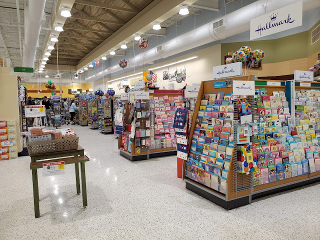
The Hallmark section, of course! According to a comment on one of my posts from a few months ago, the greeting card section is one of the highest margin areas of a supermarket. I also seem to remember hearing that all cards are sold on consignment, so Publix doesn't even have to worry about the product that doesn't sell.
 |
| Store #472 - 1994 - Wavy Pastels - Swifty (Blog Contributor) |
Turning back the clock again, we see what this section of the store looked like during the Wavy Pastels era thanks again to Swifty. I've always wondered whether those hanging ferns are real or not because it seems like they would have been very hard to water!

Heading up to the front, it looks like I was dead set on getting a good picture of the customer service counter considering how I tried three different times. I also believe that Publix removed all of its Redbox kiosks within the last year as they seem to have disappeared from the stores I frequent.

Now that's a better angle! Another indicator of this being an older Bamboo install is how Publix used a darker green plexiglass on the customer service signage. They shifted to a brighter green during the third and final wave of the package.

It's also worth pointing out that the 47N stores have a concave customer service counter compared to the flat one found in the sister 55N stores.
 |
| Publix #465 - 1994 - Kiwi Remodel (2005) - Equipment Plan |
To close out this store, we can see how Publix #540 was originally laid out thanks to this 2005 equipment plan from #465. Like I mentioned previously, all of the aisles used to line up in the back of the store and coffin coolers were stationed in the rear actionway.
Anyway, that will wrap up our tour of this Publix, but I've got one more surprise up my sleeve for y'all: the Big Lots next door.

SUPER LOTS!

Big Lots #64
Commerce Village
LaGrange, GA 30241
You know it has to be a special store for me to cover a Big Lots; not that I have anything against the company, but I think this may only be the second or third time I've even stepped foot in one. If that doesn't whet your appetite enough, I would love for somebody to raise their hand and tell me who originally occupied the building above.
"The new look starts when you're several blocks away. A graceful
white column topped by a room-sized cube bearing Kroger's name towers 30
feet high to identify the store."
As you enter the parking lot,
the store comes into view. Bigger. Longer. Often with a SupeRx drug
store as an integrated neighbor. A sharply clean, crisp look. Soaring
white arches with almost a Moorish look, silhouetted against smoke
brick and blue sky.
But the important differences are inside." - 1971 Kroger Annual Report (archive.org)

If you couldn't write your answer in time (or you didn't catch my earlier hints), the answer is: Kroger. Mind you, I have done very little research on this store, but I can almost guarantee you it opened as a Kroger during the 1970's and was replaced by the current store just down the road in the late-1980's. Judging by the fact that this Big Lots only has a two-digit store number (and based on the other stuff we'll see), I'd have to guess that it opened just a short time after Kroger moved out.
Here we see the original front doors of the store that were covered over by Big Lots. My Superstore knowledge essentially begins and ends with Retail Retell's recent Flickr series on the former Searcy, AR, Kroger, so maybe he can chime in with some insight down in the comments!

"Look around. The first impression is spaciousness and cleanliness. Then warmer, more friendly look. Then it hits you. The colors. Pulsing and alive, accented with wooden beams. Even the cases have lost their pale pastel tones. Now they're richly-hued green and gold and bittersweet, sparked with walnut-vinyl trim. Bold colors transmit a sense of shopping excitement." - 1971 Kroger Annual Report (archive.org)
Turning to the right just past the registers, we find the housewares in the front right corner. Is that some 1970's avocado green flooring I see? Am I sensing a bit of shopping excitement?

Why it is indeed! Once I saw the recent Google Maps photo of this store still sporting the original Kroger vinyl, I knew I had to see it for myself. It just so happens that I was going to be passing through LaGrange this week anyhow. I love how that worked out!

I took this shot along the front wall of the store from roughly the same place Retail Retell was standing in Searcy, but there would have been produce cases to my right (hence the repaired flooring) with the bulk of the produce department just off to my left.
 |
| 1971 Kroger Annual Report (archive.org) - Barberton, OH, Kroger Food Store - Opened 1/30/1972 |
Picture yourself: Ohio, 1972. If only LaGrange still had those hanging wooden trellises (at least it looks like the strip lights are still the same).

Turning along the right wall of the store, we see the green produce tiling continue a ways back—I just wish all of those dang shelves weren't in the way!

At least we can still get a cross-section of the faux bricks looking down this aisle. Also take note of how the infill tiles have a subtle green tint to them: almost as if somebody squeezed the tiniest bit of lime juice on them 50-years ago.

Despite many tiles being replaced, I'm still shocked at how good of shape the floors were in (it even looks like Big Lots polished them recently.

I'm not sure why, but there was a larger section of the old produce department toward the back that used a darker green tile and didn't have as many of the faux brick tiles.

We'll take a quick closeup of some of the tiles before moving on.
I originally thought that Retail Retell's photos of green tile in the
Searcy store were abnormal, but it seems like the trend was more
widespread (or I just don't know much about 1970's Krogers, which
is also valid).

The best overview of the old produce department I could get is this shot of the leftmost corner. The checkouts would have originally been (and still are) just to the right of the brick section while bread and rolls would have been behind me.
 |
| 1973 Kroger Annual Report (archive.org) - Mooresville, IN Kroger Superstore - Built in 1962, expanded in 1973. |
I didn't notice any specific remnants of the old bread department, but I wouldn't be surprised if the overhand was still there and just was painted over.

Let's take a look at the furniture department in the back right corner. I couldn't get a good look at the floors or the old bread wall since some employees were hanging out just to my right, but I did notice something else—the walls.
Shockingly, it looks like Big Lots just painted over the old Superstore décor and left it in place! It's a shame that most of the detailing is covered up by those large signs, but maybe you Kroger fans can provide some more insight as to what we are looking at.
 |
| 1973 Kroger Annual Report (archive.org) - Mooresville, IN Kroger Superstore - Built in 1962, expanded in 1973. |
Actually, I think I found a match! The paneling in this picture from the 1973 Kroger Annual Report appears to be laid out exactly like what I saw in LaGrange—neat!

Turning down what would have been the rear actionway, we find where the bricks transitioned to a more traditional reddish-brown color. I'd have to imagine that these used to line the meat department along the back wall, which is reinforced by that paneling overhead.

Popping out to the center of the store, I noticed these black lines running perpendicular to the aisles; I guess these used to provide some sort of accenting in the grocery department?
 |
| 1973 Kroger Annual Report (archive.org) - Mooresville, IN Kroger Superstore - Built in 1962, expanded in 1973. |
Or it appears that they may have lined the frozen foods department which presumably ran down the middle of the store. Doesn't that look like the same black tile in the image above?

Continuing on, we find a larger section of faux bricks which extended further from the back wall. It's interesting how most of these are randomly arranged in the tile rather than in a line like the ones we saw previously.

Here's a larger section of those bricks which line the pathway leading to the stockrooms and possibly the restrooms. Again, I'm not sure what Kroger originally did with this space.
 |
| 1973 Kroger Annual Report (archive.org) - Mooresville, IN Kroger Superstore - Built in 1962, expanded in 1973. |
I may not be sure, but I'm inclined to say that they adorned the "hospitality center" which offered greeting cards and candles.

Hey look, some more wall detailing! I feel like that fake column look reminds me of what Winn-Dixie was doing back in the 1970's (check out AFB's post here to see more of that store).

Based on my yellow comment earlier, I'm inclined to say that the back left corner of the store was home to the dairy department. It seems like these faux bricks haven't fared as well as some of the others.

Looking down the left wall of the store, we find Christmas decorations (come on, we aren't even halfway through October) and some more faux bricks. I can't even guess what Kroger originally had along here.

Another mystery is why there was a second large section of faux bricks closer to the front of the store on the left side. I feel like the hospitality section would have made more sense being over that rear patch I saw earlier, but there is also a chance it was up here. Maybe one of these regions could have also been for wine?

Returning back to the front, we see the smallest faux brick squares which tell me that I would have been standing directly in front of the delicatessen 50 years ago.
 |
| 1973 Kroger Annual Report (archive.org) - Mooresville, IN Kroger Superstore - Built in 1962, expanded in 1973. |
Yep. Seems to line up. Now if only Big Lots had kept the shingled roof!

As for the registers, most of the flooring had been replaced in this section of the store but I could still see a few traces of the red bricks behind the counter. I also noticed a few old décor pieces . . .
 |
| 1973 Kroger Annual Report (archive.org) - Mooresville, IN Kroger Superstore - Built in 1962, expanded in 1973. |
That's the decorative panels which used to line the front wall! They look like they are still in place across the entire front of the store, just painted white (see the patterned print in the top right of the picture above if you don't know what I'm talking about).
In addition to all of these cool Superstore photos I pulled from various Kroger annual reports, I'd also recommend checking out Anonymous in Houston's post which includes vintage news footage filmed inside a Superstore. It's amazing to find a 46 year old video from inside store, much less a store which was virtually identical to the one we saw today!

Our parting shot is a not-so-great overview I took while waiting in line to checkout. I have to say that walking around this store instantly brought back memories of a different Big Lots I last visited over a decade ago. That store also happened to be in an old Kroger Superstore but has since closed. Oh well, at least I got to photograph the LaGrange store as a consolation. I'd say it was worth the detour (and the last-minute addition to this post), wouldn't you?
I honestly find it interesting how many Kroger remnants were left behind in this store, especially considering how I was under the impression from others that Big Lots had eradicated all of these nuances with its "Store of the Future" campaign. I guess the odd lots do still exist, if you know where to look. Maybe I'll have to give the next Big Lots I see a second thought . . .
That's it for this week, but make sure to check back later to see what new adventures I've gotten myself into.
Until then,
- The Sing Oil Blogger
"What makes a Kroger Superstore?
While some excellent smaller stores are being built in the superstore image, a true superstore – as defined by Kroger – is at least 25,000 square feet in size (they range up to 42,000) . . . it is first and foremost a fine food store which offers more choice for the consumer – greater variety in every department . . . it includes the shopping appeal of colorful specialty departments such as delicatessens . . . and adds a convenient assortment of food-and-family-related general merchandise.
By early 1976, nearly half of all Kroger Food Stores will be in the superstore category. And virtually all these stores will be less than four years old."
Additional Resources:
Parcel ID: 0614A020001


Ha, we have a La Grange in Texas and it isn't that far from Houston. As far as most of the world goes, it is famous because the town once had a brothel known as the Chicken Ranch which the locals, including the Sheriff, were protecting from the state's authorities. Marvin Zindler, a toupee wearing consumer reporter for KTRK TV in Houston, and a former consumer fraud policeman in Houston, was asked to do a report about it in Houston in order to help the state's cause. The events of this later led to the famous Burt Reynolds and Dolly Parton movie The Best Little Whorehouse in Texas. Marvin Zindler remained a fixture on Houston TV for decades and his most famous segments were his Friday night 'Rat and Roach' report where he reported on the latest health inspections at restaurants and supermarkets. You'll just have to see these to believe them! Anyway, in October's The Year of Kroger post at HHR, I mentioned the KTRKroger and I'm sure Marvin Zindler shopped there before he died!
ReplyDeleteI don't have much to say about the Publix, but I am surprised to see a bottle of Caffeine Free Pepsi there! No, not because it is Pepsi in Georgia, though that does seem strange to me, but it is the Caffeine Free part that surprises me because I have not seen Caffeine Free Pepsi or Coca-Cola in Houston in many years that is not a diet version of those drinks. If anyone would have it here, it would probably be Food Town, but I guess Publix has it so it must be common in that region.
The star of the post has to be the Big Lots Superstore! I guess this is Superstore month given Retail Retell's posts. At least this one has a better looking ceiling. I don't know if you saw my HHR post about the SMU Jones Film videos in 2022, but there is a really good video from 1977 showing many different aspects of a Superstore I. I think you'll like it! Link: https://houstonhistoricretail.com/2022/01/14/vintage-texas-retail-videos-in-1080p-from-the-jones-film-collection/
My local Big Lots is actually in a 1978 Kroger Superstore II (the early Greenhouses). While it has many Kroger remnants left over, it is not quite as Krogery as this LaGrange one so this is really neat! As you can see from the HHR post I linked above, those colored bricks in the floor were common throughout the Superstore Is and it is surprising to see them survive at Big Lots. Big Lots is known for not altering their stores much, but even by their standards, this store has been left to be rather retro!
The last Superstore in Houston that wasn't significantly remodeled closed in around 2016. One in North Texas, Denison, survived until 2019 and that was actually an older store converted to Superstore standards. Anyway, you may be amused by this TV news video from the closing announcement as there is a Kroger shopper there who was disappointed about the Kroger closing news since he shopped there 7-8 times a day! Yes, you read that correctly! Link: https://www.kxii.com/content/news/Denison-Kroger-closing-after-59-years-505379871.html
After checking the websites of Kroger, Randall's, HEB, and Food Town in Houston, I can confirm that the only one who sells non-diet caffeine free versions of the major soft drinks around here (Coca-Cola, Pepsi, and Dr Pepper) around here is Food Town. Even then, Food Town only has caffeine free Coca-Cola and only in cans. So, yeah, that Caffeine Free Pepsi at Publix is something we don't have at Houston in our major supermarkets at least! I didn't check Walmart, but I'm guessing they don't have it either.
DeleteWow, it sounds like people had a cluckin’ good time in La Grange, TX! That’s interesting how Marvin Zindler seemed to launch his career by investigating the Chicken Ranch and how it even inspired a movie with such famous names—who would have known!
DeleteAgain, I usually don’t pay much attention to the soft drinks aisle, but I feel like I remember seeing family members drink caffeine free Coke a while back (it seems like it came in gold cans/bottles). I checked my local Publix today and indeed found 12 packs of canned caffeine free regular Coke. Maybe Georgia just likes its sugar?
I’m glad you liked the Big Lots Superstore considering how I only tacked it on three days before the post went live! The Retail Retell coordination was totally unplanned, but it seemed to work out well. You’re right—at least this Superstore does have a much better ceiling. I was personally surprised at how shiny the floors were here too; Big Lots may not have spent much on repairing them, but they sure kept them clean! I had not seen your post, but that was a really cool video! I made sure to add it to the post in case others would like to watch it as well. It is neat to see how retro this store really is!
I feel like that man must’ve meant that he went to the Kroger 7-8 times a week rather than a day (imagine going anywhere, much less a supermarket, basically once every hour).
I guess the reason so many 1960's or other older convenience store buildings have remained as convenience stores to this day is that unlike supermarkets and department stores, convenience stores really haven't changed much in concept since then. I know you have the Sheetz and Wawas of the world trying to make convenience stores fancier, but at their core, the concept of a convenience store is still the same today as it was in the mid-1960's - a small local store with a focus on beer, cigarettes, snack foods, and limited other pantry staples, and possibly a small deli counter of some kind. Overhead is pretty low for stores like this too, so independent people are more inclined to keep a convenience store going long-term compared to something larger. Still, it's quite interested how many of these old Sing stores remain as a convenience store these days, and some of these lower-budget operations have led you to discover more relics of the chain's history.
ReplyDeleteThose are some neat photos Swifty sent in too of #472 with Wavy Pastel! #540 seems pretty standard for a 47N, but it's neat to see CM 2.5 still kicking in some form. I agree, seeing the Sienna placards on the CM 2.X aisle markers is a bit glaring, as they don't match at all! My favorite photo of the photo collage is probably the one of the Art Deco store, as Publix released a special edition reusable bag for the company's 85th (I think) anniversary using that same photo (which I have in my bag collection).
As for the Big Lots, that sure was a neat find! I guess Big Lots' most recent remodel are really getting cheap, as a full "Store of the Future" remodel from 2020 or so would have ripped out all the old floors and redone the walls to remove all trace of those Kroger Superstore relics. The signage on the walls is Big Lots' most recent graphics package, used for the last year or two as part of the "Big-ionaire" ad campaign. Had you visited this store prior to when those signs were installed, you probably could have seen the wall decor remnants even better, but you still got some good shots of what was left in there. Back when Big Lots was a true closeout/junk store, they barely changed the buildings they moved into, which many times were old supermarket spaces. A new Big Lots opening these days would still be a gut rebuild, but it's nice to see the remodels these days are a bit cheaper, as we lost a good number of stores like this in the early 2020's remodel sweep. I have a few Big Lots stores photographed that are of a similar vein to what we saw here, and someday I'll get around to posting another one of those. I'm not a Kroger expert in any way, so I can't provide much insight into what all the remnants used to designate, but it's still fun to see all those 1970's supermarket elements nonetheless!
That’s a fair point: while there are outliers such as Wawa or Race Trac, convenience stores have mostly stayed the same for the last number of decades. You could argue that the food (especially fresh food) selection has declined over the years, and that delis weren’t really a thing until the 1980’s, but the stores are still just a small store to grab some essentials. The low overhead is really obvious at some of these former Sings!
DeleteI’m surprised that you haven’t seen the Wavy Pastel photos of #472 before! Regardless, #540 is fairly standard for a 47N, and I’d be curious to see how differently I would have written this post shortly after I took the photos compared to now. I’ve seen a store or two completely swap out the old CM 2.x cards for newer Sienna ones while keeping the old frames, and that looks much better than what LaGrange had. I agree that the Art Deco store is really cool. Previously, I think my favorite picture was the “home of Publix Markets one, but I think I’ve changed my mind toward favoring the orange and black vintage patches. Maybe part of the reason is because I have one of the orange patches in my room 😉. That’s neat how you got one of the Art Deco reusable bags! I saw somebody using one of those at my store a few weeks ago and overheard the cashier complimenting it. She also asked where the man got it from, and while I remember him mentioning “Florida”, I’m not sure if he told her that the bag was several years old at this point.
I agree, I thought it was cool how I stumbled across that Big Lots (and I’m glad I had the chance to go back and photograph it). That’s reassuring how this store has the most up to date package and has still held onto most of the Kroger traces, as I was worried it was just sitting on borrowed time. That would have been interesting to see what this store looked like several years ago; who knows, the walls may not have even been painted back then. Glad you enjoyed the tour!
I think you were thinking of this discussion regarding yellow for dairy. I still tend to associate dairy with blue like I said there, but it sure seems like yellow is a common color choice!
ReplyDeleteYep, that's the one! Thanks for digging that up. At least Publix seems to have all of us covered with both Invigorate (CM 2.0) and Bamboo (CM 2.5, like we see here) since both packages use yellow and blue for the dairy department.
DeleteAbsolutely awesome vintage photos of the LaGrange Sing (and nice catch on the vintage Reddy Ice logo, too)! It's really neat to be able to see what may have been their second-ever convenience store in such detailed, high-quality, original imagery. Maybe I'm just a simple guy, but I really like the facade with the backlit plastic, STOP 'N SHOP lettering, and dual Sing logos. I also agree that it's crazy how many old convenience stores are still active as opposed to other types of retail! And the zig-zag Shell canopy is odd, too.
ReplyDeleteI don't know if I would consider absence of new paint or of removal of old signs to fall into the category of routine maintenance. After all, we see plenty of grocery stores that don't bother to take down old decor and I wouldn't consider absence of a remodel to be a maintenance matter! Plus I feel like a building this old wouldn't be able to still be open today if it hasn't had at least some amount of proper care over the years. I've always considered design stuff to be simply aesthetic more than anything else upkeep-related, but that's just me.
Since you mention Standard and Chevron -- completely unrelated to this post, but I watched this video last night and thoroughly enjoyed it: https://www.youtube.com/watch?v=Iga8Fd5Y4q8 I don't know if you had known about or followed the Standard brand being used as a "broken chain"/trademark-related manner before, but I know others have discussed it in the past. I feel like Northwest Retail in particular would be interested in that video, as I believe he's the one who shared with me several years ago the exact same vintage map used as the launching point by the YouTuber in the video!
Very neat to see those Wavy Pastel remodel photos from Swifty! Thanks for the link to my Lexington pic as well. I think that's probably the first time anyone has ever linked to a Publix photo of mine, haha!
Of course, most photos of mine that people link to are probably from Kroger stores, so that brings me to the next part of my comment. Thanks for the shout-outs and links, and cool find with this Big Lots store! On the topic of the green tiles, I am under the impression that all the superstores had multiple colors (including green), not just the reddish-brown most commonly associated with them. I don't have much research to fall back on for that, either, but at least this Big Lots seems to support it, lol! Similarly, the large section of dark green floor tile was also present in Searcy.
DeleteAwesome find with that painted-over wood paneling wall decor! I've seen photos of vintage superstores before, occupied by Big Lots or otherwise, and even have a superstore-turned-Big Lots of my own waiting in my archives. But I think this is the most obvious example I've seen in recent times of actual wall decor remaining. This reminds me of the "famous" Princeton, WV, Big Lots, which kept its original deli-bakery decor totally intact for the longest time: https://www.flickr.com/photos/andrew-turnbull/3096749181/in/photostream/
Even today, it seems likely the windows are still there (most recent Google imagery is from 2017, which shows the windows present, but the shingled awning removed -- you'd think they'd have taken both out at the same time if they were going to). Andrew Turnbull, whose flickr page that's from, also has his own website with plenty of Kroger artifacts on it (here's just page 2, which is the superstore page: http://www.andrewturnbull.net/kroger2.html), including a link to one store in Peoria that had/has similarly painted over wall slats to what you encountered: http://www.andrewturnbull.net/artifacts/kro-ilpeoria16c.jpg
The black tile, I'd agree, used to be used in frozen (and that makes even more sense with it having been coffin coolers... duh, I should've realized that). As for the large red brick section, I am unsure what that was used for either, but I can say that something that seems (to me) very similar to that feature was carried over to the Bauhaus greenhouse Kroger in Southaven, which had it in the back right corner adjacent to bread and rolls and used it for seasonal/specials/sales: https://www.flickr.com/photos/130271900@N03/48331093211/in/album-72157649810722378/ Perhaps Southaven's also was originally for the "hospitality corner" as you found in the annual report?
The red bricks leading to the front would've taken you to the deli/bakery, most likely, but I can't speak to what the second large red brick section was for! Also, great find on the decorative panels on the front wall!
Anonymous in Houston's video is great, and if you haven't seen Pleasant Family Shopping's superstore blog post, it's a great resource as well (even though it largely draws from the same annual report you already referenced): http://pleasantfamilyshopping.blogspot.com/2009/02/kroger-superstores.html
Definitely recommend checking out any further Big Lots stores you might find! I don't think they've been nearly as thorough in eradicating old decor as you might have thought.
@Retail Retell - Thanks for sharing that link to the Standard Oil video. It solved a mystery that I've been wondering about, where Florida's Standard station was!
DeleteThank you, and I agree! I always think it is so cool to compare how a location has changed over time, especially with photos that date back to the 1960’s and the first months of this store’s operation. While I don’t think the plastic would age very well, I agree that the original backlit canopy looks neat. Sing eventually came full circle with a backlit canopy for its final 1980’s design (which we’ll get to see vintage pictures of one day from an unexpected place), and I wish companies would try more interesting things like this today.
DeleteThat’s a fair point that the absence of new paint, etc. doesn’t directly correlate with a lack of maintenance, but I feel like the odds are higher when those conditions are true. It does, however, seem like the more often a business is remodeled, the more often it is deep cleaned. Take Publix for an example: #1331 in Fort Myers was the second-most outdated location in the chain décor wise and had dust, Albertsons memorabilia, and chicken bones that were sitting on top of the freezers for at least a decade and a half. Had the store been remodeled, it would have received new coolers, a deep cleaning, etc. Neither directly go hand in hand, but remodels and equipment exchanges do result in other maintenance being performed that may otherwise be neglected. At least this old Sing has swapped out the light fixtures recently and presumably kept the roof in fair shape. The air vents do look pretty dirty though.
I’ll have to watch that video! Having known about gas station history much longer than supermarket history, I’ve come across those odd-ball Standard stations before (and even seen one in person). The history of Standard Oil Company is a fascinating one and may just be what a future post of mine centers on. After all, Sing did operate some stations under the Standard brand back in the 1970’s and even had a partnership with Standard / Chevron in the Atlanta Metro. I still think it’s funny that the Standard Oil Company of California (Chevron) is the division that ended up with the rights in Georgia!
I was really excited when Swifty sent those pictures to me a while back! While I’ve had them buried on my Publix store designs page, it was nice to share them in the proper context of a similar store to a wider audience. Also, you’re welcome for the link! I suppose there is a first time for everything, and maybe you should give a full-on Publix post a try sometime! I picture that you’ve been to other Publixes before!
Of course, you’re welcome! I’m far from an expert on Kroger Superstores, but it is amazing how much I learned just from visiting this one. I was also really excited when I came across that photo on Google Maps indicating the store still had Superstore traces inside. In retrospect, I agree that it appears that Superstores had multiple colors of tile rather than just the reddish-brown. It looks like most of the dark green floor tile was originally under the produce display islands according to the video (I think) Anonymous in Houston shared.
DeleteI was especially shocked to see the wall décor still in place here! While I wish I could’ve seen more here, at least it was still easy enough to piece together what each pattern originally looked like. That would have been really cool if the deli/bakery awning was still intact like that West Virginia store, but alas, it was just a blank wall of Christmas decorations. Your comment about that store reminded me to look up the other SuperLots I had been to, and I found where it still had some original decorative wallpaper visible as of 2017. I wish I had taken a better mental note of how that store looked last time I went, but that was a long time ago considering it closed back in 2014. I should still stop by to see if anything is left next time I’m in the area.
I remember coming across Andrew Turnbull’s page early in my Kroger research so I’m glad you brought it back up. He’s done a good job documenting old Kroger stores and has built a great resource. Who knows why Kroger didn’t remove the old windows (maybe they are structural and aren’t just decorative?)
I guess you should have looked through those annual reports! Jokes aside, that was just a lucky catch for me to realize the old frozen foods setup, but that context really explains the black tiles. I still can’t figure out why this store had two large brick sections. I’m sure one was in the hospitality department, but it seems like the other may just remain a mystery. Interesting how a similar feature was carried onto the Bauhaus Greenhouses, I just wonder why these are on the opposite side of the store than what you saw in Southaven.
Yes, I’ve seen the Pleasant Family Shopping’s page many times (and should have linked to it as a resource). I didn’t directly reference it this time, but it is a very nice post to read through. I had remembered it having those old pictures but figured I could track down the source in an old annual report (and I was right).
I’ll definitely be paying more attention to Big Lots stores in the future!